Microsoft® Office® 2007
Step-by-Step for Educators
Create a Graph in Excel 2007
Charts are used to display series of numeric data in a graphical format to make it easier to
understand large quantities of data and the relationship between different series of data.
About charts and their elements
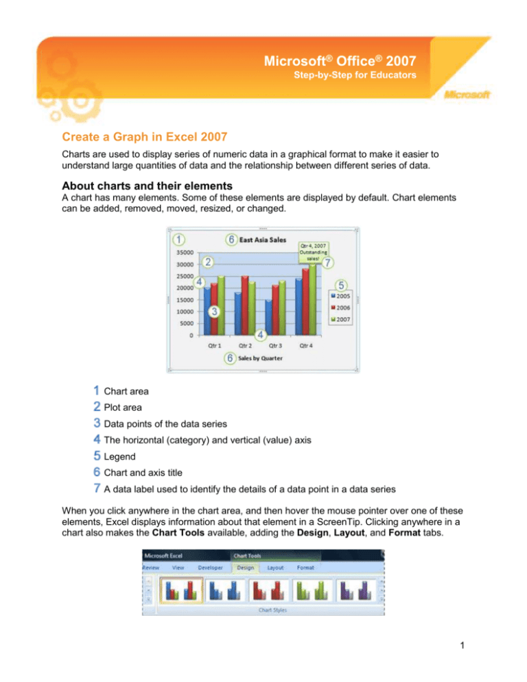
A chart has many elements. Some of these elements are displayed by default. Chart elements
can be added, removed, moved, resized, or changed.
Chart area
Plot area
Data points of the data series
The horizontal (category) and vertical (value) axis
Legend
Chart and axis title
A data label used to identify the details of a data point in a data series
When you click anywhere in the chart area, and then hover the mouse pointer over one of these
elements, Excel displays information about that element in a ScreenTip. Clicking anywhere in a
chart also makes the Chart Tools available, adding the Design, Layout, and Format tabs.
1
Available chart types
Excel 2007 supports many types of charts to help you display data in ways that are meaningful
to your audience. The following are some of the more commonly used chart types available.
Chart Type
Chart Example
Column charts
Data that is arranged in columns or rows on a worksheet can be plotted in a
column chart. Column charts are useful for showing data changes over a period of
time or for illustrating comparisons among items.
Line charts
Data that is arranged in columns or rows on a worksheet can be plotted in a line
chart. Line charts can display continuous data over time, set against a common
scale, and are therefore ideal for showing trends in data at equal intervals. In a
line chart, category data is distributed evenly along the horizontal axis, and all
value data is distributed evenly along the vertical axis.
Pie charts
Data that is arranged in one column or row only on a worksheet can be plotted in
a pie chart. Pie charts show the size of items in one data series, proportional to
the sum of the items. The data points in a pie chart are displayed as a percentage
of the whole pie.
Bar charts
Data that is arranged in columns or rows on a worksheet can be plotted in a bar
chart. Bar charts illustrate comparisons among individual items.
Area charts
Data that is arranged in columns or rows on a worksheet can be plotted in an area
chart. Area charts emphasize the magnitude of change over time, and can be
used to draw attention to the total value across a trend. For example, data that
represents profit over time can be plotted in an area chart to emphasize the total
profit. By displaying the sum of the plotted values, an area chart also shows the
relationship of parts to a whole.
XY (scatter) charts
Data that is arranged in columns and rows on a worksheet can be plotted in an xy
(scatter) chart. Scatter charts show the relationships among the numeric values in
several data series, or plots two groups of numbers as one series of xy
coordinates.
Bubble charts
Data that is arranged in columns on a worksheet so that x values are listed in the
first column and corresponding y values and bubble size values are listed in
adjacent columns, can be plotted in a bubble chart.
2
Create a chart
1. Enter the numeric data for the chart on a worksheet in Excel. For most charts, you can
plot the data that you arrange in rows or columns. However, some chart types (such as
pie and bubble charts) require a specific data arrangement.
2. Select the cells that contain the data that you want to use for the chart.
3. On the Insert tab, in the Charts group, do one of the following:
Click the chart type, and then click a chart subtype that you want to use.
To see all available chart types, click a chart type, and then click All Chart Types to
display the Insert Chart dialog box. Click the one you want to use and select OK.
4. Excel will automatically create your chart. When you click on the chart you want to
format, it displays the Chart Tools, adding the Design, Layout, and Format tabs.
Modifying a basic chart to meet your needs
After you create a chart, you can modify any one of its elements. To modify a chart, you can:
1. Change the pre-defined chart style
o
o
Select the chart you want to format.
On the Design tab, in the Chart Styles group, click the chart style you want to
use.
3
2. Add titles, axis titles, a legend, or data labels to a chart
o
o
Select the chart you want to format.
On the Layout tab, in the Labels group, select the feature you would like to
change, then click the display option that you want.
3. Show or hide gridlines
o
o
Select the chart you want to format.
On the Layout tab, in the Axes group, click Gridlines and select the horizontal
and/or vertical gridlines you would like to show.
More Information on Office 2007 for educators
For teachers:
www.microsoft.com/education/Office
For faculty:
www.microsoft.com/officeeducation
For more help with Microsoft Office Excel:
http://office.microsoft.com/en-us/excel/FX100646951033.aspx
© 2009 Microsoft Corporation. All rights reserved.
This document is for informational purposes only. MICROSOFT MAKES NO WARRANTIES, EXPRESS, IMPLIED OR STATUTORY, AS TO THE INFORMATION IN THIS
DOCUMENT.
Microsoft, Windows, SmartArt, Excel, Internet Explorer, OneNote, PowerPoint, SmartScreen, and Windows Live are trademarks of the Microsoft group of companies. The
names of actual companies and products mentioned herein may be the trademarks of their respective owners.
4
