creating population pyramids using microsoft excel
advertisement
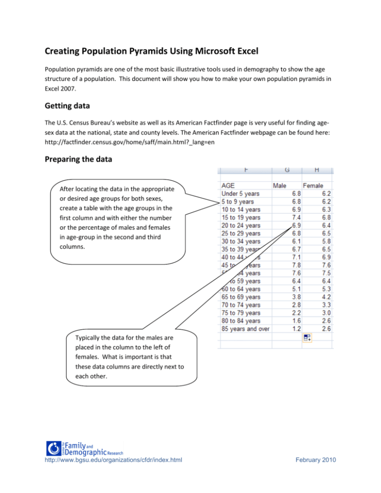
Creating Population Pyramids Using Microsoft Excel Population pyramids are one of the most basic illustrative tools used in demography to show the age structure of a population. This document will show you how to make your own population pyramids in Excel 2007. Getting data The U.S. Census Bureau’s website as well as its American Factfinder page is very useful for finding agesex data at the national, state and county levels. The American Factfinder webpage can be found here: http://factfinder.census.gov/home/saff/main.html?_lang=en Preparing the data After locating the data in the appropriate or desired age groups for both sexes, create a table with the age groups in the first column and with either the number or the percentage of males and females in age-group in the second and third columns. Typically the data for the males are placed in the column to the left of females. What is important is that these data columns are directly next to each other. http://www.bgsu.edu/organizations/cfdr/index.html February 2010 By convention in population pyramids males are on the left-hand side of the pyramid. In order for this to occur, the male values must be negative. This can be done in one of two ways: either manually changing each value by placing a negative sign in front of each value or by using the formula option in Excel to multiply each value by negative one. Once you apply this formula to the first cell you can drag and copy it to the other cells. Then replace the original values with the newly computed ones. To ensure that the proper values are copied use the paste special option and then click values only. http://www.bgsu.edu/organizations/cfdr/index.html February 2010 Creating the Pyramid 3. Select Bar 2. Select the Insert Tab 1. Now that the table is set up properly select the table. 4. Select Stacked .The chart by default will be created on the page with the data. The chart can be edited on this page or moved to a separate sheet. http://www.bgsu.edu/organizations/cfdr/index.html February 2010 To move the chart to its own tab, right click and select move chart from the drop down menu. This opens a dialogue box that allows the user to name the new chart sheet. http://www.bgsu.edu/organizations/cfdr/index.html February 2010 Formatting the Pyramid 1. Start by moving the vertical axis to the left. Under Chart Tools select the Layout Tab then click on the Axes button. 2. Select Primary Vertical Axis. 3. Select More Primary Vertical Axis Options. Change the Axis Labels option from Next to Axis to Low. Click Close http://www.bgsu.edu/organizations/cfdr/index.html February 2010 85 years and over 80 to 84 years 75 to 79 years 70 to 74 years 65 to 69 years 60 to 64 years 55 to 59 years 50 to 54 years Making the values for males negative Male ensures that these are graphed on the leftFemale side. The horizontal axis is now labeled with negative values which are misleading. 45 to 49 years 40 to 44 years 35 to 39 years 30 to 34 years 25 to 29 years 20 to 24 years 15 to 19 years 10 to 14 years 5 to 9 years Under 5 years -10.0 -8.0 -6.0 -4.0 -2.0 0.0 2.0 4.0 6.0 8.0 10.0 To fix this, repeat step 1 above and select Primary Horizontal Axis and More Primary Axis Options. Then select Number. Select Custom from the Number Category. Type in 0;0 into the Format Code text box click Add and then Close. http://www.bgsu.edu/organizations/cfdr/index.html February 2010 85 years and over 80 to 84 years 75 to 79 years 70 to 74 years 65 to 69 years 60 to 64 years 55 to 59 years 50 to 54 years 45 to 49 years Male Female 40 to 44 years 35 to 39 years The left Horizontal Axis should now display positive values for both males and females. 30 to 34 years 25 to 29 years 20 to 24 years 15 to 19 years 10 to 14 years 5 to 9 years Under 5 years 10 8 6 4 2 0 2 4 6 8 10 The next step is to reduce the gap between each bar. This is done by right-clicking on the (chart) data series (either male or female) i.e. clicking on the bars. The series selected is irrelevant because once the gap is reduced for one series it will automatically be done for the other. http://www.bgsu.edu/organizations/cfdr/index.html February 2010 This produces the Format Data Series dialogue box. Change the gap width to zero. Click Close. 85 years and over 80 to 84 years It now looks like a population pyramid but setting the gap width to zero makes it difficult to distinguish between each bar. 75 to 79 years 70 to 74 years 65 to 69 years 60 to 64 years 55 to 59 years 50 to 54 years 45 to 49 years Male Female 40 to 44 years 35 to 39 years 30 to 34 years 25 to 29 years 20 to 24 years 15 to 19 years 10 to 14 years 5 to 9 years Under 5 years 10 8 6 4 http://www.bgsu.edu/organizations/cfdr/index.html 2 0 2 4 6 8 10 February 2010 2. Check solid line. 3. Set Color to black using the drop down menu. This procedure must be repeated for the other data series. 1. To create a border around each bar use the format data series select the border color option. The border thickness can be varied by using the border styles option and increasing the width. 85 years and over 80 to 84 years 75 to 79 years Each bar is distinguishable, now to get rid of the vertical gridlines. 70 to 74 years 65 to 69 years 60 to 64 years 55 to 59 years 50 to 54 years 45 to 49 years Male 40 to 44 years Female 35 to 39 years 30 to 34 years 25 to 29 years 20 to 24 years 15 to 19 years 10 to 14 years 5 to 9 years Under 5 years 10 8 6 4 2 http://www.bgsu.edu/organizations/cfdr/index.html 0 2 4 6 8 10 February 2010 1. To remove the gridlines; under layout click on the Gridlines button. 2. Select the Primary Vertical Gridlines then select None. Usually the legend for pyramids is placed at the top of the chart. To do this select Legend then click on Show Legend at Top. The text box containing the legend can be dragged (as well as re-sized) left or right so that the legend lines up with the data series. http://www.bgsu.edu/organizations/cfdr/index.html February 2010 Using the Chart and Axis Title options label the Chart and the axes. The Finished Product Population Pyramid of Ohio in 2008 Male Female 85 years and over 80 to 84 years 75 to 79 years 70 to 74 years 65 to 69 years 60 to 64 years 55 to 59 years 50 to 54 years A g e 45 to 49 years 40 to 44 years 35 to 39 years 30 to 34 years 25 to 29 years 20 to 24 years 15 to 19 years 10 to 14 years 5 to 9 years Under 5 years 10 8 6 4 2 0 2 4 6 8 10 Population (%) http://www.bgsu.edu/organizations/cfdr/index.html February 2010


