Instruction Peer Review Sheet
advertisement
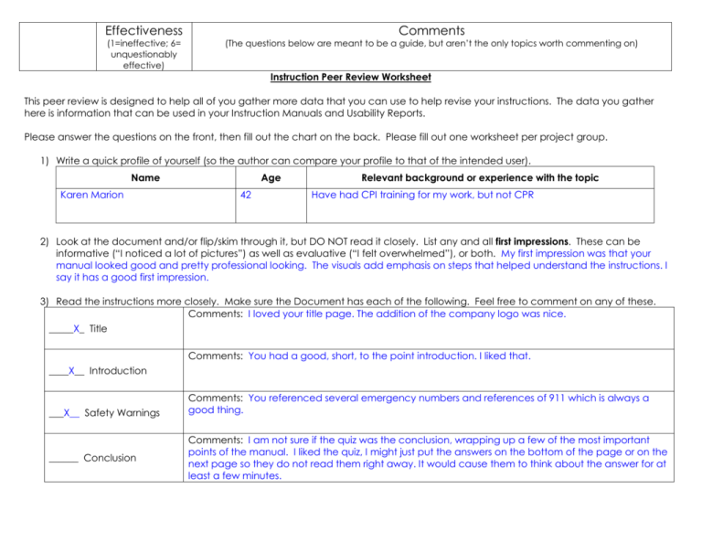
Effectiveness Comments (1=ineffective; 6= unquestionably effective) (The questions below are meant to be a guide, but aren’t the only topics worth commenting on) Instruction Peer Review Worksheet This peer review is designed to help all of you gather more data that you can use to help revise your instructions. The data you gather here is information that can be used in your Instruction Manuals and Usability Reports. Please answer the questions on the front, then fill out the chart on the back. Please fill out one worksheet per project group. 1) Write a quick profile of yourself (so the author can compare your profile to that of the intended user). Name Karen Marion Age 42 Relevant background or experience with the topic Have had CPI training for my work, but not CPR 2) Look at the document and/or flip/skim through it, but DO NOT read it closely. List any and all first impressions. These can be informative (“I noticed a lot of pictures”) as well as evaluative (“I felt overwhelmed”), or both. My first impression was that your manual looked good and pretty professional looking. The visuals add emphasis on steps that helped understand the instructions. I say it has a good first impression. 3) Read the instructions more closely. Make sure the Document has each of the following. Feel free to comment on any of these. Comments: I loved your title page. The addition of the company logo was nice. _____X_ Title Comments: You had a good, short, to the point introduction. I liked that. ____X__ Introduction ___X__ Safety Warnings ______ Conclusion Comments: You referenced several emergency numbers and references of 911 which is always a good thing. Comments: I am not sure if the quiz was the conclusion, wrapping up a few of the most important points of the manual. I liked the quiz, I might just put the answers on the bottom of the page or on the next page so they do not read them right away. It would cause them to think about the answer for at least a few minutes. Is the language, terminology, and level of detail audience-appropriate? . I think the language and terminology are suited for the audience that you are targeting. Tone Clarity and Completeness 1 2 3 4 5 6 1 2 3 4 5 6 Were there any places where you confused? Were there any steps that you had to re-read? Were there any places where steps or information seem to be missing I feel your manual had good clear instructions of what CPR is, and how to use it, as well as the signs of choking and how to handle those situations. I liked the added locations of where the manuals were located. Does the document’s organization seem consistent with the task? Are steps discrete and clearly defined? The manual was organized in a very good format. Organization Visuals Comments, Notes and Explanations 1 2 3 4 5 6 1 2 3 4 5 6 1 2 3 4 5 6 Are there visuals? Are there enough/too many? Are they appropriately cited The visuals were excellent. They were placed in appropriate locations in the manual. I am not sure if they were cited correctly. Sources were cited at the end. Does the document provide any explanatory information? If so, is it enough/too much? Is it easy to tell the difference between actions and explanations I feel your explanations will aid the person in the steps they need to follow. Does the physical design and layout of the information help the reader/make the task more efficient You manual had a good physical layout. It was organized well and had a good presentational look about it. Layout/ physical document 1 2 3 4 5 6
