Chapter Presentation Rubrics
advertisement
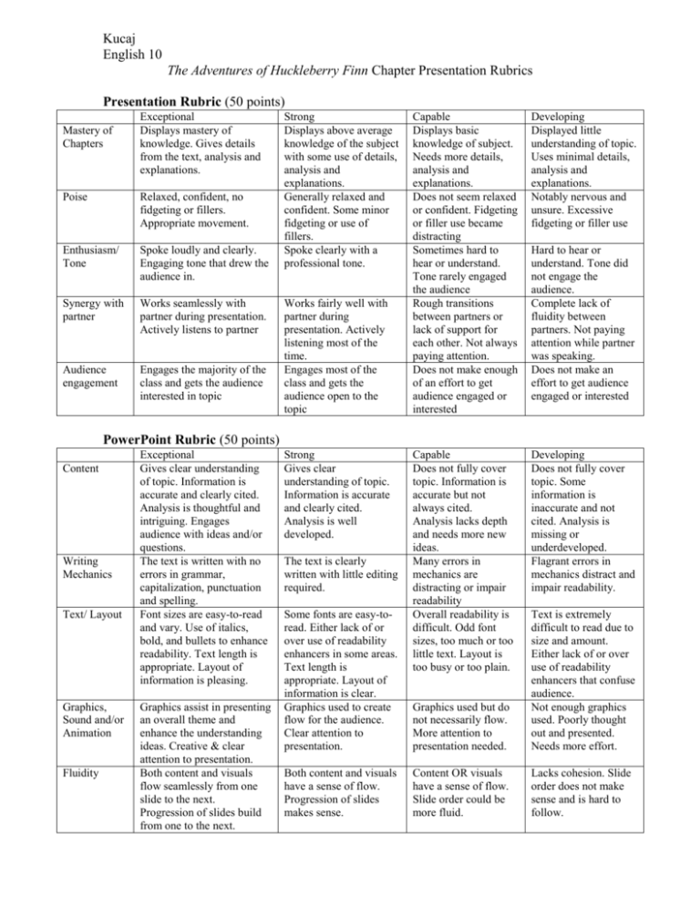
Kucaj English 10 The Adventures of Huckleberry Finn Chapter Presentation Rubrics Presentation Rubric (50 points) Mastery of Chapters Exceptional Displays mastery of knowledge. Gives details from the text, analysis and explanations. Poise Relaxed, confident, no fidgeting or fillers. Appropriate movement. Enthusiasm/ Tone Spoke loudly and clearly. Engaging tone that drew the audience in. Synergy with partner Works seamlessly with partner during presentation. Actively listens to partner Audience engagement Engages the majority of the class and gets the audience interested in topic Strong Displays above average knowledge of the subject with some use of details, analysis and explanations. Generally relaxed and confident. Some minor fidgeting or use of fillers. Spoke clearly with a professional tone. Works fairly well with partner during presentation. Actively listening most of the time. Engages most of the class and gets the audience open to the topic Capable Displays basic knowledge of subject. Needs more details, analysis and explanations. Does not seem relaxed or confident. Fidgeting or filler use became distracting Sometimes hard to hear or understand. Tone rarely engaged the audience Rough transitions between partners or lack of support for each other. Not always paying attention. Does not make enough of an effort to get audience engaged or interested Developing Displayed little understanding of topic. Uses minimal details, analysis and explanations. Notably nervous and unsure. Excessive fidgeting or filler use Capable Does not fully cover topic. Information is accurate but not always cited. Analysis lacks depth and needs more new ideas. Many errors in mechanics are distracting or impair readability Overall readability is difficult. Odd font sizes, too much or too little text. Layout is too busy or too plain. Developing Does not fully cover topic. Some information is inaccurate and not cited. Analysis is missing or underdeveloped. Flagrant errors in mechanics distract and impair readability. Hard to hear or understand. Tone did not engage the audience. Complete lack of fluidity between partners. Not paying attention while partner was speaking. Does not make an effort to get audience engaged or interested PowerPoint Rubric (50 points) Content Writing Mechanics Text/ Layout Graphics, Sound and/or Animation Fluidity Exceptional Gives clear understanding of topic. Information is accurate and clearly cited. Analysis is thoughtful and intriguing. Engages audience with ideas and/or questions. The text is written with no errors in grammar, capitalization, punctuation and spelling. Font sizes are easy-to-read and vary. Use of italics, bold, and bullets to enhance readability. Text length is appropriate. Layout of information is pleasing. Graphics assist in presenting an overall theme and enhance the understanding ideas. Creative & clear attention to presentation. Both content and visuals flow seamlessly from one slide to the next. Progression of slides build from one to the next. Strong Gives clear understanding of topic. Information is accurate and clearly cited. Analysis is well developed. The text is clearly written with little editing required. Some fonts are easy-toread. Either lack of or over use of readability enhancers in some areas. Text length is appropriate. Layout of information is clear. Graphics used to create flow for the audience. Clear attention to presentation. Both content and visuals have a sense of flow. Progression of slides makes sense. Graphics used but do not necessarily flow. More attention to presentation needed. Text is extremely difficult to read due to size and amount. Either lack of or over use of readability enhancers that confuse audience. Not enough graphics used. Poorly thought out and presented. Needs more effort. Content OR visuals have a sense of flow. Slide order could be more fluid. Lacks cohesion. Slide order does not make sense and is hard to follow.
