Graphics with R
advertisement
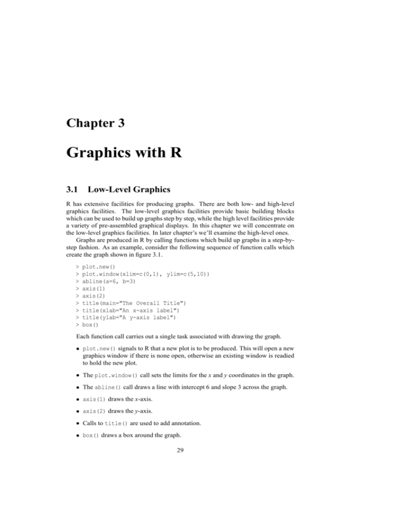
Chapter 3 Graphics with R 3.1 Low-Level Graphics R has extensive facilities for producing graphs. There are both low- and high-level graphics facilities. The low-level graphics facilities provide basic building blocks which can be used to build up graphs step by step, while the high level facilities provide a variety of pre-assembled graphical displays. In this chapter we will concentrate on the low-level graphics facilities. In later chapter’s we’ll examine the high-level ones. Graphs are produced in R by calling functions which build up graphs in a step-bystep fashion. As an example, consider the following sequence of function calls which create the graph shown in figure 3.1. > > > > > > > > > plot.new() plot.window(xlim=c(0,1), ylim=c(5,10)) abline(a=6, b=3) axis(1) axis(2) title(main="The Overall Title") title(xlab="An x-axis label") title(ylab="A y-axis label") box() Each function call carries out a single task associated with drawing the graph. plot.new() signals to R that a new plot is to be produced. This will open a new graphics window if there is none open, otherwise an existing window is readied to hold the new plot. The plot.window() call sets the limits for the x and y coordinates in the graph. The abline() call draws a line with intercept 6 and slope 3 across the graph. axis(1) draws the x-axis. axis(2) draws the y-axis. Calls to title() are used to add annotation. box() draws a box around the graph. 29 30 Chapter 3. Graphics with R 8 7 5 6 A y−axis label 9 10 The Overall Title 0.0 0.2 0.4 0.6 0.8 1.0 An x−axis label Figure 3.1: A plot produced with low-level R function calls. A wide range of graphs can be created by a similar sequence of simple steps. Some graphs may omit some of the axis or titling steps, but the majority will only differ in what is drawn inside the central plot region. R has a number of functions which are designed to draw in the plot region. 3.1.1 Adding Points To A Plot The function points can be used to add a set of points to a plot. The simplest form of a call to points has the form > points(x, y) where x and y contain the x and y coordinates of the point to be plotted. This simple form plots each of the points as an open circle, but and additional optional argument specified with pch= allows different plotting symbols to be used. The values 1 through 25 specify special graphical plotting symbols, while values from 33 to 126 are taken as the ASCII code for a character. These can also be specified by enclosing the desired character in quotes. 31 3.1. Low-Level Graphics 1 2 3 4 5 6 7 8 9 10 11 12 13 14 15 16 17 18 19 20 21 22 23 24 25 Figure 3.2: R plotting symbols. The value specified for pch can be a vector and so a different plotting symbol can be specified for each point. If there are more points than pch values, the pch values are recycled. By default, all plotting symbols are plotted in black, but other colours can be obtained with an additional argument specified with col=. The simplest form of colour specification is a colour name given as a character string (e.g. col="purple"). The value of the col= argument can be a vector so a different colour can be specified for each symbol plotted. 3.1.2 Adding Connected Line Segments To A Plot The function lines can be used to draw a connected set of line segments to a plot. A call to lines has the form > lines(x, y) with the x and y arguments containing the coordinates of the points to be joined by the line segments. If a point has a non-finite value for one of its coordinates, the lines joining that point to its neighbours are not drawn. This provides a useful way of obtaining a break in a line. The texture of the line can be altered with an optional lty= argument. The simplest line specifications are by name — "blank", "solid", "dashed", "dotted", "dotdash", "longdash" and "twodash". Other specifications are possible using strings containing either 2 or 4 hexadecimal digits. These are interpreted as the length of the successive black and white components of the line pattern. For example, "11" is a high density dotted line, "33" is a short dashed line and "3313" is a dot-dashed line. The colour of the line can be changed using a col= specification and the width of the line can be altered using the lwd= argument. Only the first value in each of these arguments is used. 3.1.3 Drawing Straight Lines Across A Plot The function abline provides a simple way of drawing a line which extends all the way across a plot. The line can be described in slope intercept form with arguments a= and b=. These give the intercept and slope of the line. Vertical and horizontal lines can be obtained by using the h= and v= arguments. The function call > abline(v=1:4) draws vertical lines at x > abline(h=1:4) 1, x 2, x 3 and x 4. Similarly 32 Chapter 3. Graphics with R draws horizontal lines across the plot at y 1, y 2, y 3 and y 4. The colour, width and line texture of the lines drawn by abline can be controlled with the col=, lwd= and lty= arguments. 3.1.4 Adding Disconnected Lines Segments To A Plot The function segments adds a set of disconnected line segments to a plot. Each line is described by four line values — the x and y coordinates of its start point and the x and y coordinates of its end point. > segments(x0, y0, x1, y1) The arguments to segments can be vectors, so that several line segments can be drawn with a single call. The optional arguments col=, lwd= and lty= can be used to set the colour, width and texture of the line segments. The values of these arguments are recycled so it is possible to specify a single value, or to specify values for each line segment. 3.1.5 Adding Arrows To A Plot The function arrows can be used to a set of arrows to a plot. As with segments, the first four arguments give the coordinates of the start and end of the arrows. There are additional arguments which affect how the arrows are drawn. The value of the length= argument gives the length of side of the arrow head (in inches). The value of the angle= argument gives the angle (in degrees) which the sides of the arrow head make with the shaft. A value of 90 can be useful for drawing error bars. The value the code= argument specifies which ends of the arrows have an arrow head. code=1 produces a head at the start of arrow, code=2 produces a head at the end of the arrow and code=3 produces a head at both ends of the arrows. The optional arguments col=, lwd= and lty= can be used to set the colour, width and texture of the lines used to draw the arrows. The values of these arguments are recycled so it is possible to specify a single value, or to specify values for each arrow. 3.1.6 Adding Rectangles To A Plot The function rect is useful for drawing rectangles whose sides run parallel to the plot axes. The first four arguments give the coordinates of points which lie at diagonally opposite sides of the rectangle(s). Additional arguments effect the way that the rectangles are drawn. The col= argument indicates the colour that the rectangle(s) should be filled with (the default is no fill), the border= argument indicates the colour that the border should be drawn with and the lwd= and lty= arguments describe the width and texture of the line drawn around the rectangle(s). 3.1.7 Adding Polygons To A Plot The function polygon draws one or more polygons on a plot. The simplest call to polygon has the form > polygon(x, y) 33 3.1. Low-Level Graphics with x and y containing the x and y coordinates of the vertexes of the polygon. NA values can be used to separate different polygons. The col=, border=, lwd= and lty= have the same meaning as for rectangles. 3.1.8 Adding Text To A Plot The function text draws text strings into a plot. The simplest call has the form: > text(x, y, labels) where x and y give the coordinates at which the text is to appear and labels gives a vector of text strings which are to appear the given coordinates. A number of optional arguments affect the way in which the text appears. The argument adj describes the way in which the text is to justified relative to the point it is being placed at. The specification has the form adj=ax or adj=c(ax , ay ), where ax is a value describing the x justification and ay is a value describing the y justification. A value of 0 indicates left/lower justification and a value of 1 indicates right/upper justification. A value of .5 indicates centering. The argument srt= describes the rotation of the text, in degrees counterclockwise from horizontal and the argument cex= specifies a magnification factor relative to the standard size. Not all rotation angles and magnifications may be available for a particular graphics device. Some experimentation may be required to determine what is possible. The colour of text can be set with the col= argument and the typeface can be set with the font= argument. Setting font=1 produces standard text, font=2 produces bold text, font=3 produces italic text and font=4 produces bold-italic text. It is also possible to make use of some basic mathematical typesetting facilities to place mathematical annotation in plots. Look at the manual entry for plotmath for details. 3.1.9 Adding A Legend To A Plot A legend is a small table which explains the coding used in a plot. Legends are typically used to explain the meaning of symbols, line textures or colours. It is possible to produce legends using the primitive functions above, but R has a special purpose function called legend which can be used to add a legend to a plot. The legend function is very flexible. The cost of this is having a large number of arguments to the function. A simple example of using legend to indicate the meaning of line types is > legend(xloc, yloc, legend = c("Exact", "Approximate"), lty = c("solid", "dotted"), xjust = .5, yjust = .5) This produces a legend with a solid line labeled with “Exact” and a dotted line labelled with “Approximate.” The legend will be centered on the point xloc,yloc . It is also possible to use legend to describe the use of symbols and the use of colours to fill areas. 34 Chapter 3. Graphics with R 3.2 Customising The Plot Region When plot.new is called it sets up a default plot region with margins on each side large enough to contain a minimal amount of annotation (x and y axes, axis labelling and and overall plot title). The default set up is shown in figure 3.3. Plot Region Margin 4 Margin 2 Margin 3 Margin 1 Figure 3.3: The standard margins for a plot. The default margins are often appropriate, but sometimes it is necessary to use a different choice. The default choice is a predefined graphics parameter and can be overridden by calling the function par with a different specification. The call to par needs to be made before the call to plot.new. Some common forms of specification are: > par(mar=c(l1 , l2 , l3 , l4 )) where l1 , l2 , l3 and l4 specify the number of lines of text to be left on four sides of the plot; > par(mai=c(i1 , i2 , i3 , i4 )) where i1 , i2 , i3 and i4 specify the number of inches of space to be left on the four side of the plot; > par(pin=c(w, h)) where w and h give the width and height of the plot region in inches. 3.3. Axes and Annotation 35 3.3 Axes and Annotation We’ve seen how to set up a plot and draw its contents. For many types of plot it is useful to have a way of drawing axes. The axis function provides a convenient way of doing this. The first argument to axis indicates which side of the plot the axis should be drawn on. The values correspond to the margins as shown in figure 3.3. If just a single argument is given to axis, a default set of tick mark positions is chosen and marked. This default choice can be overridden by specifying additional arguments. The argument at= gives a vector of tick mark positions. These positions are marked with ticks and the positions labelled with the appropriate numerical values. These numerical labels can be replaced by another choice by using the lab= axis. For example, the call > axis(1, at=1:4, lab=c("A", "B", "C", "D")) puts ticks at 1 2 3 and 4, and labels them with “A”, “B”, “C” and “D”. The tick marks can be inhibited by including the argument tick=FALSE. By default the tick mark labels are placed parallel to their axis. This is an appropriate default choice, but sometimes you may wish to orient the labels differently. Control over the label orientation is via the argument las. Setting las=0 produces labels which are placed parallel to their axes, las=1 produces labels which are horizontally oriented, las=2 produces labels which are at right-angles to the axis and las=3 produces labels which are vertically oriented. These specifications can be included in the call which produces a particular axis or can be set permanently using par. For example, setting > par(las=1) means that all future tick mark labels will be horizontal. Standard annotation can be placed around the plot region by using the function title. The argument main= specifies the overall title for a plot, while xlab= and ylab= specify labels for the x and y axis. 3.4 Manipulating the Axis Limits The statement > plot.window(xlim=c(0,1), ylim=c(10,20)) sets the limits on the x and y axes. By default the specified ranges are enlarged by 6%, so that the specified values do not lie at the very edges of the plot region. This is appropriate for most types of plot, but sometimes we want the specified limits to lie at the edges of the plot window. This can be specified separately for each axis using the arguments xaxs="i" and yaxs="i". For example, the call > plot.window(xlim=c(0,1), ylim=c(10,20), xaxs="i") produces a plot with 0 lying at the extreme left of the plot region and 1 lying at the extreme right. The "i" is an abbreviation for internal. The standard style of axis can be set with xaxs="r" and yaxs="r". In this case the "r" is an abbreviation for regular. 36 0.0 0.5 1.0 1.5 2.0 2.5 3.0 Chapter 3. Graphics with R 1.0 1.5 2.0 2.5 3.0 3.5 4.0 Figure 3.4: A plot produced with the lines function. 3.5 Drawing Line Graphs and Curves If we have a vectors containing the x and y coordinates of a set of points, we can draw a series of line segments connecting these points using the lines function. For example, we can join points 10 22 31 43 as follows > > > > > > > > plot.new() plot.window(xlim=c(1,4), ylim=c(0,3)) x = c(1,2,3,4) y = c(0,2,1,3) lines(x, y) axis(1) axis(2) box() The results are shown in figure 3.4. 37 0.0 0.1 0.2 0.3 0.4 3.5. Drawing Line Graphs and Curves −3 −2 −1 0 1 2 3 Figure 3.5: The probability density function of the normal distribution. One of the most common graphics tasks is to draw the graph of y f x over an interval a b . One way to do this is to approximate the graph by a series of straight line segments. For example, we could draw a graph of the density of the normal distribution as follows. > > > > > > > > x = seq(-3, 3, length=1000) y = dnorm(x) plot.new() plot.window(xlim=range(x), ylim=range(y)) lines(x, y) axis(1) axis(2) box() The choice to approximate the curve by 1000 lines segments is and arbitrary one. Generally the number of approximating lines segments must be obtained by trial and error. In some cases the function to be graphed has discontinuities. An example of this is the function function f x 1 x over the interval 4 4 . To draw this function we 38 Chapter 3. Graphics with R −4 −2 y 0 2 4 A Graph of 1/x −4 −2 0 2 4 x Figure 3.6: A graph of f x 1 x. must handle the discontinuity which occurs at x 0. One approach to this problem is to handle each side of the discontinuity separately. Another is to ensure that the values passed to lines include an NA value at the discontinuity. The graph in figure 3.6 is created with the following code. > > > > > > > > > > x = seq(-5, 5, length=1001) y = 1/x plot.new() plot.window(xlim=c(-4, 4), ylim=c(-4, 4)) lines(x, y) abline(h=0, v=0, lty="11") axis(1) axis(2) box() title(main="A Graph of 1/x", xlab="x", ylab="y") By choosing an odd number of values in the sequence from 5 to 5 we ensure that 1 x is evaluated at x 0. This introduces an NA value in y which in turn produces the appropriate discontinuity in the graph. 39 3.6. An Example: Filling Areas In Line Graphs Average Yearly Temperature In New Haven Degrees Fahrenheit 54 52 50 48 1920 1930 1940 1950 1960 1970 Year Figure 3.7: A custom-built time series plot. 3.6 An Example: Filling Areas In Line Graphs To illustrate the flexibility of the functionality we have described in this chapter consider how we might go about producing the graph shown in figure 3.7. The graph is based on the yearly average temperature in New Haven Connecticut from 1920 to 1970. The values are as follows: > y [1] [10] [19] [28] [37] [46] 49.3 50.6 51.8 51.3 50.9 51.4 51.9 51.5 50.9 51.0 52.6 51.7 50.8 52.8 48.8 54.0 50.2 50.8 49.6 51.8 51.7 51.4 52.6 51.9 49.3 51.1 51.0 52.7 51.6 51.8 50.6 49.8 50.6 53.1 51.9 51.9 48.4 50.2 51.7 54.6 50.5 50.7 50.4 51.5 52.0 50.9 50.9 51.6 52.1 52.0 51.7 To create the plot we will need to generate the corresponding sequence of year values. > x = 1920:1970 Now we can set about creating the plot. 40 Chapter 3. Graphics with R To begin, we must make some decisions about what ranges of values the plot region should represent. Clearly the time interval is 1920 1970 and we can take the temperature range to be 46 5 55 5 . We set up the plot range as follows > plot.new() > plot.window(xlim=c(1920,1970), xaxs="i", + ylim=c(46.5,55.5), yaxs="i") Note that we are using internal axes. This is so the coloured area in the plot will extend all the way to the edges of the plot region. This is appropriate time to draw the background grid because the contents of the graph are going to be drawn over it. The grid lines are made gray so that they don’t dominate the plot. > abline(v=seq(1930, 1960, by=10), col="gray") > abline(h=seq(48, 54, by=2), col="gray") Next we have to construct the polygon representing the shaded area in the graph. We can do this by taking the sequence of coordinates in the x and y variables and adding the point 1920 46 5 at the start and 1970 46 5 at the end. > xx = c(1920, x, 1970) > yy = c(46.5, y, 46.5) > polygon(xx, yy, col="gray") The last steps are to add the axes, the box sourrounding the plot, the axis annotation and the plot title. > > > > > > axis(1) axis(2, las=1) box() title(main = "Average Yearly Temperature In New Haven") title(ylab = "Degrees Fahrenheit") title(xlab = "Year") 3.7 High Level Graphics The previous section has shown how flexible the low-level graphics capabilities of R are. R also has a higher-level set of graphics functions which make it possible to produce complex graphics with a single function call. The high level function which produces graphs is called plot. Given a set of x and y coordinates, plot can be used to produce a variety of plots. All these variants can be customised with the following optional plot arguments. xlim= ylim= These arguments set the ranges on the x and y axes as they do for the low level function plot.window. Each of xlim and ylim must be a numeric vector of two values. xaxs= yaxs= These arguments set the axis styles for the x and y axes as they do for plot.window. They can take the value "i" for internal axes and "r" for regular axes. 3.7. High Level Graphics asp= The aspect ratio for the plot, as specified for plot.window. axes= A value which can be TRUE or FALSE. if it is TRUE (the default), then x and y axes and a surrounding box are drawn for the plot. If FALSE, neither the axes nor surrouning box are drawn. xlab= ylab= Labels for the x axis, y axis of the plot can be specified with these arguments. By default, the labels that are printed are the expression which were passed as the arguments to plot. To inhibit the labelling of the axes xlab and ylab must be set to the empty string "". main= An overall title for the plot. 41 3.7.1 Scatter Plots The simplest use of plot is to produce a scatter plot of points. The form of this simple call is: > plot(x, y) A variety of optional arguments can be used to customise the plot. pch= col= These arguments set the plotting symbol and colour for the points in the same was as the corresponding arguments for the function points. By using vectors of values it is possible to specify the plotting symbol and colour separately for each point. 3.7.2 Line Plots Line plots can be produces by plot by specifying the optional argument type="l". > plot(x, y, type="l") The following optional arguments can be used to customise the plot. col= lty= lwd= These arguments set the line texture, line width and colour for the line drawn on the plot. Since only one line is drawn on the plot, it only makes sense to pass a single value for these arguments. 3.7.3 High Density Needle Plots Needle plots consist of a series of vertical lines drawn from the line y 0 to the points passed as arguments to plot. They are produced by specifying the optional argument type="h". > plot(x, y, type="h") The following optional arguments can be used to customise the plot. col= lty= lwd= These arguments set the line texture, line width and colour for the line drawn on the plot. Since only one line is drawn on the plot, it only makes sense to pass a single value for these arguments. 42 Chapter 3. Graphics with R 3.7.4 Empty Plots Empty plots can also be produced with a call to plot. This is done by specifying the optional argument type="n"). > plot(x, y, type="n") The effect of this call is to set up the coordinates for the plots and to draw the axes and annotation in the margins. The main use for this is to set up plots which can then have custom graphs drawn in them. 3.7.5 Other Plots The type= argument can also be used to produce several other types of plot. The values "b" and "o" produce scatter plots where the points in the plot are joined by lines. In the case of "b" the lines are broken so that they do not touch the plotting symbols at the points, and in the case of "o", the lines pass through the points. The values "S" and "s" produce step functions. These are rather less useful (and less used) than the other options.

