Graphing Your Data in Excel: Osmosis in Potato Lab
advertisement
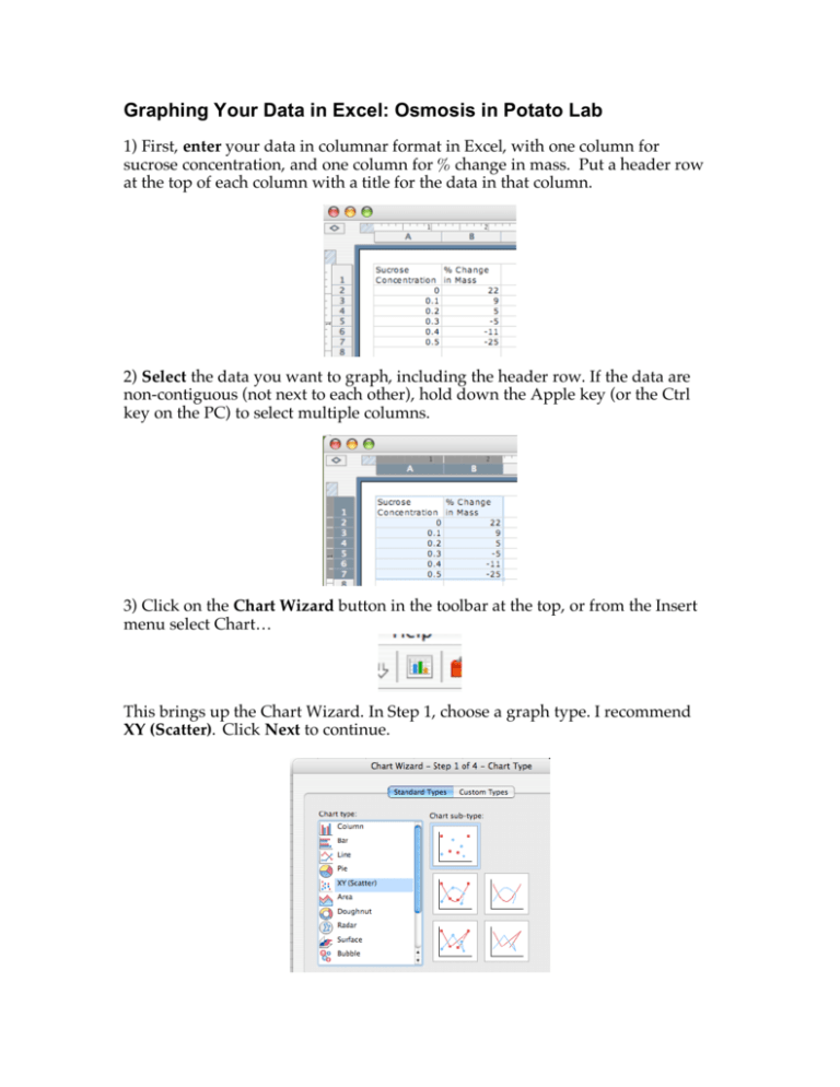
Graphing Your Data in Excel: Osmosis in Potato Lab 1) First, enter your data in columnar format in Excel, with one column for sucrose concentration, and one column for % change in mass. Put a header row at the top of each column with a title for the data in that column. 2) Select the data you want to graph, including the header row. If the data are non-contiguous (not next to each other), hold down the Apple key (or the Ctrl key on the PC) to select multiple columns. 3) Click on the Chart Wizard button in the toolbar at the top, or from the Insert menu select Chart… This brings up the Chart Wizard. In Step 1, choose a graph type. I recommend XY (Scatter). Click Next to continue. 4) In Step 2 of the Chart Wizard, just click Next to continue. 5) In Step 3 of the Chart Wizard, enter the title for your chart (“Percent Change in Potato Mass vs. Sucrose Concentration”). You should also label your axes (“% Change in Mass” on the Y axis and “Sucrose Concentration (M)” on the X axis). Then click Next. 6) In Step 4 of the Chart Wizard, it is asking you whether you want the chart to appear next to your data in the spreadsheet, or in a new worksheet. Choose As new sheet: and give it a name (“Potato Graph” or something). Then click Finish. You’ll now have a lovely graph. If you ever want to go back to your original data, just click the “Sheet 1” tab at the bottom of the screen. 7) Now you want Excel to draw a trendline, or line of best fit. This is a line that corresponds as best as mathematically possible with the trend in your data. While in Chart 1, click on the Chart menu, then click Add trendline. 8) Under Trend/Regression type, choose Linear. This will draw a straight line through your data. The final graph should look something like this: 9) Print your graph and include it with your lab write-up, using it to answer the discussion questions.
