Analyzing Historical Phenology Datasets for Climate Trends Pinot
advertisement
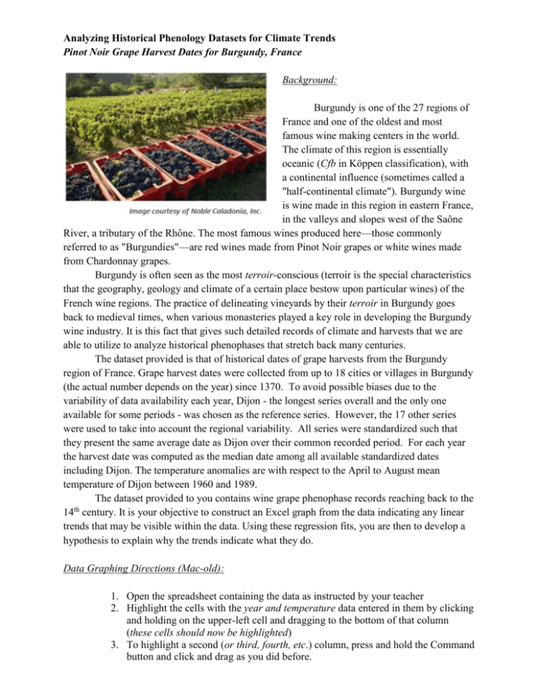
Analyzing Historical Phenology Datasets for Climate Trends Pinot Noir Grape Harvest Dates for Burgundy, France Background: Burgundy is one of the 27 regions of France and one of the oldest and most famous wine making centers in the world. The climate of this region is essentially oceanic (Cfb in Köppen classification), with a continental influence (sometimes called a "half-continental climate"). Burgundy wine is wine made in this region in eastern France, in the valleys and slopes west of the Saône River, a tributary of the Rhône. The most famous wines produced here—those commonly referred to as "Burgundies"—are red wines made from Pinot Noir grapes or white wines made from Chardonnay grapes. Burgundy is often seen as the most terroir-conscious (terroir is the special characteristics that the geography, geology and climate of a certain place bestow upon particular wines) of the French wine regions. The practice of delineating vineyards by their terroir in Burgundy goes back to medieval times, when various monasteries played a key role in developing the Burgundy wine industry. It is this fact that gives such detailed records of climate and harvests that we are able to utilize to analyze historical phenophases that stretch back many centuries. The dataset provided is that of historical dates of grape harvests from the Burgundy region of France. Grape harvest dates were collected from up to 18 cities or villages in Burgundy (the actual number depends on the year) since 1370. To avoid possible biases due to the variability of data availability each year, Dijon - the longest series overall and the only one available for some periods - was chosen as the reference series. However, the 17 other series were used to take into account the regional variability. All series were standardized such that they present the same average date as Dijon over their common recorded period. For each year the harvest date was computed as the median date among all available standardized dates including Dijon. The temperature anomalies are with respect to the April to August mean temperature of Dijon between 1960 and 1989. The dataset provided to you contains wine grape phenophase records reaching back to the th 14 century. It is your objective to construct an Excel graph from the data indicating any linear trends that may be visible within the data. Using these regression fits, you are then to develop a hypothesis to explain why the trends indicate what they do. Data Graphing Directions (Mac-old): 1. Open the spreadsheet containing the data as instructed by your teacher 2. Highlight the cells with the year and temperature data entered in them by clicking and holding on the upper-left cell and dragging to the bottom of that column (these cells should now be highlighted) 3. To highlight a second (or third, fourth, etc.) column, press and hold the Command button and click and drag as you did before. 4. Highlight the cells with data entered in them by clicking and holding on the upper-left cell and dragging to the bottom right cell with data in it (these cells should now be highlighted) 5. Click on the “Chart Wizard” icon on the toolbar. This icon appears as a small colored bar graph. i. If this icon does not appear, click on “View,” “toolbars,” and “standard” (the icon should now appear) 6. Click on “X-Y Scatter” 7. Click “Next” 8. Click “Next” again 9. Give your Title and Axis appropriate names and then click “next” 10. Click on the button that says “As new sheet” and then click “Finish” 11. While holding the “Control” button, click on one of the data points on your graph. 12. Click on “Add Trendline” 13. As you are trying to draw a line of best fit, click on the “Linear” box and click “OK” 14. Double click on the line that you added and click on “options” 15. Click the “display equation on chart” button and then click “OK” 16. Make sure that you can read the entire equation on your graph. If you are having trouble seeing part of it, you can click and drag it to another location on your graph. 17. Save the chart to a location where you can access it outside of class 18. Repeat these steps for the year and temperature anomalies data Data Analysis: 1. What does the general trend of each chart indicate? a. Harvest Date vs. Year: b. Temperature Anomaly vs. Year: 2. How do these two trends, when considered together, fit into the larger picture of what you understand about climate change? 3. Develop a hypothesis that explains, considering the general warming of the planet is occurring, how these trends seen in the Burgundy grape harvest over the past 600+ years are possible.
