Clinical Vignette Poster Template
advertisement
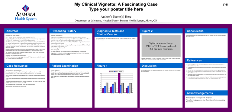
My Clinical Vignette: A Fascinating Case Type your poster title here P# Author’s Name(s) Here Department or Lab name, Hospital Name, Summa Health System, Akron, OH Abstract Presenting History How to use this poster template… Importing / inserting files… Use a “zoomed view” to work on your poster, generally I use 66%. Images such as photographs, graphs, illustrations, etc, can be added to the poster. Simply highlight this text and replace it by typing in your own text, or copy and paste your text from a MS Word document or a PowerPoint slide presentation. To insert scanned images into your poster, go through the menus as follows: Insert / Picture / From File… then find the file on your computer, select it, and click OK. Hint: When pasting text use: Edit / Paste Special… / Unformatted Text, then click OK. This will maintain the font attributes in the poster template and save you text reformatting time. The best type of image files to insert are JPEG or TIFF, JPEG is the preferred format for a smaller overall poster file size. When selecting text frames and graphics in PowerPoint hold the Shift key, then click to select your item. Once selected, you can use the four-way arrow keys on your keyboard to move your objects. Be aware of the image size you are importing. The average color photo (5x7 in. at 200ppi) would be about 4MB (1MB for B/W). Complex graphics with multiple elements can be Grouped to make it easier to move within the poster space. To do this select the objects and then go to the menu: Draw / Group. Notes about graphs… The body text / font size should be between 16 and 24 points. Times, Times New Roman, Garamond or equivalent serifed font. Keep body text left-aligned, do not justify text. Diagnostic Tests and Clinical Course Figure 2 Just highlight this text and replace with your own text. Replace this with your text. Replace this with your text. Just highlight this text and replace with your own text. Replace this with your text. Replace this with your text. Digital or scanned image: JPEG or TIFF format preferred, 200 ppi max. resolution Do not use images from the web. For simple graphs use MS Excel or Word, or do the graph directly in PowerPoint. Graphs done in a scientific graphing programs (eg. Sigma Plot, Prism, SPSS, Statistica) should be saved as JPEG or TIFF if possible. NOTE: PowerPoint doesn’t support page sizes over 56”. If your poster needs to be larger it will be scaled to size for the final print. Case Relevance Captions should be set in Times or equivalent, 14 to 18 points, to the width of the column when a figure takes more than 2/3 of the column width. Patient Examination Tips for making a successful poster… Printing the poster… Rewrite your paper into poster format ie. Simplify everything, avoid data overkill. Once you have completed your poster, get it to Corporate Communications for printing. Here we can do last minute adjusting/fine-tuning of your layout. We will produce a draft print for you to check and proof read. The final poster will then be printed. Headings of more than 6 words should be in upper and lower case, not all capitals. Never do whole sentences in capitals or underline to stress your point, use bold characters instead. When laying out your poster leave breathing space around you text. Don’t overcrowd your poster. Conclusions Note: Do not leave your poster until the last minute. This can cause much unneeded stress. ;-) Figure 1 Discussion Week 1 Week 2 Just highlight this text and replace with your own text. Replace this with your text. Replace this with your text. Week 3 90 References 1. Lorem ipsum dolor sit amet, consectetaur adipisicing elit, sed do eiusmod tempor incididunt ut labore et dolore magna aliqua. 2. Ut enim ad minim veniam, quis nostrud exercitation ullamco laboris nisi ut aliquip ex ea commodo consequat. 3. Duis aute irure dolor in reprehenderit in voluptate velit esse cillum dolore eu fugiat nulla pariatur. 4. Excepteur sint occaecat cupidatat non proident, sunt in culpa qui officia deserunt mollit anim id est laborum Et harumd und. 5. Lookum like Greek to me, dereud facilis est er expedit distinct. Nam liber te conscient to factor tum poen legum odioque civiuda. 80 6. Et tam neque pecun modut est neque nonor et imper ned libidig met, consectetur adipiscing elit, sed ut labore et dolore magna aliquam makes one wonder who would ever read this stuff? 70 60 Your poster design does not need to be perfectly symmetrical. The height of one text frame might be taller/shorter than the next, this is OK. 50 Try using photographs or color graphs. Avoid long numerical tables. 40 Spell check and get someone else to proof-read. 30 20 10 0 Drug A Drug B Drug C Drug D Acknowledgements Thank everyone who helped with this project. Also acknowledge grants or other financial contributions regarding this research.
