EX:Image Maps
advertisement
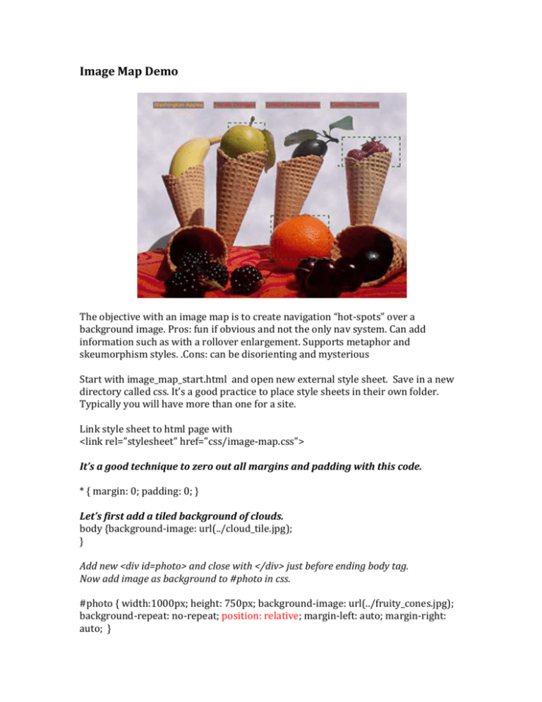
Image Map Demo
The objective with an image map is to create navigation “hot-spots” over a
background image. Pros: fun if obvious and not the only nav system. Can add
information such as with a rollover enlargement. Supports metaphor and
skeumorphism styles. .Cons: can be disorienting and mysterious
Start with image_map_start.html and open new external style sheet. Save in a new
directory called css. It’s a good practice to place style sheets in their own folder.
Typically you will have more than one for a site.
Link style sheet to html page with
<link rel=”stylesheet” href=”css/image-map.css”>
It’s a good technique to zero out all margins and padding with this code.
* { margin: 0; padding: 0; }
Let’s first add a tiled background of clouds.
body {background-image: url(../cloud_tile.jpg);
}
Add new <div id=photo> and close with </div> just before ending body tag.
Now add image as background to #photo in css.
#photo { width:1000px; height: 750px; background-image: url(../fruity_cones.jpg);
background-repeat: no-repeat; position: relative; margin-left: auto; margin-right:
auto; }
Relative positioning of the #photo will allow us to contain and center and also
keep the absolute positioned gifs under control.
Now in html add transparent gif and title to apple, orange and add new cherry
link
<li class="apple"><a href="http://www.bestapples.com" title="Washington
Apples"><img src=transparent.gif ></a></li>
<li class="orange"><a href="http://www.floridaorange.com" title="Florida
Oranges"><img src=transparent.gif ></a></li>
<li class="berries"><a href="http://www.driscolls.com/index.php" title="Driscoll
Berries"><img src=transparent.gif ></a></li>
Temporarily add a border to your transparent image so you can see
li img {border-style: solid; border-color: red; }
li {list-style-type: none; } to remove dots
Add aclass for each mapped fruit and size/position transparent gifs to cover the
areas of image you want to be “hot”. Note, position values here are
notional…your’s will be different and more accurate.
.apple { position: absolute; top: 25px; left: 25px; }
.orange {position: absolute; top: 50px; left: 50px; }
.berries {position: absolute; top: 75px; left: 75px; }
Resize transparent gifs to better fit hot spot area. Do this in html
<li class="apple"><a href="http://www.bestapples.com" title="Washington
Apples"><img src=transparent.gif width=125px height=100px></a></li>
Designer Challenges: I want you to add a horizontal row of navigation terms to
compliment and complete the page. Style and center the links and try putting a
background color behind them.
Once you have the horizontal navigation, consider how you might style the hot spots
to make them more informative and identifiable. What added information might the
rollover provide? Could you make the hot spot more visible?
This completed exercise with an external style sheet should be uploaded onto our
server and linked to your Exercises Image Map/Navigation for the next class.
