in MS Word
advertisement
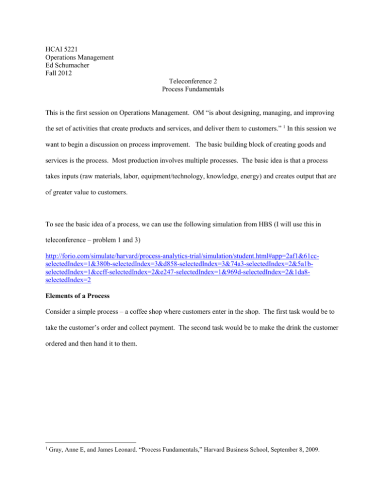
HCAI 5221 Operations Management Ed Schumacher Fall 2012 Teleconference 2 Process Fundamentals This is the first session on Operations Management. OM “is about designing, managing, and improving the set of activities that create products and services, and deliver them to customers.” 1 In this session we want to begin a discussion on process improvement. The basic building block of creating goods and services is the process. Most production involves multiple processes. The basic idea is that a process takes inputs (raw materials, labor, equipment/technology, knowledge, energy) and creates output that are of greater value to customers. To see the basic idea of a process, we can use the following simulation from HBS (I will use this in teleconference – problem 1 and 3) http://forio.com/simulate/harvard/process-analytics-trial/simulation/student.html#app=2af1&61ccselectedIndex=1&380b-selectedIndex=3&d858-selectedIndex=3&74a3-selectedIndex=2&5a1bselectedIndex=1&ccff-selectedIndex=2&e247-selectedIndex=1&969d-selectedIndex=2&1da8selectedIndex=2 Elements of a Process Consider a simple process – a coffee shop where customers enter in the shop. The first task would be to take the customer’s order and collect payment. The second task would be to make the drink the customer ordered and then hand it to them. 1 Gray, Anne E, and James Leonard. “Process Fundamentals,” Harvard Business School, September 8, 2009. Inputs: labor, coffee, others Take Order Make Order (30 Seconds ) (90 Seconds) Prepared coffee to customer Inspection Control/ Input Orders Essentially the process shows three things: Tasks, flows, and storage We show storage as triangles – this is where things are being held. In this example we have inputs waiting to be used, and final goods waiting to be “shipped”. We also will store information. In this case the circle represents the storage of information. One could also imagine storage between task1 and 2. So if the patient first sees the nurse who takes his/her vital signs and then they go to a second waiting area to see the doctor, we could show this second waiting area as a storage stage between task 1 and 2. We show tasks as rectangles. This is where things are being done. The arrows show flows. There are two types of flows: physical flows shown by solid arrows, and information flows shown by dotted arrows. Measuring the Performance of a Process Task Time – the time it takes to complete a specific task within a process. In the above example they are 30 and 90 seconds, respectively. Cycle Time (CT) – the average time between completion of successive units. “How often does a finished unit complete the process?” In the above example, the cycle time will be 90 seconds. Capacity – is the maximum rate of output from the process and is measured in units of output per unit of time. Typically this is easy to define but hard to measure Theoretical capacity vs. effective capacity Cycle time and capacity are related – if the cycle time of a task is 30 minutes per unit, then the capacity of that task is 2 units per hour. In our example since cycle time is 90 seconds per unit, then capacity will be 40 per hour (60*60=3600 seconds in an hour, so 3600/90 = 40 cups per hour). Capacity Utilization – how much output was actually achieved relative to capacity, or how much could be produced in an ideal situation. If the capacity of a process is 500 units per day and on a given day 480 are produced, then capacity utilization is 480/500 = 96%. Utilization – the ratio of the input the process actually used in creating the output to the amount of that input available for use. This can be in terms of labor – the ratio of hours worked on a process to total hours – or in machine utilization – the percentage of time a machine is used over a time period. Flexibility – This measures how long it takes to change the process so that it could produce a different output, or use a different set of inputs. Bottleneck – is the factor which limits production. Often the task with the longest cycle time is the bottleneck. Alternative the availability of labor (or waiting for other inputs) can determine a bottleneck. The bottleneck affects both the process cycle time and capacity and so it is important to identify where bottlenecks exists in a process. In my above example task 2, making the cup of coffee is the bottle neck. We can improve the first step all we want and it will not change our cycle time or our capacity. Theory of Constraints – an approach to management that focuses on whatever impedes progress toward the goal of maximizing the flow of total value added. Idle Time – the time when useful work is not being performed. Throughput time – the length of time spent in the process. How long does it take to produce a unit of output? Note this is different from cycle time. In my example throughput time is 30+90 = 120 seconds. Cycle time refers to how often a unit “drops off” the end of the process whereas throughput time refers to how long that unit takes between entering and leaving the process, including any in process storage or transport time. Cycle time determines a process’ capacity, which limits the volume of a product that the process is able to produce. Throughput time, however, is an important determinant of the speed of a process. Takt time – this is German for pace or rhythm. It refers to the rate at which we need to produce our product in order to satisfy customer demand. Suppose that 60 customers come to our coffee shop per hour, then we need to be able to serve one patient per minute. Thus our cycle time needs to be less than or equal to our Takt time. So in my example we have troubles, since we need to produce 60 cups per hour, but our process is designed to only produce 40. We would need to focus on the second task. Note it has nothing to do with the workers – unless the reason it is taking 90 seconds is because the worker is lazy or incompetent. Firing the barista and hiring a “more qualified” one would not change anything. Likewise, performance incentives (either carrots or sticks) would not have much affect either. The only way to fix the problem would be to change the system. This is a key observation of modern process improvement theory that we will return to. Suppose we change task 1 so that this person takes the order and payment, but then pulls the proper type of cup and starts the machine. So task 1 now takes 60 seconds and step 2 decreases to 60 seconds. Note now we will still have a 120 second throughput time, but now our cycle time will be 60 seconds, and will now have a capacity of 60 per hour and can meet our customer’s demand. Of course, I’ve left no room for nonproductive time, or defects. This gets back to theoretical vs. effective capacity. Part of what we have to manage is what an acceptable utilization rate is. We need to allow time for breaks, and other downtime, but also allow for time for redesign and other training and improvement. Much of this material is a lot easier when applied to machines and mechanical processes than when applied to people and services. Next teleconference we will talk about two specific types of process improvement methodologies: Six Sigma and Lean. Here I just want to introduce you to the idea of a process and highlight the importance of having well defined processes in place that are measurable. Our ultimate goal is process improvement, but here I have shown the first two of several steps towards that goal: 1) Define the process – determine the tasks and the flows of information and goods. Note this could (and should) be done at both a macro and micro level – patient throughput through the entire hospital vs. a particular lab test run on an ED patient. 2) Determine the capacity or range of capacities for the process. This requires an analysis of each task and a comparison of how these tasks are balanced. Statistical Process Control I want to focus now on an issue within process improvement called statistical process control. Whereas the above discussion dealt with more how to define a process and to measure its rate of output, here we focus more on the quality of the products produced by a process. There is really a quality and quantity issue we must tackle. The previous focus on the defining and measuring our process gave us good information on capacity and cycle time, but as we move into how to improve our process we need to be able to identify when our process is improving in terms of both quality and quantity. Not only do we need to produce results fast enough to satisfy customers, they also have to be at a high enough level of quality. Thus our challenge is design and operate a processes that provide a service package to the total satisfaction of customers. The failure to satisfy customers (be they internal or external) is a process failure. Thus, evaluating process performance is an important element of process analysis. I. Total Quality Management TQM is a philosophy that stresses three principles for achieving high levels of process performance and quality: Customer Satisfaction, Employee Involvement, and continuous improvement in performance. 1. Customer Satisfaction Customers (internal or external) are satisfied when their expectations regarding a service or product have been met or exceeded. Conformance to specifications Value Fitness for use – how well the service or product performs its intended purpose. Support Psychological Impressions – atmosphere, image, or aesthetics 2. Employee Involvement Cultural Change. Under TQM everyone is expected to contribute to the overall improvement of quality. Thus one of the challenges is to define customer for each employee. The external customer(s) are often far removed from particular employees. Thus the notion of internal customers is important here. Teams. 3. Continuous Improvement Continuous improvement involves identifying benchmarks of excellent practice and instilling a sense of employee ownership in the process. Generally firms will use a “plan-do-checkact” cycle in their problem-solving process II. Statistical Process Control One practical type of continuous improvement is the use of statistical process control. This is the application of statistical techniques to determine whether a process is delivering what the customer wants. SPC primarily involves using control charts to detect production of defective services or products or to indicate that the process has changed and that services or products will deviate from their design specifications unless something is done to correct the situation. Examples: A decrease in the average number of complaints per day at a hospital, A sudden increase in the proportion of bad lab tests, An increase in the time to process a lab test, chart, billing claim, etc. An increase in the number of medication errors An increase in the absenteeism rate in a particular nursing unit. An increase in the number of claimants receiving late payment from an insurance company. Suppose that the manager of the accounts payable department of an insurance company notices that the proportion of claimants receiving late payment has risen from an average of .01 to .03. Is this a cause for alarm or just a random occurrence? Note that if it is random, any resources devoted to “fixing” the problem would be wasted, but if there is truly a problem, then it may be worthwhile to attempt to fix. Another way to look at it is to say that if our objective is to improve a process, we must first establish that the current process is stable. If we are starting with an unstable process, any efforts to improve the process will be impossible to measure. Variation of Outputs Even if the processes are working as intended there will be variation in outcomes, but it is important to minimize the variation because variation is what the customer sees and feels. We can focus on the types of variation: 1. Common Causes -- these are purely random, unidentifiable sources of variation that are unavoidable with the current process. Statistically, this is referred to as “noise” 2. Assignable Cause – any variation-causing factors that can be identified and eliminated. An employee that needs training, or a machine that needs repair. To detect abnormal variations in process output, employees must be able to measure performance variables. One way is to measure variables – that is, service or product characteristics, such as weight, length, volume, or time that can be measured. Another way is to measure attributes – characteristics that can be quickly counted for acceptable performance. Ex: the number of insurance forms containing errors that cause underpayments or overpayments, the proportion of radios inoperative at the final test, the proportion of airline flights arriving within 15 minutes of scheduled times, etc. The advantage of attribute counts is that less effort and fewer resources are needed than for measuring variables, but the disadvantage is that, even though attribute counts can reveal that process performance has changed, they may not be of much use in indicating by how much. Control Charts In order to decide if the variation is out of whack, statistical process control methods use control charts. These are time-ordered diagrams that are used to determine whether observed variations are abnormal. Type of Data Measurement Data Count Data Continuous variables: time, money, length, height, temperature Discrete variables: Number of errors, yes/no, pass/fail/ etc. Each subgroup has more than one observation. Subgroup Size >1 X-Bar and SChart Each subgroup is composed of a single observation. Subgroup size =1 I-Chart Can only count nonconformities (defects), eg. Errors, complications, falls, needle sticks per subgroup, Numerator can be greater than denominator Nonconforming units (defectives) are counted as percentages. An entire unit either meets or fails to meet criteria. Numerator can’t be greater than the denominator, e.g. mortalities, c- Equal area of opportunity Unequal area of opportunity Unequal or equal subgroup size C-Chart U-Chart P-Chart The chart first splits the decision into two types – those using continuous variables and those using count or discrete data. On the continuous side there are two further classifications. When you have information about the subsamples (say you are looking at the average LOS per week, and you have 100 patients per week to get that average), then we use an X-bar and S-chart (Xbar for average, and S for standard deviation). If, however, we only have information on the average (say we only have the average LOS per week but not the individual observations that generated those averages), then we use an I chart. Control Charts for Variables I chart. In the accompanying Excel spreadsheet (SPC Examples.xls) on the worksheet labeled Ichart, is an example of using an Ichart. These data are the Weekly average of delays between an abnormal mammogram and biopsy. Presumably we’d want this number to be as low as possible. What is shown are the average days delay per week over a 36 week period. After week 20 an “intervention” was instituted that was intended to reduce the average delay. We want to know if the intervention helped to reduce the delay. Note that all the information we have is the average delay per week, we do not have the individual data that went into making these averages. Thus we have to construct an I chart. Basically what all of these charts do is construct a confidence interval that moves through time, then by tracking how each new period’s data falls within that range we can make judgments about how we are doing. Week Average Delay 1 2 3 4 5 6 7 8 9 10 11 12 13 14 15 16 17 18 19 20 34 30 35 32 28 26 29 28 35 26 34 31 28 40 26 32 31 30 33 35 To construct the chart, we first calculate the average of the average weekly delay, this is 31.15. The standard deviation is 3.70. Next we construct the upper and lower control limits. Generally these are constructed to be 3 standard deviations above and below the mean. So UCL = Xbar + 3S, and LCL = Xbar -3S. You can also do this using “2 –sigma” limits as well. Basically it becomes a tradeoff between type I and type II errors. Note that these give slightly different numbers from what the book uses. The book uses a formula based on the range of the data. I prefer using the standard deviation. Doing this and putting it all in a graph gives us the following: I Chart Average Weekly Delays Average Delay Per Week 45 40 35 30 25 20 15 10 5 0 0 5 10 15 20 25 30 35 40 Week Average Delay Xbar UCL LCL So the Xbar, UCL, and LCL were constructed on the first 20 weeks of data (before the intervention). Plotted are the first 20 weeks, plus the 15 weeks that followed. So what can we say? Detecting Special Causes We want to be able to distinguish “information” from “noise” or Special (assignable) causes from common causes. That is when should we pay attention and when should we ignore? 1. A special cause is indicated when a single point falls outside a control limit. In weeks 26 and 30, note that we are below the LCL, that is we are more than 3 standard deviations below the mean. It is pretty unlikely for this to be a random event (less than a 1 percent chance), so we would say this is a special cause – something different has happened here. 2. A special cause is indicated when two out of three successive values are: a) on the same side of the centerline, and b) more than two standard deviations from the centerline. The 2 sigma LCL is 23.7, so in weeks 21, 22, 23 we have two of three observations below this. 3. A special cause is indicated when eight or more successive values fall on the same side of the centerline. So we get this in the above chart weeks 21 to 28 are all below the centerline. 4. A special cause is indicated by a trend of six or more values in a row steadily increasing or decreasing. This is not shown in the above graph. Using the above criteria we can know say something about the intervention. First note that in the first 20 weeks of data there are no special causes – things are pretty stable, but after week 20 we get a different picture, special causes are detected from Tests 1, 2, and 3. So we could conclude that the “world has changed” We could re-do the graph to show this: Average Delay I Chart showing Intervention 45 40 35 30 25 20 15 10 5 0 0 10 20 30 40 Week Average Delay Xbar UCL LCL These are the same data, but it now shows the new mean, UCL, and LCL after the intervention. So now when we get future data, we compare them to the new numbers, etc. This is the continuous improvement idea. Recall that this type of chart only had data on the mean per week and so we had to treat each sample as a data point and use the standard deviation (as opposed to the standard error) to construct the limits. This makes them larger than they would be if we had sample information. This is what the X-bar chart does: X-Bar and S-Chart When each subgroup has more than one observation then we can use this information to our advantage by accounting for the sample variations. In the worksheet titled “XBar and S-Chart” is an example of this. Here we have lab turnaround time from lab to ED using a sample of three tests each day for 23 consecutive weekdays (you don’t have to have the same number of observations per period). day 1 2 3 4 5 6 7 8 9 10 11 12 13 14 15 16 17 18 19 20 21 22 23 test1 86 90 101 76 102 81 75 92 93 109 70 80 85 69 106 89 85 95 72 95 75 60 77 test2 73 82 74 71 76 82 50 65 71 92 84 79 63 71 93 95 101 89 60 84 97 110 55 test3 75 95 89 105 115 55 95 93 82 76 67 58 110 112 82 73 68 88 97 61 115 56 99 xbar 78.0 89.0 88.0 84.0 97.7 72.7 73.3 83.3 82.0 92.3 73.7 72.3 86.0 84.0 93.7 85.7 84.7 90.7 76.3 80.0 95.7 75.3 77.0 7.0 6.6 13.5 18.4 19.9 15.3 22.5 15.9 11.0 16.5 9.1 12.4 23.5 24.3 12.0 11.4 16.5 3.8 18.9 17.3 20.0 30.1 22.0 st dev So xbar is the average for each day, stdev is the standard deviation for each day. If we take the average of the average (Xbarbar) we get 83.28, and if we take the standard deviation of all the tests (Sbar) we get 16.01. Now we can construct the UCL and LCL as: UCL = Xbarbar + 3*Sbar/sqrt(n) LCL = Xbarbar – 3*Sbar/sqrt(n) Where n is the size of the sample from each day – so if the sample sizes are the same for each period the UCL and LCL will be the same across the chart, but if the sample sizes vary, then the UCL and LCL will also vary. Doing this and graphing gives us the Xbar chart: X-Bar Chart CBC Turnaround Time 110.0 Minutes 100.0 90.0 80.0 70.0 60.0 50.0 0 5 10 15 20 25 Day xbar Xbarbar UCL LCL Note that things here look pretty stable: there are no observations outside the 3-sigma limits. The two sigma limits are 101.7 and 64.8 and no observations are outside of them either. There are not eight successive values above or below the centerline, and there is not a trend of six or more. Note that we also can (and should) look at what is happening to the variance over time. This is the sbar chart. Basically we do the same thing with the standard deviation as we did with the mean. We know the standard deviation for each period, and we can construct the average of the standard deviations and look at how day to day observations bounce around the standard deviation. First we construct the average of the standard deviations and then the standard deviation of the standard deviations. Then use 3 times this standard deviation to construct the UCL and LCL. Note that if the LCL is calculated to be negative, we set it equal to zero since negative values do not make sense. Sigma Chart CBC turnaround time 40.0 minutes 30.0 20.0 10.0 0.0 0 5 10 15 20 25 Day st dev Sbar UCL LCL Again things look pretty stable. In practice one would first want to look at the s-chart to make sure the process was stable, and then go to the xbar chart, but both can help identify abnormalities in the process. A good way to think about it is that the xbar chart looks at variations overtime (or across subgroups) while the s chart looks at variation within groups. Control Charts for Count or Attribute Data P-chart The p-chart is probably the easiest to deal with. In this case we have a percentage or proportion of something that we are tracking over time. On the worksheet titled “p-chart” data for Readmission Rates after Congestive Heart Failure. In January 2011 an intervention occurred (a case management protocol), and so we want to know if things have improved. So we know how many patients were admitted for heart failure and how many of them were later readmitted, and thus we know the proportion of readmit for each month. To construct the control chart, we first calculate the total proportion of readmission for the period prior to the intervention (2009 and 2010) this is Pbar= .125, then to construct the UCL and LCL we calculate Sigma: = Sqrt [(p)*(1-p)/(n)]. This should look somewhat familiar (think back to the standard error when doing hypothesis tests on a proportion). Note that the n is the sample size for each period which varies, thus the UCL and LCL will vary across the chart. So the UCL is Pbar + 3 times the sigma for each month and the LCL is the maximum of Pbar – 3sigma and zero. P Chart Readmission Rate 0.35 0.30 Percent 0.25 0.20 0.15 0.10 0.05 0.00 0 1 2 3 4 5 6 7 8 9 10 11 12 13 14 15 16 17 18 19 20 21 22 23 24 25 26 27 28 29 30 31 32 33 34 35 36 Month Percent Readmission Pbar UCL LCL So note that prior to the intervention there is only common cause variation (all the variation is noise), but after month 24 we get 9 consecutive months below the centerline (test 3) and so conclude that the plan seems to have been successful – at least for a while. Note that the last 3 months of 2011 show a percentage back above the centerline. So further tracking would be needed before concluding things were better. Subgroup sizes for P-charts. P charts are likely to be especially sensitive to small sample sizes. One simple rule is that the subgroup size should be big enough such that there is at least one event or occurrence in every subgroup – so there are no zero percent occurrences. Alternatively, some argue it should be large enough to get a positive LCL. The American Society for Testing and Materials (ASTM) has set guidelines for p-charts: The lower limit on subgroup size for p-charts may not yield reliable information when: 1. Subgroups have less than 25 in the denominator, or 2. the subgroup size n multiplied by Pbar is less than one. U-Chart. When we have count data and different sample sizes for each period – where there is an unequal area of opportunity. For example on the worksheet labeled U-chart are data that show the number of code blues as well as the number of patient days per month, from April 2008 to June 2011. Note that you have a count -- the number of code blues and you also have a varying number of patient days. In months with a higher census you’d expect more codes even if things were still “normal” so you want to account for this to the extent you can. Also an x-bar chart probably would not be appropriate since the count is not really normally distributed. Likewise one could calculate the proportion of code blues and do a pchart, but since codes are such rare events most of the proportions would be close to zero and so it would be difficult to pick up any action. A U-chart is generally more powerful than the pchart since it will take all this information into account. First we calculate Ubar – the average proportion of codes per patient day: Ubar = number of defects for all subgroups/total number of observations in all subgroups. In this example we get Ubar = .0042 or about 4 codes per 1,000 patient days. Then the sigma = sqrt(Ubar/n) where n is the number of observations in each period. So sigma will vary across subgroups. Then the control limits = Ubar 3*Sigma. Then we get: U Chart Ratio of Code Blues per Patient Day 0.012 0.01 Ratio 0.008 0.006 0.004 0.002 0 0 1 2 3 4 5 6 7 8 9 101112131415161718192021222324252627282930313233343536373839 Month codes per day Ubar UCL LCL Looking at the graph does not reveal any special causes – but it is close to test #4 where we have a trend of 5 in a row of increasing, but officially you need 6 in a row. C-Chart The final case to discuss is the c-chart. This is an alternative to the U-chart, but when there is equal opportunity for defects (or when the opportunity is unknown). So suppose on the code blue data we only knew the total number of codes per month, but not the patient days. Now we have to assume that codes are equally likely across months and we look at how the actual counts vary across months. This is done on the C-chart worksheet. Now we first calculate Cbar = average number of defects over the period, cbar = 5.72. Then the standard deviation = sqrt(cbar) This is assumes the count data follows the hypergeometric distribution. So now we get the following C-chart. Note that the UCL no longer varies across the sample but is constant. C-Chart Count of Code Blues 14 12 Count 10 8 6 4 2 0 0 1 2 3 4 5 6 7 8 9 101112131415161718192021222324252627282930313233343536373839 Month codes Cbar UCL LCL We generally get the same picture here, but the U-chart generally is more powerful than the C-chart since it has more information in it. Similarly the Xbar chart is more powerful than the I chart. But sometimes you just don’t have the information needed to do the U chart or Xbar chart. Subgroup sizes for C-charts and U-charts. The ASTM suggests that, to provide reliable information, the subgroup size for U-chart should at least be equal to one divided by the average of nonconformities (Ubar), but will be “most useful” when the subgroup is at least equal to four divided by Ubar. For example, if the average number of medication errors at a hospital is four per 1000 (.004), The U-chart would be most useful when the subgroup size (the number of medication orders) was at least 4/.004 or 1000. For C-charts the subgroup size should be large enough that the average count of nonconforming items (cbar) is at least greater than one, but preferably greater than 4.
