Statistical Process Control
advertisement
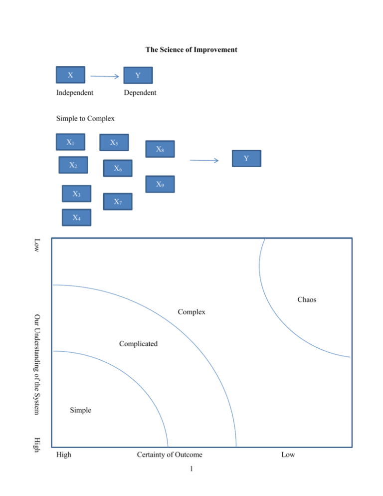
The Science of Improvement X Y Independent Dependent Simple to Complex X1 X2 X5 X8 Y X6 X9 X3 X7 X4 Low Chaos Our Understanding of the System Complex Complicated Simple High High Certainty of Outcome 1 Low Simple: Baking a cake – simple problems lend themselves to a recipe approach. The process and results are generalizable, and special skills are not necessarily needed. Complicated: Sending a rocket to the moon – Complicated problems are best dealt with using formulaic and expert-knowledge approaches. The overall problem can be broken down into component parts and assigned to teams of experts. When surprising events occur, we can study these, build improvements into the system, and thus raise the probability for future success. Think of the organization as a machine – plan and control. Complex: Raising a child – Success in raising one child is no guarantee of success in raising another. Past experience, along with expert advice can serve as a starting point – but simply applying the formula that worked before may not lead to success (and may even guarantee failure). Think of the organization as a complex adaptive system – learn and adapt as you go Much of health care is complex (or at least we have made it so) How do we think about complexity? W. Edwards Deming gave a framework for dealing with complexity. For any problem we are trying to improve there are 4 things we need to understand: 1) The system 2) Variations 3) Theories 4) Human behaviors System Variations Y HB Theories So for any complex problem we need to break it into its constituent parts so as not to oversimplify the complexity of what we are trying to do 2 Appreciation for a System Systems thinking embraces the causal influences and feedback loops that enable (or impede) enactment of the organization’s aim, its capacity for improvement and propensity to change, and the qualities it must exhibit in order to achieve its aim. These are by nature complex and adaptive – resist efforts to improve them through simplistic “top down” directives. Theories Theory of knowledge refers to the development of practical knowledge of “what works”. It is grounded in predictions about the results to be achieved through system changes. Knowledge is gained through a process of stating a theory, making a prediction based on the theory, comparing observations with predictions, and revising or abandoning the theory accordingly (sounds like hypothesis testing!) Thus we are deeply concerned with the nature of learning and with ways to foster, maintain and accelerate learning. Human Behavior This deals with the behavior of humans as social actors, their interactions with one another, and their interactions with the systems of which they are a part. Intrinsic personal motivation is fundamental to improvement, and the factors that mobilize and sustain the will to improve are vital for successful initiatives. Biases in people’s perception and interpretation of others’ behavior have implications for leaders working to develop a blame-free culture of improvement. Variation Understanding variation requires the recognition that variability -- both across section and across time – is an inherent characteristic of any system. Measures and data are useful to guide future action, provided we can discern patterns in such variation and respond appropriately. We’ll focus some time here. “The Various segments of the system of profound knowledge cannot be separated. They interact with each other” W. Edwards Deming 3 Apply to say hand hygiene System NICU Surgery PT Administration (each system has its own set up subsystems) statistical data by system Theory Human Behavior Germs different people will behave differently depending on their vew of the world Variations Views of the world Appreciation for a System A system is an interdependent group of items, people and processes with a common aim All work is done through processes Every system is perfectly designed to achieve exactly the results it gets People are a key part of systems in organizations: they want to do a good job and take pride in their work. 4 If we are going to attempt to improve complex systems we need to start with a roadmap. IHI defines its Model for Improvement as follows: 1) Aim – What are we trying to accomplish? How good? By when? 2) Measurement – How will we know that a change is an improvement? a. processes b. outcomes 3) Changes? – what change can we make that will result in improvement? Apply to Patient Satisfaction: Let’s say we currently have 45% of our patients at an outpatient clinic who say they are very satisfied with their visit Aim: Greater than 75% very satisfied by end of first quarter 2016 Measures: Outcome: the percent marking very satisfied on satisfaction survey -- % topbox Process: wait time in clinics, availability of appointment Changes: Early preregistration process, on-line registration, tickler system Then we would want to check to see if these things worked, so we would measure again, check with the aim, then do something next: This then puts us into the PDSA cycle: Plan Act Do Study This is also known as the Shewhart Cycle after Walter Shewhart – an engineer and statistician who developed this. He is considered the father of statistical quality control Plan – “what will happen if we try something different?” Do – “Let’s try it!” Study – “Did it work?” Act – “What’s next?” Note we are always using the PDSA cycle we just might not think about it 5 Eg, driving to school Small to big: Lets say we are working on our patient satisfaction Plan: -- new type of patient rounding Do: apply to 1particular unit Study: get feedback from employees, measure patient satisfaction on that unit Act: think about next step Different/frequent/More patients on same floor? Different type of patients? Etc then we might move to doing it hospital wide, and then system wide Etc. as we go through each tests gets larger So instead of thinking of it like a circle, it can be thought more of as a spiral Sequential building of knowledge under a wide range of conditions 6 Statistical Process Control – understanding variation I. One practical type of continuous improvement is the use of statistical process control. This is the application of statistical techniques to determine whether a process is delivering what the customer wants. SPC primarily involves using control charts to detect production of defective services or products or to indicate that the process has changed and that services or products will deviate from their design specifications unless something is done to correct the situation. Examples: A decrease in the average number of complaints per day at a hospital, A sudden increase in the proportion of bad lab tests, An increase in the time to process a lab test, chart, billing claim, etc. An increase in the number of medication errors An increase in the absenteeism rate in a particular nursing unit. An increase in the number of claimants receiving late payment from an insurance company. Suppose that the manager of the accounts payable department of an insurance company notices that the proportion of claimants receiving late payment has risen from an average of .01 to .03. Is this a cause for alarm or just a random occurrence? Note that if it is random, any resources devoted to “fixing” the problem would be wasted, but if there is truly a problem, then it may be worthwhile to attempt to fix. 7 Variation of Outputs Even if the processes are working as intended there will be variation in outcomes, but it is important to minimize the variation because variation is what the customer sees and feels. We can focus on the types of variation: 1. Common Causes -- these are purely random, unidentifiable sources of variation that are unavoidable with the current process. Statistically, this is referred to as “noise” 2. Assignable Cause – any variation-causing factors that can be identified and eliminated. An employee that needs training or a machine that needs repair. To detect abnormal variations in process output, employees must be able to measure performance variables. One way is to measure variables – that is, service or product characteristics, such as weight, length, volume, or time that can be measured. Another way is to measure attributes – characteristics that can be quickly counted for acceptable performance. Ex: the number of insurance forms containing errors that cause underpayments or overpayments, the proportion of airline flights arriving within 15 minutes of scheduled times, etc. The advantage of attribute counts is that less effort and fewer resources are needed than for measuring variables, but the disadvantage is that, even though attribute counts can reveal that process performance has changed, they may not be of much use in indicating by how much. 8 Run Charts Run charts are typically simpler than control charts. This is just a plot of the variable over time. Then insert a line for the median line. We then look at the data to decide what is happening. Define a run: one or more data points on the same side of the median. A run can be one or more data points on the same side. Run chart rules: 1) Shift in the data – too much of the data above or below the center line – a run of 6 or more data points 2) Trend in the data – 5 data points constantly going up or down (repeats don’t count) 3) Astronomical data point -- judgment Example: See Spreadsheet SPC Examples Control Charts Control charts are a little more technical in nature. They use statistical concepts that might be familiar to you to dig a little deeper into the data than a simple run chart. Run charts are easy and quick, control charts are more complicated. In order to decide if the variation is out of whack, statistical process control methods use control charts. These are time-ordered diagrams that are used to determine whether observed variations are abnormal. 9 Type of Data Measurement Data Continuous variables: time, money, length, height, temperature Each subgroup has more than one observation. Subgroup Size >1 X-Bar and S-Chart Count Data Discrete variables: Number of errors, yes/no, pass/fail/ etc. Each subgroup is composed of a single observation. Subgroup size =1 I-Chart Can only count nonconformities (defects), eg. Errors, complications, falls, needle sticks per subgroup, Numerator can be greater than denominator Nonconforming units (defectives) are counted as percentages. An entire unit either meets or fails to meet criteria. Numerator can’t be greater than the denominator, e.g. mortalities, csections, etc. Equal area of opportunity Unequal area of opportunity Unequal or equal subgroup size C-Chart U-Chart P-Chart 10 The chart first splits the decision into two types – those using continuous variables and those using count or discrete data. On the continuous side there are two further classifications. When you have information about the subsamples (say you are looking at the average LOS per week, and you have 100 patients per week to get that average), then we use an X-bar and S-chart (Xbar for average, and S for standard deviation). If, however, we only have information on the average (say we only have the average LOS per week but not the individual observations that generated those averages), then we use an I chart. Control Charts for Variables I chart. In the accompanying Excel spreadsheet (SPC Examples.xls) on the worksheet labeled I-chart, is an example of using an Ichart. These data are the Weekly average of delays between an abnormal mammogram and biopsy. Presumably we’d want this number to be as low as possible. What is shown are the average days delay per week over a 36 week period. After week 20 an “intervention” was instituted that was intended to reduce the average delay. We want to know if the intervention helped to reduce the delay. Note that all the information we have is the average delay per week, we do not have the individual data that went into making these averages. Thus we have to construct an I chart. Basically what all of these charts do is construct a confidence interval that moves through time, then by tracking how each new period’s data falls within that range we can make judgments about how we are doing. Week Average Delay 1 2 3 4 5 6 7 8 9 10 11 12 13 14 15 16 17 18 19 20 34 30 35 32 28 26 29 28 35 26 34 31 28 40 26 32 31 30 33 35 11 To construct the chart, we first calculate the average of the average weekly delay, this is 31.15. The standard deviation is 3.70. Next we construct the upper and lower control limits. Generally these are constructed to be 3 standard deviations above and below the mean. So UCL = Xbar + 3S, and LCL = Xbar -3S. You can also do this using “2 –sigma” limits as well. Basically it becomes a tradeoff between type I and type II errors. Doing this and putting it all in a graph gives us the following: I Chart Average Weekly Delays Average Delay Per Week 45 40 35 30 25 20 15 10 5 0 0 5 10 15 20 25 30 35 Week Average Delay Xbar UCL LCL So the Xbar, UCL, and LCL were constructed on the first 20 weeks of data (before the intervention). Plotted are the first 20 weeks, plus the 15 weeks that followed. So what can we say? 12 40 Detecting Special Causes We want to be able to distinguish “information” from “noise” or Special (assignable) causes from common causes. That is when should we pay attention and when should we ignore? 1. A special cause is indicated when a single point falls outside a control limit. In weeks 26 and 30, note that we are below the LCL, that is we are more than 3 standard deviations below the mean. It is pretty unlikely for this to be a random event (less than a 1 percent chance), so we would say this is a special cause – something different has happened here. 2. A special cause is indicated when two out of three successive values are: a) on the same side of the centerline, and b) more than two standard deviations from the centerline. The 2 sigma LCL is 23.7, so in weeks 21, 22, 23 we have two of three observations below this. 3. A special cause is indicated when eight or more successive values fall on the same side of the centerline. So we get this in the above chart weeks 21 to 28 are all below the centerline. 4. A special cause is indicated by a trend of six or more values in a row steadily increasing or decreasing. This is not shown in the above graph. Using the above criteria we can now say something about the intervention. First note that in the first 20 weeks of data there are no special causes – things are pretty stable, but after week 20 we get a different picture, special causes are 13 detected from Tests 1, 2, and 3. So we could conclude that the “world has changed” We could re-do the graph to show this: Average Delay I Chart showing Intervention 45 40 35 30 25 20 15 10 5 0 0 10 20 30 40 Week Average Delay Xbar UCL LCL These are the same data, but it now shows the new mean, UCL, and LCL after the intervention. So now when we get future data, we compare them to the new numbers, etc. This is the continuous improvement idea. Recall that this type of chart only had data on the mean per week and so we had to treat each sample as a data point and use the standard deviation (as opposed to the standard error) to construct the limits. This makes them larger than they would be if we had sample information. This is what the X-bar chart does: X-Bar and S-Chart When each subgroup has more than one observation then we can use this information to our advantage by accounting for the sample variations. 14 In the worksheet titled “X-Bar and S-Chart” is an example of this. Here we have lab turnaround time from lab to ED using a sample of three tests each day for 23 consecutive weekdays (you don’t have to have the same number of observations per period, but as we’ll see it is easier if you do). day 1 2 3 4 5 6 7 8 9 10 11 12 13 14 15 16 17 18 19 20 21 test1 86 90 101 76 102 81 75 92 93 109 70 80 85 69 106 test2 73 82 74 71 76 82 50 65 71 92 84 79 63 71 93 22 23 89 85 95 72 95 95 101 89 60 84 75 60 77 97 110 55 test3 75 95 89 105 115 55 95 93 82 76 67 58 110 112 82 73 68 88 97 61 115 56 99 xbar 78.0 89.0 88.0 84.0 97.7 72.7 73.3 83.3 82.0 92.3 73.7 72.3 86.0 84.0 93.7 85.7 84.7 90.7 76.3 80.0 95.7 75.3 77.0 7.0 6.6 13.5 18.4 19.9 15.3 22.5 15.9 11.0 16.5 9.1 12.4 23.5 24.3 12.0 11.4 16.5 3.8 18.9 17.3 20.0 30.1 22.0 st dev So xbar is the average for each day, stdev is the standard deviation for each day. If we take the average of the average (Xbarbar) we get 83.28, and if we take the standard deviation of all the tests (Sbar) we get 16.01. Now we can construct the UCL and LCL as: UCL = Xbarbar + 3*Sbar/sqrt(n) LCL = Xbarbar – 3*Sbar/sqrt(n) Where n is the size of the sample from each day – so if the sample sizes are the same for each period the UCL and LCL will be the same across the chart, but if the sample sizes vary, then the UCL and LCL will also vary. Doing this and graphing gives us the Xbar chart: 15 X-Bar Chart CBC Turnaround Time 110.0 Minutes 100.0 90.0 80.0 70.0 60.0 50.0 0 5 10 15 20 25 Day xbar Xbarbar UCL LCL Note that things here look pretty stable: there are no observations outside the 3sigma limits. The two sigma limits are 101.7 and 64.8 and no observations are outside of them either. There are not eight successive values above or below the centerline, and there is not a trend of six or more. Note that we also can (and should) look at what is happening to the variance over time. This is the sbar (or sigma) chart. Basically we do the same thing with the standard deviation as we did with the mean. We know the standard deviation for each period, and we can construct the average of the standard deviations and look at how day to day observations bounce around the standard deviation. First we construct the average of the standard deviations and then the standard deviation of the standard deviations. Then use 3 times this standard deviation to construct the 16 UCL and LCL. Note that if the LCL is calculated to be negative, we set it equal to zero since negative values do not make sense. Sigma Chart CBC turnaround time 40.0 minutes 30.0 20.0 10.0 0.0 0 5 10 15 20 Day st dev Sbar UCL LCL Again things look pretty stable. In practice one would first want to look at the s-chart to make sure the process was stable, and then go to the xbar chart, but both can help identify abnormalities in the process. A good way to think about it is that the xbar chart looks at variations overtime (or across subgroups) while the s chart looks at variation within groups. Control Charts for Count or Attribute Data P-chart The p-chart is probably the easiest to deal with. In this case we have a percentage or proportion of something that we are tracking over time. On the worksheet titled “p-chart” data for Readmission Rates after Congestive Heart Failure. In January 2013 an intervention occurred (a case management protocol), and so we want to know if things have improved. 17 25 So we know how many patients were admitted for heart failure and how many of them were later readmitted, and thus we know the proportion of readmit for each month. To construct the control chart, we first calculate the total proportion of readmission for the period prior to the intervention (2011 and 2012) this is Pbar= .125, then to construct the UCL and LCL we calculate Sigma: = Sqrt [(p)*(1-p)/(n)]. This should look somewhat familiar (think back to the standard error when doing hypothesis tests on a proportion). Note that the n is the sample size for each period which varies, thus the UCL and LCL will vary across the chart. So the UCL is Pbar + 3 times the sigma for each month and the LCL is the maximum of Pbar – 3sigma and zero. P Chart Readmission Rate 0.35 0.30 Percent 0.25 0.20 0.15 0.10 0.05 0.00 0 1 2 3 4 5 6 7 8 9 10 11 12 13 14 15 16 17 18 19 20 21 22 23 24 25 26 27 28 29 30 31 32 33 34 35 36 Month Percent Readmission Pbar UCL LCL So note that prior to the intervention there is only common cause variation (all the variation is noise), but after month 24 we get 9 consecutive months below the centerline (test 3) and so conclude that the plan seems to have been successful – at least for a while. 18 Note that the last 3 months of 2011 show a percentage back above the centerline. So further tracking would be needed before concluding things were better. Subgroup sizes for P-charts. P charts are likely to be especially sensitive to small sample sizes. One simple rule is that the subgroup size should be big enough such that there is at least one event or occurrence in every subgroup – so there are no zero percent occurrences. Alternatively, some argue it should be large enough to get a positive LCL. The American Society for Testing and Materials (ASTM) has set guidelines for p-charts: The lower limit on subgroup size for p-charts may not yield reliable information when: 1. Subgroups have less than 25 in the denominator, or 2. the subgroup size n multiplied by Pbar is less than one. U-Chart. When we have count data and different sample sizes for each period – where there is an unequal area of opportunity. For example on the worksheet labeled U-chart are data that show the number of code blues (Cardiac Arrest) as well as the number of patient days per month, from April 2008 to June 2011. Note that you have a count -- the number of code blues and you also have a varying number of patient days. In months with a higher census you’d expect more codes even if things were still “normal” so you want to account for this to the extent you can. Also an x-bar chart probably would not be appropriate since the count is not really normally distributed. Likewise one could calculate the proportion of code blues and do a pchart, but since codes are such rare events most of the proportions would be close to zero and so it would be difficult to pick up any action. A U-chart is generally more powerful than the pchart since it will take all this information into account. 19 First we calculate Ubar – the average proportion of codes per patient day: Ubar = number of defects for all subgroups/total number of observations in all subgroups. In this example we get Ubar = .0042 or about 4 codes per 1,000 patient days. Then the sigma = sqrt(Ubar/n) where n is the number of observations in each period. So sigma will vary across subgroups. Then the control limits = Ubar 3*Sigma. Then we get: U Chart Ratio of Code Blues per Patient Day 0.012 0.01 Ratio 0.008 0.006 0.004 0.002 0 0 1 2 3 4 5 6 7 8 9 101112131415161718192021222324252627282930313233343536373839 Month codes per day 20 Ubar UCL LCL Looking at the graph does not reveal any special causes – but it is close to test #4 where we have a trend of 5 in a row of increasing, but officially you need 6 in a row. C-Chart The final case to discuss is the c-chart. This is an alternative to the U-chart, but when there is equal opportunity for defects (or when the opportunity is unknown). So suppose on the code blue data we only knew the total number of codes per month, but not the patient days. Now we have to assume that codes are equally likely across months and we look at how the actual counts vary across months. This is done on the C-chart worksheet. Now we first calculate Cbar = average number of defects over the period, cbar = 5.72. Then the standard deviation = sqrt(cbar) This is assumes the count data follows the hypergeometric distribution. So now we get the following C-chart. Note that the UCL no longer varies across the sample but is constant. 21 C-Chart Count of Code Blues 14 12 Count 10 8 6 4 2 0 0 1 2 3 4 5 6 7 8 9 101112131415161718192021222324252627282930313233343536373839 Month codes Cbar UCL LCL We generally get the same picture here, but the U-chart generally is more powerful than the C-chart since it has more information in it. Similarly the Xbar chart is more powerful than the I chart. But sometimes you just don’t have the information needed to do the U chart or Xbar chart. Subgroup sizes for C-charts and U-charts. The ASTM suggests that, to provide reliable information, the subgroup size for U-chart should at least be equal to one divided by the average of nonconformities (Ubar), but will be “most useful” when the subgroup is at least equal to four divided by Ubar. For example, if the average number of medication errors at a hospital is four per 1000 (.004), The U-chart would be most useful when the subgroup size (the number of medication orders) was at least 4/.004 or 1000. 22 For C-charts the subgroup size should be large enough that the average count of nonconforming items (cbar) is at least greater than one, but preferably greater than 4. II. Process Capability Statistical process control helps mangers achieve and maintain a process distribution that does not change in terms of its mean and variance. The control limits on the control charts signal when the mean or variability of the process changes. A process that is in statistical control, however, may not be producing services or products according to their design specifications because the control limits are based on the mean and variability of the sampling distribution, not the design specifications. Process Capability refers to the ability of the process to meet the design specifications for a service or product. Design specifications often are expressed as a target and a tolerance. For example, the administrator of an ICU lab might have a target value for the turnaround time of results to the attending physicians of 25 minutes and a tolerance of 5 minutes because of the need for speed under life-threatening conditions. The tolerance gives an upper specification of 30 minutes and a lower specification of 20 minutes. The administrator is also interested in detecting occurrences of turnaround times of less than 20 minutes because something might be learned that can be built into the lab process in the future. 23 Lower Specification Upper Specification 20 25 0 30 The above process is capable Upper Specification Lower Specificatio n 20 25 30 Process is not capable The idea here is kind of in reverse from the control charts. There we let the data decide what the limits were and looked to see if there were any outliers (voice of the process). But now we are saying, “Let’s define what our limits are and then see if our data fit into them”(voice of the customer). If they do not, then we change the process until they do. The above diagrams show one process that is “capable”, that is, it is working within the specifications. The bottom diagram is not. 24 There are two measures commonly used in practice to assess the capability of a process: Process capability ratio and process capability index. Process Capability Ratio. This deals with VARIATION. A process is capable if it has a process distribution whose extreme values fall within the upper and lower specifications for a service or product. As a general rule, most values of any process distribution fall with 3 standard deviations. [Specifically 68.26% are within one SD, 95.44 are within two, and 99.73 are within 3] In other words, the range of values of the quality measure generated by a process is approximately 6 standard deviations of the process distribution. Hence if a process is capable, the difference between the upper and lower specification, called the tolerance width, must be greater than 6 standard deviations. The process capability ratio, Cp is defined as: Cp Upper Specificat ion Lower Specificat ion 6 where is the standard deviation of the process distribution. A Cp value of 1.0 implies that the firm is producing three-sigma quality and that the process is consistently producing outputs within specifications even though some defects are generated. Values greater than 1 imply higher levels of quality achievement. Firms striving to achieve greater than three-sigma quality use a critical value for the ratio greater than 1. A firm targeting six-sigma quality will use 2.0, a firm targeting 5 sigma quality will use 1.67, etc. The table below gives various levels of quality. DPMO is Defects Per Million Opportunities. 25 Sigma level DPMO 1 691,462 2 308,538 3 66,807 4 6,210 5 233 6 3.4 7 0.019 Percent defective Percentage yield Critical Value 69% 31% 0.33 31% 69% 0.67 6.7% 93.3% 1.00 0.62% 99.38% 1.33 0.023% 99.977% 1.67 0.00034% 99.99966% 2.00 0.0000019% 99.9999981% 2.33 Process Capability Index. This deals with CENTERDNESS. The process is capable only when the capability ratio is greater than the critical value and the process distribution is centered on the nominal value of the design specification. For example, the lab process may have a process capability ratio greater than 1.33 for turnaround time. However, if the mean of the distribution of process output, x , is closer to the upper specification, lengthy turnaround times may still be generated. Likewise if x is closer to the lower specification, very quick results may be generated. Thus, the capability index measures the potential for the output of the process to fall outside of either the upper or lower specifications. The process capability index, Cpk, is defined as: x lower specificat ion upper specificat ion x Cpk Minimum : , 3 3 We take the minimum of the two ratios because it gives the worst-case situation. Or if we are only concerned with one direction we only look at one or the other. If large values are bad then we might only look at the second term. Or if small values are bad, we might look at the first. 26 If Cpk is greater than the critical value (say 2 for six sigma quality) and the process capability ratio is also greater than the critical value, we can say the process is capable. If Cpk is less than the CV, either the process average is close to one of the tolerance limits and is generating defective output, or the process variability is too large. Example: The intensive care unit lab process has an average turnaround time of 26.2 minutes and a standard deviation of 1.35 minutes. The target value for this service is 25 minutes with an upper specification limit of 30 minutes and a lower specification limit of 20 minutes. The administrator of the lab wants to have four-sigma performance for her lab. Is the lab process capable of this level of performance? The first step is to check to see if the process is capable by applying the process capability index (centeredness): Lower Specification = (26.2-20)/3(1.35) = 1.53 Upper Specification = (30-26.2)/3*(1.35) = .94 In this case the upper specification is relevant so Spk is .94 Since the target value for four-sigma is 1.33 (4/3), the process capability index tells us the process is not capable. But note this doesn’t tell us if the problem was the variability of the process, the centering, or both. Next we look at the process variability with the process capability ratio: Cp = (30-20)/6(1.35) = 1.23 27 So this does not meet the four-sigma target of 1.33. Thus, there is too much variability. Suppose the administrator initiated a study and found that two activities: report preparation and specimen slide preparation were identified as having inconsistent procedures. When these procedures were modified to provide more consistent performance, new data were then collected and the average turnaround was now 26.1 minutes with a sd of 1.2. Now: Cp = (30-20)/6(1.20)= 1.39 So we have process capability. But note the capability index still has problems: Lower: (26.1-20)/3(1.2) = 1.69 Upper: (30-26.1)/3(1.2) = 1.08 Thus we have 3 sigma capability, but not 4 sigma. The variability is OK, but we are off center – 26.1 is still too high. 28
