Word 2007
advertisement
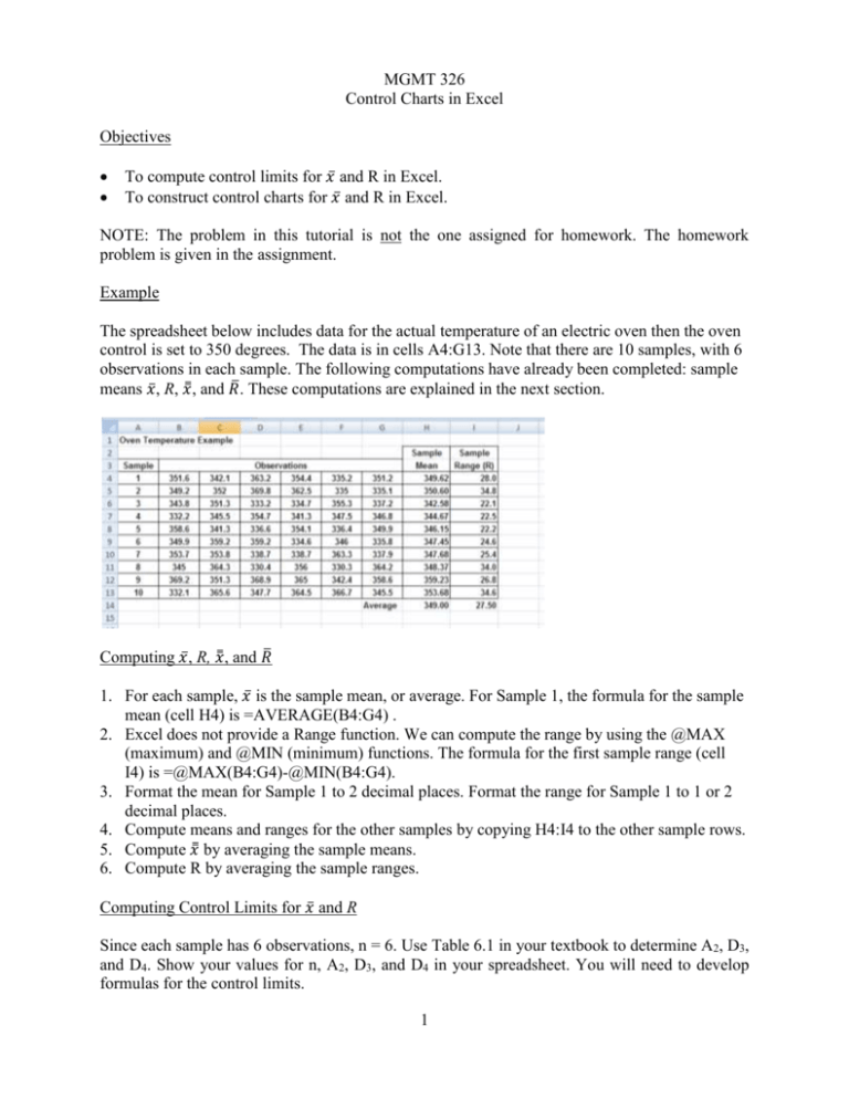
MGMT 326 Control Charts in Excel Objectives To compute control limits for 𝑥̅ and R in Excel. To construct control charts for 𝑥̅ and R in Excel. NOTE: The problem in this tutorial is not the one assigned for homework. The homework problem is given in the assignment. Example The spreadsheet below includes data for the actual temperature of an electric oven then the oven control is set to 350 degrees. The data is in cells A4:G13. Note that there are 10 samples, with 6 observations in each sample. The following computations have already been completed: sample means 𝑥̅ , R, 𝑥̿ , and 𝑅̅ . These computations are explained in the next section. Computing 𝑥̅ , R, 𝑥̿ , and 𝑅̅ 1. For each sample, 𝑥̅ is the sample mean, or average. For Sample 1, the formula for the sample mean (cell H4) is =AVERAGE(B4:G4) . 2. Excel does not provide a Range function. We can compute the range by using the @MAX (maximum) and @MIN (minimum) functions. The formula for the first sample range (cell I4) is =@MAX(B4:G4)-@MIN(B4:G4). 3. Format the mean for Sample 1 to 2 decimal places. Format the range for Sample 1 to 1 or 2 decimal places. 4. Compute means and ranges for the other samples by copying H4:I4 to the other sample rows. 5. Compute 𝑥̿ by averaging the sample means. 6. Compute R by averaging the sample ranges. Computing Control Limits for 𝑥̅ and R Since each sample has 6 observations, n = 6. Use Table 6.1 in your textbook to determine A2, D3, and D4. Show your values for n, A2, D3, and D4 in your spreadsheet. You will need to develop formulas for the control limits. 1 The Data Table for the 𝑥̅ Chart This chart must include a line for the sample means, and three horizontal lines for the LCL, mean (𝑥̿ ), and UCL. We will set up a data table for the 𝑥̅ chart, as shown below. We want to set the data table up so that it would be easy to add more samples to the chart. Therefore, we will use formulas, instead of typing numbers into the chart. For the spreadsheet shown above, the following formulas will work for the first sample: Cell A27: =A4 Cell D27: = $C$19 Cell B27: =H4 Cell C27: = $H$14 Cell E27: = $C$20 After completing Row 27, copy the formulas to rows 28-36. 2 Constructing the 𝑥̅ Chart 1. Highlight the cells that contain the column headings and the data series for your chart. This area includes cells B26:E36. 2. Insert a line chart in your spreadsheet. The default two-dimensional line is the best choice. 3. On the Xbar, we need markers for the individual points. Click the Xbar line. Then right click, and select Format Data Series. On the Format Data Series menu, select Marker Options and then Automatic. 4. Add a title for your chart. 5. Add a title for each axis. 6. Eliminate the grid lines by right clicking on a grid line, and then clicking Delete. 7. Make other format changes if you wish. The following is an example of an acceptable chart. Mean Chart for Oven Temperature T e m p e a r a t u r e 365 360 355 Xbar 350 Mean 345 LCL 340 UCL 335 330 1 2 3 4 5 6 7 8 9 10 Sample Note: In the spreadsheet, each line is a different color. Therefore, different line types are not required. Constructing an R chart To construct an R chart, follow a similar process: Construct a data table, create your chart, and edit it as instructed above. The data table should include columns for the sample number, sample range (R), 𝑅̅ , and the LCL and UCL for R. 3

