History of Architecture and Urbanism I
advertisement
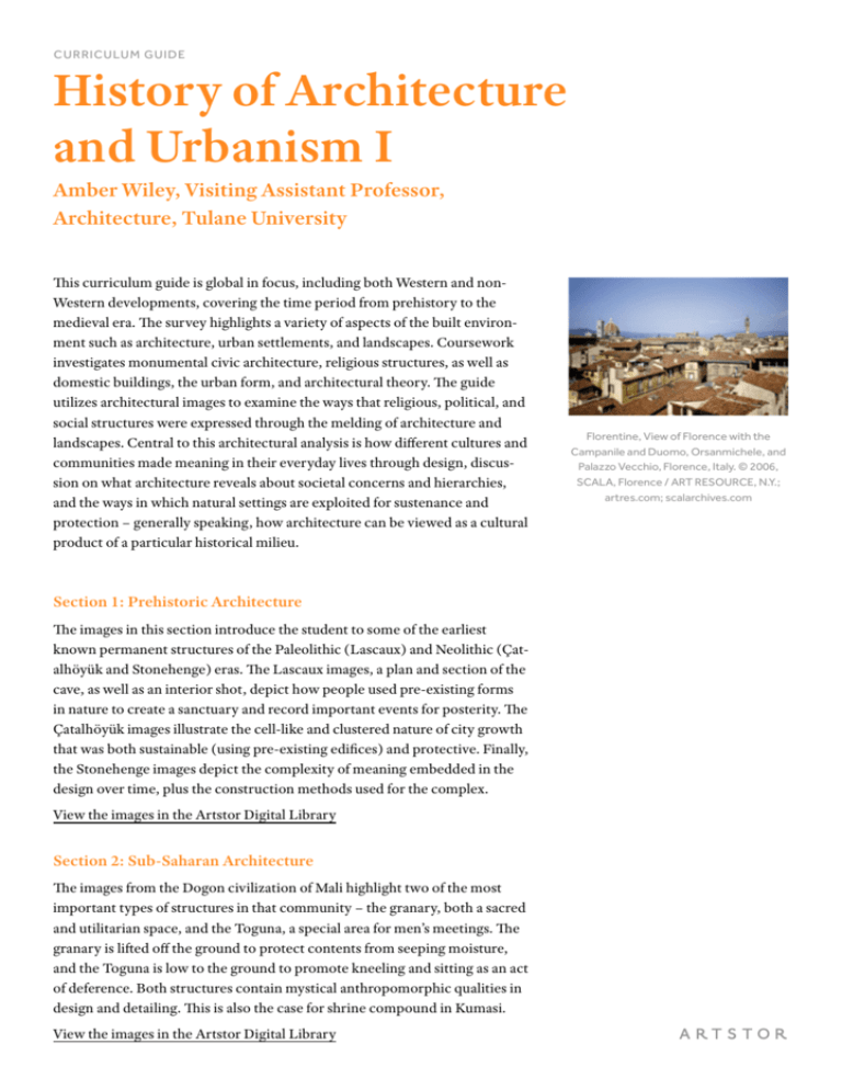
CURRICULUM GUIDE History of Architecture and Urbanism I Amber Wiley, Visiting Assistant Professor, Architecture, Tulane University This curriculum guide is global in focus, including both Western and nonWestern developments, covering the time period from prehistory to the medieval era. The survey highlights a variety of aspects of the built environment such as architecture, urban settlements, and landscapes. Coursework investigates monumental civic architecture, religious structures, as well as domestic buildings, the urban form, and architectural theory. The guide utilizes architectural images to examine the ways that religious, political, and social structures were expressed through the melding of architecture and landscapes. Central to this architectural analysis is how different cultures and communities made meaning in their everyday lives through design, discussion on what architecture reveals about societal concerns and hierarchies, and the ways in which natural settings are exploited for sustenance and protection – generally speaking, how architecture can be viewed as a cultural product of a particular historical milieu. Section 1: Prehistoric Architecture The images in this section introduce the student to some of the earliest known permanent structures of the Paleolithic (Lascaux) and Neolithic (Çatalhöyük and Stonehenge) eras. The Lascaux images, a plan and section of the cave, as well as an interior shot, depict how people used pre-existing forms in nature to create a sanctuary and record important events for posterity. The Çatalhöyük images illustrate the cell-like and clustered nature of city growth that was both sustainable (using pre-existing edifices) and protective. Finally, the Stonehenge images depict the complexity of meaning embedded in the design over time, plus the construction methods used for the complex. View the images in the Artstor Digital Library Section 2: Sub-Saharan Architecture The images from the Dogon civilization of Mali highlight two of the most important types of structures in that community – the granary, both a sacred and utilitarian space, and the Toguna, a special area for men’s meetings. The granary is lifted off the ground to protect contents from seeping moisture, and the Toguna is low to the ground to promote kneeling and sitting as an act of deference. Both structures contain mystical anthropomorphic qualities in design and detailing. This is also the case for shrine compound in Kumasi. View the images in the Artstor Digital Library Florentine, View of Florence with the Campanile and Duomo, Orsanmichele, and Palazzo Vecchio, Florence, Italy. © 2006, SCALA, Florence / ART RESOURCE, N.Y.; artres.com; scalarchives.com Section 3: The Americas The plan and sketch of Poverty Point, North America’s newest World Heritage Site, show the intricacy of earthwork construction in the United States. The Teotihuacan images illustrate the vastness of the city on a macrolevel, and then zoom in to highlight the colorful aesthetic detailing of the Temple of Quetzalcoatl and compare the talud-tablero construction methods seen at both Tenochtitlan and Teotihuacan. View the images in the Artstor Digital Library Section 4: India The Great Stupa of Sanchi plan and elevation show the importance of the circle in the construction and layout of the site. One can also begin to understand how various details like entrance, procession through circumambulation, and levels heighten the sense of reverence. The rocks cut temples of Ajanta illustrate how some of these principles are translated into a protective geography. The Lakshmana Temple shows how closely related major Buddhist principles about directionality, procession, and geography are to those of Hindu design principles, though the detailing is different. View the images in the Artstor Digital Library Section 5: China The Forbidden City and Temple of Heaven are two major complexes built around the same time – 1420 CE. The former was the center of royal administration and the latter was the center of worship for good harvests. What is clear here is that tile and wall colors are highly symbolic – for instance, most of the tiles depicted in the Forbidden City are yellow, representing the emperor, while the tiles in one lone image are black to represent the color of water. The building with the black tiles is the library; the black tiles are added for symbolic protection from fire damage. The emperor’s procession is stressed in both complexes with an elaborate stone walkway. Ornate colorful detailing is seen in the dou-gong bracket structures that hold the roofs. View the images in the Artstor Digital Library Section 6: Japan Both the Itsukushima and Ise shrines are different representations of the Shinto religion in Japan. The Itsukushima Shrine straddles earth and water on the island of Miyajima, its bright red color a contrast to the darker, mute tones of water and trees. The shrine mediates between the natural resources, creating a sanctuary for the worship of the seas and the sun. The great Torii gate directs pilgrims to the site. The Ise shrine is also referential to nature, and is rebuilt every 20 years. Historians have noted its similarity to the vernacular granary of agrarian Japan. View the images in the Artstor Digital Library Section 7: Mesopotamia The reconstruction drawing of the Ziggurat at Ur shows various levels and platforms of the structure and how the size diminished to create the illusion of great height. The contemporary image illustrates the impermanent nature of the materials, while the plan puts the Ziggurat into greater context to show it was not a building sitting in isolation. The plan of the Qsar Quarter of Babylon and Ishtar Gate depict the dense magnitude of the city at its height. The painted reconstruction of the Ishtar Gate shows how it was a means of protection, while at the same time was a great ceremonial entryway. The image of the Ishtar Gate in a Berlin museum reminds students that architectural fragments are often displayed in contexts far removed from the place of origin. It should prompt students to question preservation theory and methods. View the images in the Artstor Digital Library Section 8: Egypt These images contrast the Old, Middle, and New kingdom periods in ancient Egypt. The first image is a popular view of Pyramids of Giza, while the next view shows the pyramids in relationship to the Nile River. This is the most important view considering the processional approach with the funeral boat was from the Nile. The plan and section of Pyramid of Cheops illustrate the massiveness of the structure and the ways in which the building worked – airshafts for workers and protection against collapse above the chambers. The Kahun courtyard house exemplifies the ubiquitous nature of this residential form. The images at Karnak illustrate an extremely different approach to Egyptian sacred architecture in the New Kingdom, as opposed to what was seen in the Old Kingdom. The Louis Kahn impressions from his time studying ancient Egyptian architecture portray the powerful contrast of light and dark, something he would work to create in his monumental modernist designs of the twentieth century. View the images in the Artstor Digital Library Section 9: Aegean Architecture The images of the Palace of Knossos depict its plan, said to have been created by the mythological Daedalus, as well as views that capture the multitude of building materials and techniques – wood frame, rubble stone, and ashlar veneer. The images also depict the light wells that were used to supply adequate light to the lower floors. View the images in the Artstor Digital Library Section 10: Greece Miletus was one of the earliest Greek cities planned with a regular grid. The grid of Miletus was adapted to the three fingers of the peninsula. The following images are of some of the earliest Greek settlements in Southern Italy that illustrate the blueprint for Greek temples that will mature in the classical period. The drawings show attention to detail in the façade, and division of interior space with the cella and peripteral columniation. The detail images, however, illustrate how rough some of the earlier techniques were – fluffy, marshmallow-like echinus of the capital, and the over-exaggeration of entasis in columns. Later images of the Temple of Hera II (Temple of Poseidon) illustrate the careful variation on a theme with narrower plan, and sturdier, more carefully tapered columns. View the images in the Artstor Digital Library Section 11: Etruscans Etruscans are known for their elaborate burial practices and sprawling necropoli like Cerveteri (Caere). Much of what we know about their everyday architecture comes from what we see in cemeteries, which were built with permanent materials. These burial sites are made of streets lined with “houses,” from simple to complex. These houses for the dead contain individual rooms with beds for the deceased. The Tomb of the Reliefs is a great example of burial practices in which carvings imitate items that the deceased would need in their transition. Sarcophagi often depicted the deceased reclining. The reconstruction of Portonaccio Temple is based on archaeological evidence left at the site. The side elevation and plan show the three-room cella that was typical of Etruscan temples (recall that Greek temples had fewer). The gorgon antefix was used to ward off bad spirits. View the images in the Artstor Digital Library Section 12: Rome The Maison Carrée in Nîmes, France, is one of the most well preserved Roman temples in the world. The plan, section, and details show how this temple varies from both the Greek and Etruscan examples, while building on the precedents. This Roman temple contained a single cella, sitting upon a podium with stairs on one side, pseudo-peripteral columniation, and extensive use of the Corinthian capital. The images of the Capitolium, Roman Forum, Imperial Forum, and Trajan’s Market all depict the heart of civic Rome. The images also show the accretion and initially haphazard growth of the center, which becomes more precise and exacting as the Imperial fora are constructed. Trajan’s Market illustrates how the arch was used both as building technology and to articulate separate spaces called “taberna” for vendors. View the images in the Artstor Digital Library Section 13: Early Christian The Basilica of Maxentius and Constantine is one of the structures of ancient Rome that represent the advent of Christianity as a state religion. The Romans under Constantine borrowed the basilica form for early churches since the basilica could house a multitude of people and because it did not have major ties with the previous pagan religion. In this example, the vaulting reflects techniques often seen in public baths. This is clearly illustrated in the section, plan, and detail of coffering. View the images in the Artstor Digital Library Section 14: Byzantine The exterior shots of the Hagia Sophia show its present day reconstitution as a mosque with minarets, as well as the extensive buttressing needed to keep the structure erect. Interior shots show the “dematerialization” of the building’s skin. The magnificent quality of light through fenestration is afforded by the buttressing on exterior and use of domes to transfer gravitational forces and weight. Walls were not the principal load-bearing components, so they could be punctured with numerous windows. View the images in the Artstor Digital Library Section 15: Islamic Urbanism + Architecture The Prophet’s Mosque was built adjacent to his house in Medina. This image illustrates how the structure grew over time to become a blueprint for other mosque structures. One can see the use of the mihrab (niche) in the kiblah wall (between letters D and E in the plan), which indicates the direction to pray to Mecca. The plans of the Great Mosque of Cordoba also show its growth over time. Later images depict its conversion to a church. The interior and details include an elaborate mihrab. One can see how Arabic script, flowers, and geometric “non-figural” shapes are the staples of Islamic decoration. The Masjid-I-Shah, located in Iran, is a much later example that highlights the major regional differences between Islamic sacred architecture. View the images in the Artstor Digital Library Section 16: Carolingian + Romanesque The Monastery at St. Gall plan is a blueprint for an ideal monastery. It was drawn at a time when monasteries served as the center of literary and cultural life and resilience. Though this monastery was never constructed, the wooden model depicts how it might have looked. Other drawings illustrated the modular division in the floor plan, the cloister and adjoining spaces, as well as housing for “distinguished guests.” Cluny the III was the realization of this ideal. It was extremely complex in section, and housed countless chapels made to accommodate pilgrims. The drawing of the interior clearly depicts bay divisions that would become a staple of mature Gothic cathedral architecture. View the images in the Artstor Digital Library Section 17: Medieval Urbanism These images depict the monumental axis of Florence. The two most important public spaces in the city belong to Il Duomo, and the Palazzo Vecchio, centers of religious and civic life. The reconstructed drawing of the Palazzo Vecchio shows its first façade and plan, which was very much replicated in courtyard houses of the elite in Florence. Key features include the tripartite division of the façade and heavy rustication. The last image is how one encountersIl Duomo today after extensive demolitions in the early Renaissance to enlarge the Piazza della Signoria and expand the Palazzo Vecchio. View the images in the Artstor Digital Library Section 18: The Gothic Cathedral St. Denis, considered the first gothic cathedral, was built over many years to the specifications of Abbot Suger. The addition of the chapels reflects the importance of church to pilgrims and its relationship with the French monarchy – it was where kings were buried. The elevation and section show the details of bay construction and innovations in vaulting characteristic of gothic structures. View the images in the Artstor Digital Library


