Correlations Lab Excel Instructions
advertisement
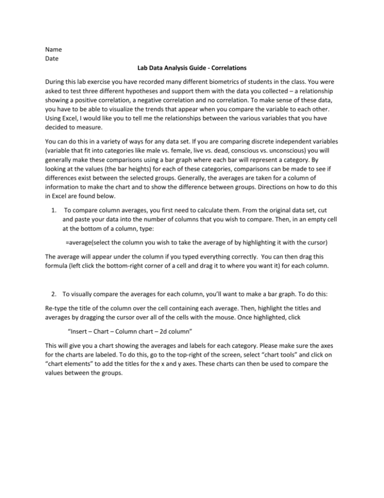
Name Date Lab Data Analysis Guide - Correlations During this lab exercise you have recorded many different biometrics of students in the class. You were asked to test three different hypotheses and support them with the data you collected – a relationship showing a positive correlation, a negative correlation and no correlation. To make sense of these data, you have to be able to visualize the trends that appear when you compare the variable to each other. Using Excel, I would like you to tell me the relationships between the various variables that you have decided to measure. You can do this in a variety of ways for any data set. If you are comparing discrete independent variables (variable that fit into categories like male vs. female, live vs. dead, conscious vs. unconscious) you will generally make these comparisons using a bar graph where each bar will represent a category. By looking at the values (the bar heights) for each of these categories, comparisons can be made to see if differences exist between the selected groups. Generally, the averages are taken for a column of information to make the chart and to show the difference between groups. Directions on how to do this in Excel are found below. 1. To compare column averages, you first need to calculate them. From the original data set, cut and paste your data into the number of columns that you wish to compare. Then, in an empty cell at the bottom of a column, type: =average(select the column you wish to take the average of by highlighting it with the cursor) The average will appear under the column if you typed everything correctly. You can then drag this formula (left click the bottom-right corner of a cell and drag it to where you want it) for each column. 2. To visually compare the averages for each column, you’ll want to make a bar graph. To do this: Re-type the title of the column over the cell containing each average. Then, highlight the titles and averages by dragging the cursor over all of the cells with the mouse. Once highlighted, click “Insert – Chart – Column chart – 2d column” This will give you a chart showing the averages and labels for each category. Please make sure the axes for the charts are labeled. To do this, go to the top-right of the screen, select “chart tools” and click on “chart elements” to add the titles for the x and y axes. These charts can then be used to compare the values between the groups. However, if you are comparing continuous variables (height vs. weight, breathing rate vs. pulse rate, etc.) where the numbers you are measuring could be almost any value, you should compare them using a scatterplot chart. This will allow you to include a “line of best fit” or a trendline that will show the general relationship between the variables. 3. To compare continuous variables, you need to make a scatter-plot chart. Open a new sheet at the bottom of the excel document and copy the columns of data you wish to compare. Highlight the columns, click on “insert” and select “scatterplot”. This will result in a graph with data points whose relationship can be compared between the two variables you measured. Right click on any one of the data points and select “add trendline” and choose “linear”. This will place a “line of best fit” through your data points to show you the general relationship between the categories. Follow the directions above to add proper axes and other labels to your charts. This shows a positive relationship between variables This shows NO relationship between variables This shows a negative relationship between variables These relationships can be used to infer how one might impact the other. Please remember that looking at data this way only shows how they are related to each other, not that one CAUSES the other. Correlation and causation are two completely different relationships. It is YOUR job to offer an explanation that explains the relationships that you have found in your (or, in this case, the class) data. To confirm your hypothesis, perform your comparison in Excel and include a data chart showing your comparison. Then say whether you or not you supported your hypothesis and offer an explanation for each outcome. You should also offer other procedures (tests) that could be done to increase your understanding of what you learned or those that may support your hypothesis. For example… Chronic smokers will have increased resting respiratory rates when compared to non-smokers. This is because the decreased lung capacity of smokers will cause them to breathe faster to compensate for lack of lung volume and therefore gas exchange. 25 Resting Respiration Rate NonSmokers smokers 13 18 20 19 22 15 25 20 24 17 23 13 24 15 25 14 28 16 18 14 23 18 21 19 20 12 20 15 24 12 20 15 10 5 0 Smokers Non-smokers NonSmokers smokers Average 22 15.8 These data support my hypothesis in that smokers have a higher average resting respiration rate than non-smokers. This is because smokers have decreased lung capacity and therefore may need to increase their respiration rates to compensate for this lack of gas exchange. In addition, smokers may have much of the surface area of their lungs clogged with smoke particulates, preventing the diffusion of gases through the epithelia of the lungs. Further testing of the lung capacity of smokers would be needed to confirm this hypothesis. This could be compared by recording the total amount of air moved in and out of the lungs in one breath between smokers and non-smokers by blowing up a balloon. Please make sure that you perform at least three different comparisons between the dependent variables and an independent variable and offer an explanation for each of the comparison you make. This should be summarized with an end paragraph (like a Discussion section) at the end of the entire lab report that logically synthesizes the comparisons that you chose to make. In other words, what story do your results tell? GRADING Hypothesis for each variable comparison – 5 points each Charts showing comparisons with appropriate labels – 10 points each Explanation of results for each comparison – 10 points each Summarizing paragraph that synthesizes the results of each comparison – 25 points

