A Data Plotting Tool for QUASAR
advertisement
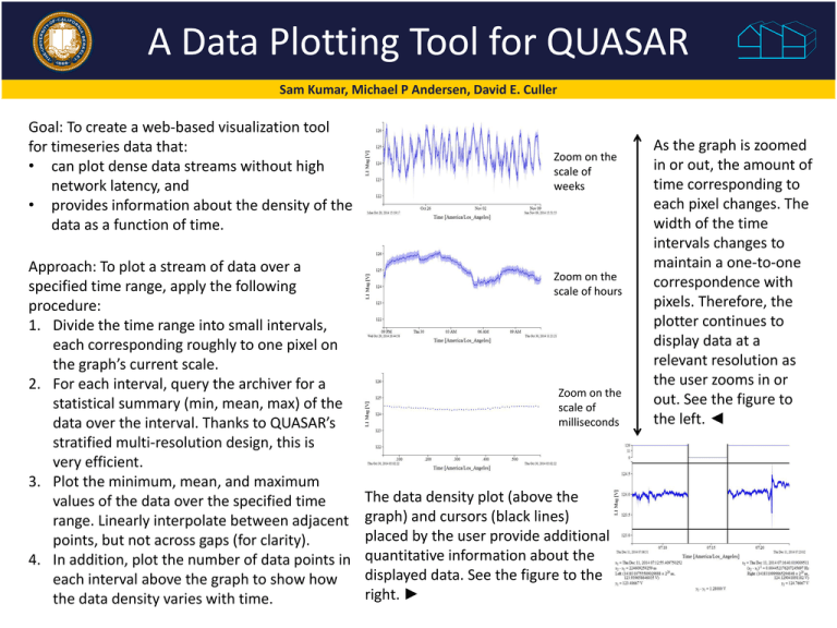
A Data Plotting Tool for QUASAR Sam Kumar, Michael P Andersen, David E. Culler Goal: To create a web-based visualization tool for timeseries data that: • can plot dense data streams without high network latency, and • provides information about the density of the data as a function of time. Approach: To plot a stream of data over a specified time range, apply the following procedure: 1. Divide the time range into small intervals, each corresponding roughly to one pixel on the graph’s current scale. 2. For each interval, query the archiver for a statistical summary (min, mean, max) of the data over the interval. Thanks to QUASAR’s stratified multi-resolution design, this is very efficient. 3. Plot the minimum, mean, and maximum values of the data over the specified time range. Linearly interpolate between adjacent points, but not across gaps (for clarity). 4. In addition, plot the number of data points in each interval above the graph to show how the data density varies with time. Zoom on the scale of weeks Zoom on the scale of hours Zoom on the scale of milliseconds The data density plot (above the graph) and cursors (black lines) placed by the user provide additional quantitative information about the displayed data. See the figure to the right. ► As the graph is zoomed in or out, the amount of time corresponding to each pixel changes. The width of the time intervals changes to maintain a one-to-one correspondence with pixels. Therefore, the plotter continues to display data at a relevant resolution as the user zooms in or out. See the figure to the left. ◄
