Statistics 305 The Relationship Between Quantiles in Normal Populations and its Use
advertisement
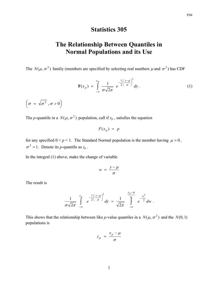
F04 Statistics 305 The Relationship Between Quantiles in Normal Populations and its Use The N ( µ , σ 2 ) family (members are specified by selecting real numbers µ and σ 2 ) has CDF xp F( x p ) = ∫ −∞ σ = 1 y −µ − e 2 σ 1 σ 2π 2 (1) dy . σ 2 , σ > 0 The p-quantile in a N ( µ , σ 2 ) population, call if xp , satisfies the equation F (x p ) = p for any specified 0 < p < 1. The Standard Normal population is the member having µ = 0 , σ 2 = 1 . Denote its p-quantile as zp . In the integral (1) above, make the change of variable w = y−µ σ The result is 1 σ 2π xp ∫ 1 y−µ − e 2 σ x p −µ 2 dy = −∞ 1 2π σ ∫ e − w2 2 dw . −∞ This shows that the relationship between like p-value quantiles in a N ( µ , σ 2 ) and the N (0, 1) populations is zp = xp − µ σ 1 F04 or xp = µ +σ zp . This is the equation of a straight line relationship. Thus, as p moves across the interval [0, 1] the ordered pairs (zp, xp) all lie on a straight line in the zx plane with intercept µ and slope σ. Now, as a theoretical consideration, suppose we have a random sample of size n from some N ( µ , σ 2 ) population. The sorted sample values are approximate p-quantiles in the sampled population for p-values 1 /(n + 1), 2 /( n + 1), ..., n /(n + 1) (JMP definition) or (1 − 1 / 2) / n , (2 − 1 / 2) / n, ..., (n − 1 / 2) / n (Textbook definition). The scatterplot of the sample values, paired with like p-value quantiles in the N (0, 1) population, should be rather linear. (If we had actual p-quantiles from N ( µ , σ 2 ) , instead of approximations, the plot would be exactly linear.) The application of this result goes as follows. We have a random sample of n from a population of interest and we wonder whether the shape of the distribution of elements in the sampled population is bell-shaped. We sort the sample values, compute associated p-values ( i /(n + 1) or (i − 1 / 2) / n ) and pair the sample values with like p-quantiles from N (0, 1) . If the scatterplot of these ordered pairs is strongly linear, this is evidence that the shape of the distribution of elements in the sampled population is approximately bell-shaped. If this turns out to be the case we will be motivated to treat the sample as if it came from a Normal population. The scatterplot is called a Normal Probability Plot or JMP calls it a Normal Quantile Plot. You will see as we progress thru the course that we hope populations of interest to us are approximately Normal, and there is good reason to believe this will often be the case. We note in passing that the relationship between like p quantiles in Normal populations permits us to compute p quantiles in any Normal population if we have the corresponding p quantile in the Standard Normal population N (0, 1). Table B.3 gives quantiles in N (0, 1) for rounded p values in the body of the table. Thus the table can be used to find p quantiles if we don’t elect to use a computer program like JMP. 2

