Why use graphs and charts?
advertisement

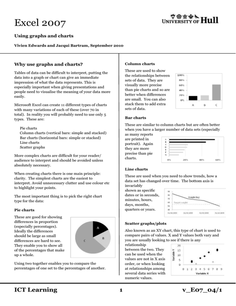
Excel 2007 Using graphs and charts Vivien Edwards and Jacqui Bartram, September 2010 Column charts Why use graphs and charts? These are used to show the relationships between sets of data. They are visually more precise than pie charts and so are better when differences are small. You can also stack them to add extra sets of data. Tables of data can be difficult to interpret, putting the data into a graph or chart can give an immediate impression of what the data represents. This is especially important when giving presentations and people need to visualise the meaning of your data more easily. Microsoft Excel can create 11 different types of charts with many variations of each of these (over 70 in total). In reality you will probably need to use only 5 types. These are: Bar charts These are similar to column charts but are often better when you have a larger number of data sets (especially as many reports are printed in portrait). Again they are more precise than pie charts. Pie charts Column charts (vertical bars: simple and stacked) Bar charts (horizontal bars: simple or stacked) Line charts Scatter graphs More complex charts are difficult for your reader/ audience to interpret and should be avoided unless absolutely necessary. Line charts When creating charts there is one main principle: clarity. The simplest charts are the easiest to interpret. Avoid unnecessary clutter and use colour etc to highlight your points. These are used when you need to show trends, how a data set has changed over time. The bottom axis is invariably shown as specific dates or in seconds, minutes, hours, days, months, quarters or years. The most important thing is to pick the right chart type for the data: Pie charts These are good for showing differences in proportion (especially percentages). Ideally the differences should be large as small differences are hard to see. They enable you to show all of the percentages that make up a whole. Scatter graphs/plots Also known as an XY chart, this type of chart is used to compare pairs of values. X and Y values both vary and you are usually looking to see if there is any relationship between the two. They can be used when the values are not in X axis order, or when looking at relationships among several data series with numeric values. Using two together enables you to compare the percentages of one set to the percentages of another. ICT Learning 1 v_E07_04/1 Pie Charts 1. Creating a pie chart 2. In the Labels group click on Chart Title and then on Above Chart. To build a pie chart of the data illustrated on the right, we must first inform Excel which data is to be included, it would not be appropriate to include the Total in this chart. 1. With the chart active, click on the Chart Tools Layout ribbon tab. 3. Type in the title and then hit the Enter key. The title will appear on the chart. To edit the title, double click on the title, position the cursor and make the required changes. To ‘escape’ the title textbox, click on the white background of the chart. Select the cells from A3 to B7, the Total row should not be included. 2. Click on the Insert tab to bring the Insert ribbon forward and then click on Pie in the Charts group. Moving the position of the legend 3. Select the first (2D) option to place the chart as an object in the worksheet. You can move the legend small distances by dragging on its border. However, if you want to change its position entirely do the following: 3D pie charts should not be used as data can be misinterpreted due to the smaller size of the segments at the top of the chart. 2D is clearer and remember clarity is your main principle. 1. With the chart active, click on the Chart Tools Layout ribbon tab. 2. In the Labels group click on Legend. 3. Choose the required position from the drop-down list. Deleting the legend 1. Chart Tools Layout ribbon, Labels group, Legend button. 2. Choose None from drop-down list. or 1. Notice that when the chart is active (selected) three Chart Tools ribbons become available; if the chart is not active then their tabs are not shown. Click on Legend within the chart and hit the Delete key on the keyboard. Adding data labels to the segments Rather than using a legend, the segments may have labels attached to them showing the category names of each. 1. If these ribbons are not shown at the top right of the screen, click on the white background of the chart to make it active. To make the worksheet active simply click in one of the cells on the worksheet. 2. Click on the Data Labels button and then on More Data Label options . The box illustrated alongside is opened. Improving the chart The charts that Excel produces are never the easiest to interpret. Some information may be missing (usually titles) and extra clutter may be present. 3. Within the Label Options, Label Contains area check the boxes to add labels to the chart (or remove them if they are already checked) Adding a title The chart will need a title, otherwise it tells us nothing (if your chart will be in a PowerPoint presentation where the slide itself contains a title this may not be necessary) ICT Learning On the Chart Tools, Layout ribbon, find the Labels group. 2 v_E07_04/1 Pie Charts 1. Show leader lines should also be unchecked (these point from the labels to the segment and are only really useful when you have lots of small segments – and if this is the case you should consider using a different type of chart!). Student Recruitment UK China Saudi Arabia 2. Under Label Position click to show where the data label is to be placed in relation to the segment. Other Asian Other European Default colours – no particular segment appears important and colours are not clear on a B&W printout. 3. You may also wish to change the number formats by clicking on Number in the box on the left (for instance to show percentages). Student Recruitment UK China Saudi Arabia Alternatively you could wish to show the actual values on the segments with the categories in a legend: Other Asian Other European Student Recruitment 6% Colours changed – emphasis on UK segment 4% UK Student Recruitment China 15% UK Saudi Arabia 55% 20% China Other Asian Saudi Arabia Other European Other Asian Other European Formatting/moving data labels Colours changed – emphasis on China segment Text size and colour can be changed by clicking on any label (to select them all) and then using the normal font size/font colour buttons on the Home ribbon. Clicking on an individual label when they are all selected will select it alone for individual formatting. Drag on their borders to move them (you cannot reshape them). To change colours: 1. Left click on the segment to be changed (this will select all segments). Pause and then left click again. Only that segment should now be selected. 2. On the Chart Tools, Format ribbon, use the Shape Fill button to choose a new colour. You may need to click on More Fill Colors... to get a greater range. Emphasising information On many charts, you are trying to get the reader/ audience to notice a particular piece of information. This can be done using colour, proximity or labelling. Changing the colour of a segment Colour is invaluable for making charts clearer. The part you are trying to emphasise can be given a more dominant colour than the other segments. Other segments can be given more neutral colours such as greys or tans. This can also work in black and white printouts using black to emphasise and shades of pale grey as the neutral colours. ICT Learning 3 v_E07_04/1 Pie Charts Exploding segments Resizing or moving the pie within the chart box Another way to emphasis segments is to move segments away from the main body of the pie. This is known as “exploding”. It is best to do this with only one or two segments. 1. The important thing here is to select the right thing. Clicking on the pie will select the segments, which cannot be resized or moved (other than to explode segments). You need to select the “plot area”. The problems is, on pie charts you cannot see it! Select the segment individually as you did for changing colours. 2. Drag the segment out of the pie with the mouse. The plot area for a pie chart is shown selected below: Student Recruitment UK China Saudi Arabia 20% Other Asian Other European Even more emphasis on China! 1. Adding other labels The final way of emphasising information is to add labels. These are simply text boxes that are considered part of the chart and not the worksheet. 1. To select this yourself, you must click in the “corners” i.e.: Click Click here here Even though you cannot see the box: Make sure the chart is active (click on the white background area if you are not sure). 2. On the Chart Tools, Layout ribbon, click on Text Box in the Insert group. Click here 3. Click where you want your text box to appear and type. Click here 2. Once you have selected the plot area you can resize the pie chart within the chart area by dragging on the white circular corner handles. For some reason the text does not seem to wrap within the text box so you may need to press Shift-Enter to force new lines. 3. You can move the pie chart within the chart area by dragging on the border of the plot area (avoiding the handles). Student Recruitment UK Changing the location of the chart China When you originally create a chart it is located in a box on the same worksheet as the original data. You can also choose to locate it on a sheet of its own as follows: Saudi Arabia Other Asian Recruitment in China up to 20% from 10% 1. Other European 2. At the right-hand end of this ribbon click on the Move Chart Location button. Resizing the whole chart 1. 3. In the Move Chart box that opens up click on New sheet, type in the title you wish to appear on the sheet tab and then click on OK. Make sure the chart is active. 2. Drag on the dotted sections around the border of the chart to make the chart bigger or smaller. ICT Learning With the chart active, click on the Chart Tools, Design tab. The chart has been removed from the worksheet and is now placed on its own sheet with the new name showing on the sheet tab 4 v_E07_04/1 Column Charts Creating a simple column chart Note that Excel calls vertical bar charts column charts. To build a column chart of the data illustrated below, we must select the data to be included. Improving the chart 1. Adding a chart title Select the cell range A3 to D7, this includes the row and column titles but not the Totals. 1. 2. Click on the Insert tab to bring the Insert ribbon forward, then click on Column in the Charts group. Follow the instructions given for adding a title to a pie chart. Adding axis titles 1. 3. Select the appropriate column chart from the options shown, in this case the first option (2D) is correct. (Again, 3D charts do not aid clarity and should be avoided.) With the chart active, click on the Chart Tools, Layout tab. 2. In the Labels group click on Axis Titles, Primary Horizontal Axis Title, then on Title Below Axis. 3. Type in the title and press Enter. The title will appear below the horizontal axis on the chart. This places the chart as an object in the worksheet. 1. The resultant chart (below) shows us the faculties grouped by recruitment region, allowing you to see what students from different regions are studying. In the Labels group click on Axis Titles, this time choose Primary Vertical Axis Title, then choose Rotated Title. 2. Type in the title and press Enter. The title will appear by the vertical axis on the chart. Deleting gridlines from the chart background It is advisable to remove as much ‘chart junk’ from the graph or chart as possible. Gridlines (the horizontal lines behind the columns) are only necessary if you are going to be reading off the chart or noting when a particular target is reached. This is not very often! 1. However, you may wish to see the data grouped by each Faculty, showing where their most successful recruitment is from. 1. Point carefully at and click on one of the grid lines, all should be selected (showing round ‘handles’ at each end). 2. Hit the Delete key on the keyboard. With the chart active, click on the Chart Tools, Design tab to bring this ribbon forward 2. In the Data group click on Switch Row/Column and the chart will change immediately, as shown in the next column. ICT Learning 5 v_E07_04/1 Column Charts Emphasising information 1. For column charts the only ways to emphasise information is to change the colours or add labels. Labels are added in exactly the same way as they are for pie charts so look there for instructions. Resizing the plot area Again, columns or series that you want to emphasis should be given a more dominant colour than the others. This is a little easier than with pie charts as at least you can see it! 1. Changing column colours for a whole series 1. On the Chart tools, Layout ribbon, click on the Layout button and choose the option you require. The legend can also be moved by dragging its border. Click anywhere in the white area towards the centre of the chart (the plot area will be selected). 2. Drag the handles to resize the chart. Click on any column in the series. All columns of that colour (in that series) will be selected. 2. On the Chart tools, Format ribbon, use the Shape Fill button to change the colour. Changing chart type Sometimes it is hard to decide what type of column or bar chart will be best for the data. For instance does it make more sense as a clustered column chart or a stacked one? Would it look better as bars (horizontal) rather than columns (vertical)? These colours focus attention on the Asian recruitment and could show that Humanities and Science could improve in this region). 1. Changing colours of individual columns This is particularly useful when you only have a single series. 1. 2. Select a Stacked Column chart. Click on any column in the series. 3. Amend the position of labels, legend etc if required. All columns of that colour (in that series) will be selected. Same data shown as a stacked column. This shows proportions better. 2. Click on the individual column you want to select. 3. On the Chart tools, Format ribbon, use the Shape Fill button to change the colour. Same data shown as a 100% stacked bar. 100% charts show as proportions of the whole a bit like pie charts. Repositioning the legend Sometimes it is best if the legend is underneath or above the chart (giving you more room for the actual chart data). ICT Learning Make the chart active and on the Chart Tools, Design ribbon, click on the Change Chart Type button. 6 v_E07_04/1 Line Charts Creating a Line Chart After removing the gridlines, the chart now makes more sense: The same procedure is followed as for building a column chart, i.e. selecting the data, inserting the type of graph, adding a chart title and axes titles. However, one difficulty may arise. If the data labels are years (such as in the example below) Excel will try to plot these cells as values so steps must be taken to overcome this. Improving the chart A lot of the work has already been done (titles, gridlines etc). Changing colour or styles of lines The important thing to note is that for Line charts this is done using the Shape Outline button rather than the Shape Fill button. 1. Select the line you want to change. 2. On the Chart Tools, Format ribbon, click on the Shape Outline button. Once the chart has been created: 1. 3. Choose a new colour, weight of line or dash style as required. On the Chart Tools, Design ribbon click on Select Data in the Data group Changing the Scale on the Vertical (y) Axis 2. The Select Data Source box will open, click on the first series in the Legend Entries box and then click on Remove. This is not always necessary and is the same for column and bar charts too. 1. 2. From the drop-down list choose More Primary Vertical Axis Options. 3. Click on Edit in the Horizontal (Category) Axis Labels. 3. In the resulting Format Axis box, within the Axis Options amend the Minimum and Maximum settings, click on the Fixed button and then key in the new high or low limit to be applied to the axis. 4. Enter the cell range for the labels (B3:E3 in this example) and click on OK. ICT Learning On the Chart Tools, Layout Ribbon, click on the Axes button and select Primary Vertical Axis 7 v_E07_04/1 Scatter plots (XY Charts) Creating a scatter plot Changing to a logarithmic scale In the example, the data (illustrated) shows how far molecules in DNA samples of known molecular size travel through gel. 1. 1. 2. This will change the scale to Log base 10. If the scale needs to be to a different base follow the steps below. Select the data (in the example, cells A3 to B12) 3. Click on the vertical axis to select it, right click on it and choose Format Axis from the list. 2. On the Insert ribbon, in the Charts group, choose Scatter and then choose the second option (with curved lines and markers). 4. In the Format Axis box, under Axis Options, ensure there is a tick mark in the Logarithmic sale box and then set the Base in the adjacent box. 3. Change the chart location to a new sheet, naming the tab DNA Size. 4. Add a chart title ‘Molecular Size as a Function of Migration Distance’. 5. Adjusting the maximum and minimum scale values and adding extra gridlines means that this chart can be used to estimate the size of DNA molecules from the distance they travel in the gel. Add Primary Horizontal Axis Title, Below Axis: Migration Distance (cm) 6. Add Primary Vertical Axis Title, Rotated: Molecular Size (bp) 7. With the chart active, on the Layout ribbon, click on the Axes button, then on Primary Vertical Axis and then on Show Axis with Log Scale. Remove the legend. Molecular size as a function of migration distance Trend lines and Error Bars Facilities exist in the Analysis group on the Layout ribbon to allow the addition of Trend lines and Error Bars. In the chart above it might be useful to see the molecular size axis in logarithmic scale, rather than linear. In this way the values at the smaller end of the scale are portrayed with equal importance. ICT Learning 8 v_E07_04/1 Mixed Charts 3. In the Format Data Series box, in Series Options, choose to Plot Series On Secondary Axis and then Close the box. Creating a mixed chart (line and column) The secondary axis has now been created and the scale on each axis adjusts automatically. To display different types of data on the same chart one or more of the data series may be displayed as different chart types. In the following example the number of houses sold over a period and the average price realised by those sales have been plotted on the same graph. Firstly, create the chart using the same chart type for all data, as below Sales of Houses, 2009 Number of Houses Sold Sales of Houses, 2009 300 250 200 No of Sales 150 Average Price £000 100 50 180 160 140 120 100 80 60 40 20 0 300 250 200 150 100 50 0 January 0 January February March April May February March No of Sales June 2. Select the data series to be changed by clicking on one of the relevant bars. Average Price in £000 1. By changing the legend position, adding axis titles, changing colours, adjusting axis scales and removing the gridlines the chart can be improved to look like that below: April May June Average Price £000 Removing a secondary axis from a chart 3. Right click on the bar and choose Change Series Chart Type from the pop-up menu. 1. Click on the chart to make it active. 2. On the Chart Tools, Layout Ribbon in the Axes group click on the Axes button. 4. Choose the appropriate chart type for this series from the gallery of chart types. In this example a line graph has been chosen. 3. Choose Secondary Vertical Axis and then choose None. Sales of Houses, 2009 300 250 200 150 100 No of Sales Bibliography Average Price £000 “Slide:ology, the art and science of creating great presentations”, Nancy Duarte 2008, p68 - 77 50 0 January February March April May June The graph can be better displayed, to improve it use a secondary axis for the Average Price data. Adding a secondary axis to a chart 1. Right click on the series for which you require a secondary axis (in this example the Average Price line). 2. Choose Format Data Series from the pop-up list. ICT Learning 9 v_E07_04/1


