How to Make Graphs with Excel 2007
advertisement
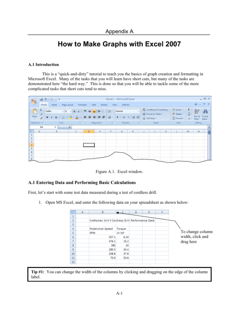
Appendix A How to Make Graphs with Excel 2007 A.1 Introduction This is a “quick-and-dirty” tutorial to teach you the basics of graph creation and formatting in Microsoft Excel. Many of the tasks that you will learn have short cuts, but many of the tasks are demonstrated here “the hard way.” This is done so that you will be able to tackle some of the more complicated tasks that short cuts tend to miss. Figure A.1. Excel window. A.1 Entering Data and Performing Basic Calculations First, let’s start with some test data measured during a test of cordless drill. 1. Open MS Excel, and enter the following data on your spreadsheet as shown below: To change column width, click and drag here Tip #1: You can change the width of the columns by clicking and dragging on the edge of the column label. A-1 2. Let’s add a few calculations to the spreadsheet. First, let’s convert RPM to rad/s. Right-click on the C column heading, , and select Insert. A new column should now appear. Click on cell C6, and type “=”. You are now entering an equation into the cell. While the cell is highlighted, click cell B6, and the cell label “B6” should now show in the equation. Now type the following, “*2*pi()/60” and press [enter]. You have now converted RPM to radians per second. To perform the same calculation for all the data, click the cell again, and click and drag on the square at the bottom-right corner of the cell: the column copies the calculation for all the rows. Clicking-and-dragging down the rest of Finally, label the new column by entering “rad/s” in cell C5. 3. Next, convert the Torque values to foot-pounds by dividing each value by 12. Do this in column E, and label the column “ft-lbf.” 4. Finally, we want to calculate the power, which is (A.1) Where T is torque (ft-lbf) and ω is rotational speed (rad/s). The conversion from ft-lbf/s to horsepower is 1 hp = 550 ft-lbf/s. Calculate power in column F, and don’t forget to label the column. Your spreadsheet should now look like this: A.2. Column Formatting We’re not going to spend a lot of time formatting the spreadsheet, since you won’t usually present a printed spreadsheet in a report. (Instead, you often import the important data into your Word document, so we’ll deal with formatting then. See Appendix B.) However, a few improvements can make viewing the spreadsheet easier. 5. First, let’s make the make the decimals uniform in column B (the RPM data): a. Using your mouse, highlight the values in column B, then right-click once to obtain a pop-up menu. A-2 b. c. d. e. Choose Format Cells… and click the menu tab called Number. Under Category, choose the item Number, which brings up additional information. Under Decimal Places, change the value in the selection box to 1. Then at the bottom of the Format Cells window, click the OK button. Tip #2: Excel gives you a shortcut so you can change the decimal places with one click. Once you’ve highlighted the cells, click on the decimal buttons Number group. located in the Home menu under the 6. Using the shortcut, make the rest of the columns show 2 decimal places. (Hint: you can highlight all the data at once.) 7. You can also adjust the width of the columns to bring the data a bit closer together. Your spreadsheet should now look something like: A.3 Creating the Graph We are now ready to create a graph. Again, we’ll show you a few short-cuts as we go, but we are going to focus on learning the nuts and bolts here. 1. At the top of the page, click the Insert tab. 2. In the menu that appears below the Insert tab , a new series of Groups will appear. Under the Charts group, click on the Scatter button. present experimental data. The scatterplot is the most common way to 3. There are several Chart types to choose from. Click on the first option, which shows a plot called Scatter with only Markers. (Experimental data is usually plotted as unconnected symbols.) A blank box will appear, and a new menu called Chart Tools will appear at the top of Excel. The Design tab should already appear. 4. Let’s select some data to plot. Within the Design tab is the Data group. Click Select Data. The following window should appear: A-3 5. We have decided to plot Torque (in-lbf) vs. RPM. Select Add from the window. The following window should now appear: Under Series X values, click the Select Range button . Now highlight the column of RPM data, and click Select Range button again. Repeat this process for the Series Y values, selecting the Torque (in-lbf) data this time. 6. While we’re editing the series, let’s choose a useful name for the data series. Enter “Torque” for the series name. Your plot should now look like the following: A.4. Formatting the Graph We now have a plot, but it is not formatted properly. We will now modify the chart as follows: 7. Adding Axis Titles: Select the Layout tab under Chart Tools. Locate the group entitled Lables, and select Axis Titles. Under Primary Horizontal Axis Title, choose Title Below Axis. Under Primary Vertical Axis, choose Rotated Title. Titles now appear on the plot; click on the axis titles to edit them. Rename the axis titles as “Rotational Speed (RPM)” and “Torque (inlbf).” A-4 8. Notice that the chart has a title “Torque” at the top. We will later be using a figure title, so click on the title and delete it. 9. Modifying the axis numerals: The extra decimals in the axes are more than necessary. Can you locate a point on chart to within 0.01 inch-pounds? It makes more sense to reduce the decimal places to be practical and to simplify the figure. The reason the extra decimal places are showing is that Excel is smart! It recognizes that you changed the decimal places in the data. However, we can turn off this feature as follows: a. Right-click on the x-axis, and select Format Axis from the pull-down menu. b. Select Number from the next menu. c. At the bottom of that window is a selection box called Linked to source. Click the box to unselect it. Close the window. d. Repeat for the y-axis. The figure should now look something like this: Tip #3: You can force the decimals to be as many (or as few) as you like. This is done by typing a value into the Decimal places box when in Format Axis>Number. 10. Formatting the series: Experimental data is usually plotted as unconnected symbols. You may recall that we specifically chose a plot with unconnected symbols, but for some reason (called a bug), Excel has given us lines again! Also, we prefer black and white plots. Why? Because your reports are likely to be printed, copied, or FAXed in black-and-white. So it makes sense to create them in black-and-white; when colored points and lines are printed, they all show up as gray, and may not be easy to distinguish. Even worse, some colors may disappear in the final print or copy. The good news is that all series formatting occurs in one menu. To format the series, do the following: a. Right-click on the series and select Format Data Series from the pull-down menu. b. Under Line Color, select No Line; this removes the connecting lines. c. The symbols are made up of two parts, the marker fill and the marker line (outline). Each is listed on the menu; you can select a variety of fill and line types, but for this exercise A-5 let’s choose solid colors. Select Solid line for marker line color, and Solid fill for the marker fill. Choose a gray color for the fill, and black for the line. d. We can also change the size of the markers. Select Marker Options, and under Marker Type, select Built-in. You can now change the type of the marker (its basic shape) as well as its size. Let’s change the size to 5-point. e. Click on Close to exit the menu. 11. Adding a Plot Border: The plot is missing its border (the line is missing on the right side of the plot). To add a plot border, right-click on the plot, and select Format Plot Area. Under Border Color, select Solid Line, and choose a gray color to match the rest of the plot. 12. Changing Gridlines: The horizontal lines in the plot are called gridlines. Gridlines can help the reader identify points on the plot, but can sometimes be distracting and add little value. For the sake of this exercise, let’s delete the gridlines. Click on the plot, and select the Layout tab under Chart Tools. Click Gridlines, then Primary Horizontal Gridlines, and select None. At this point your plot should look something like this: 13. Moving/Formatting the legend: If we bring the legend box inside the plot area, we can expand the plot area, making the plot more readable: a. Right-click on the legend, and choose Format Legend from the pull-down menu. b. Under Legend Options, unselect the box titled Show the legend without overlapping the chart. c. While in this window, let’s add a border to the legend: Choose the menu Border Color, select Solid line, and then select a gray color to match the rest of the figure. d. Click Close to exit the window. Now you can click and drag the legend anywhere you want. 14. Removing the Chart Border: To remove the border from the chart, right-click near the edge of the chart, and select Format Chart Area from the pull-down menu. Select No Line under Border Color. Your plot should now look like: A-6 Tip #4: To save a lot of effort later, you can save this format as a Template that you can call up later. To do this, • Under Chart Tools, select the Design tab. Click on “Save as Template”. • Save the Chart Type in the box labeled File Name (like “ME 236”). • Click on “Save”. When you make a chart, you will now be able to select this as your format from Insert>Scatter>All Chart Types>Templates folder. Your new template will appear as the • icon: You can even set this chart as your default style by clicking the icon and then selecting Set as Default Chart. A.5. Adding a Trendline Now we will add a trendline (curve-fit) to the series. Do the following: 15. Right-click on one of the data points, and select Add Trendline. In this case, it appears a linear trendline is appropriate, so select it (it’s the default selection). 16. While in this menu, we can also change the name to something like “Linear Curve Fit.” This will now appear in the legend (you may have to change the size of the legend to fit it in). 17. If it is meaningful to the reader, we can also show the equation for the trendline by selecting the box Display Equation on Chart. Close the menu. 18. You should edit the curve-fit equation so that the proper variables appear (T instead of y, RPM instead of x). You can enter the equation by simply clicking on it. You can also move the equation if you wish. The graph should now look like: A-7 A.6. Importing the Graph into Word We can now (finally) import the graph into our Word Document. 19. Open MS Word, and keep Excel open. 20. In Excel, right-click on your chart. Choose Copy from the pop-up menu. 21. Go to Word, and move the cursor to where you want to paste the plot. Right-click and choose Paste from the pop-up menu. The graph should now be in your document! 22. At this point you may need to alter the size and shape of your figure. You can do this by clicking and dragging on the corner and sides of the chart window. You can also change the size of the plot within the chart window the same way. 23. An important issue to be aware of is the font size: it has to be readable. Keep your fonts around 10-12 points. You can change the font size of the entire figure by selecting the chart, then changing the font size in Word’s Home menu. A small font menu also appears if you rightclick on the chart. Warning: Changing the figure size and font size can change your axis labels. THIS IS NOT GOOD: Notice that even the x-axis scale has changed! A-8 24. Now, write a figure number and descriptive title below it. Center both the graph and the title by highlighting them and selecting Canter look something like this: from the Home menu. Your figure should now Figure 1. Torque and power data for a Craftsman 14.4V cordless drill. Tip 5#: Not only can you edit your graphs easily within Word, but you can call up the original Excel file! Just right-click on the chart, and select Edit Data. A.7. Advanced Axis Formatting You may have noticed that, if you weren’t careful, the x- or y-axis numbers were too sparse, as in below: A-9 Notice that the x-axis values are too sparse, making it harder to get an idea of the actual values of the data. Simply changing the font size or graph size doesn’t always work, but we can make a few other modifications to make the plot more readable: 25. Forcing the axis scaling: Let’s force the axis scale to read every 50 RPM as follows: a. Right-click on the x-axis, and select Format Axis. b. Choose the Axis Options menu (it should be the default selection), and locate Major Unit. Select Fixed. c. Choose a value of 100 for the major unit, and close the window. The plot should noe look like this: 26. Adding minor tick marks: Sometimes the reader needs more resolution, but adding more numbers to the axis over-complicates the plot (try changing the major RPM units to 20, for example, and see what happens). Instead, we can add minor tick marks (tick marks without numbers). Let’s try this: a. Right-click the x-axis, and select Format Axis again. b. Under Axis Options, locate Minor Unit. Select Fixed, and enter a value of 20. A-10 c. Below this selection is an option called Minor Tick Mark Type. Select Outside from the options. Close the window, and your plot should look like: A.8. Adding a Secondary y-Axis A common problem is how to plot two series on the same plot even though the y-variable is different. Let’s show how to do this by adding the calculated power data to the graph. 27. Adding the series: Right-click on the plot, and choose Select Data. Click Add, and then select the x- and y-series corresponding to the power data, just as we did in Task 5. Name the series “Power.” 28. Because the power values are so low compared to the torque, the Power data are barely visible at the bottom of the plot. To make a secondary y-axis, right-click on one of the Power series data points, and select Format Data Series. Under Series Options, choose Secondary Axis. 29. You can now modify the marker style, and add an axis title like we did earlier. Experiment with different marker styles and sizes. Your plot may now look something like: Note that, for simplicity, the trendline equation was removed, as was the trendline title in the legend. Note, however, that the trendline itself is still in the graph. A-11 30. One formatting issue has just come up. We prefer the significant figures in the axes to be uniform, but the power axis is not. If you have this same problem, you can fix it as follows: a. Right-click on the axis, and choose Format Axis. b. Under the Number menu, choose the category Number. An option called Decimal Places appears. Choose the value 2. c. Close the menu, and the secondary y-axis should now have uniform decimal places. 31. Don’t forget to add a figure number and descriptive title below the figure. A-12 Appendix B How to Make Tables with MS Excel and Word 2007 In this section, we will learn how to make basic tables using MS Excel and Word 2007. Like Appendix A, this appendix is only an introduction, not a complete guide. Let’s start with the torque and power measurement data we used in Appendix A: Rotational Speed Torque Power RPM rad/s in‐lbf ft‐lbf hp 557.1 58.34 6.24 0.52 0.06 476.1 49.86 15.20 1.27 0.11 380.0 39.79 24.00 2.00 0.14 290.3 30.40 34.40 2.87 0.16 258.8 27.10 37.60 3.13 0.15 70.9 7.42 53.60 4.47 0.06 B.1 Creating a Table in MS Word The simplest way to begin a table is to copy the data from the Excel spreadsheet: 1. Select the data in Excel, and right-click to open the pull-down menu. Select Copy. Then go to the Word document, right-click, and select Paste. The cells should appear in your document like below: Rotational Speed Torque Power RPM rad/s in‐lbf ft‐lbf hp 557.1 58.34 6.24 0.52 0.06 476.1 49.86 15.20 1.27 0.11 380.0 39.79 24.00 2.00 0.14 290.3 30.40 34.40 2.87 0.16 258.8 27.10 37.60 3.13 0.15 70.9 7.42 53.60 4.47 0.06 B.2 Formatting the Table and Data. We now have the basic form of a table in Word, but it needs to be formatted. 2. Creating cell borders: Move your mouse over the table until the selection icon top left corner of the table. Click the icon, which highlights the entire table. a. Right-click on the table selection icon , and select Borders and Shading. B-1 appears at the b. In the menu that appears, select the All setting under the Borders tab, and select the color to be Automatic. The table should now have black lines around all the cells, as shown below. Rotational Speed Torque Power RPM rad/s in‐lbf ft‐lbf hp 557.1 58.34 6.24 0.52 0.06 476.1 49.86 15.20 1.27 0.11 380.0 39.79 24.00 2.00 0.14 290.3 30.40 34.40 2.87 0.16 258.8 27.10 37.60 3.13 0.15 70.9 7.42 53.60 4.47 0.06 3. Sizing and locating the table: Select the entire table (by clicking the selection icon ), and then under the Home tab. This will center the table on the page. select the Center justify button You can also change the font and font size for the entire table at once (choose a readable font size, between 10- and 12-point. Finally, you can modify the size of the table by clicking and dragging the selection icon at the bottom left of the table. 4. Centering the Columns: Center the data within their cells as follows: Highlight all the cells under the Home tab. This aligns (but not the entire table), and select the Center justify button all the data with their column labels. The table should now look like: Rotational Speed RPM 557.1 476.1 380.0 290.3 258.8 70.9 rad/s 58.34 49.86 39.79 30.40 27.10 7.42 Torque in‐lbf 6.24 15.20 24.00 34.40 37.60 53.60 ft‐lbf 0.52 1.27 2.00 2.87 3.13 4.47 Power hp 0.06 0.11 0.14 0.16 0.15 0.06 B.3. Formatting the Data Labels You’ll notice in the above table that some columns do not have labels; or rather, column titles apply to more than one column. We can fix this with a little formatting. 5. Merging cells: Select the cell “Rotational Speed” and the blank cell next to it. Right-click, and select Merge Cells from the pull-down menu. The two cells have now been combined. Repeat for the Torque columns. You can also move the cell border between the columns to even the two columns of Rotational Speed data. The result is below. B-2 Rotational Speed RPM rad/s 557.1 58.34 476.1 49.86 380.0 39.79 290.3 30.40 258.8 27.10 70.9 7.42 Torque in‐lbf ft‐lbf 6.24 0.52 15.20 1.27 24.00 2.00 34.40 2.87 37.60 3.13 53.60 4.47 Power hp 0.06 0.11 0.14 0.16 0.15 0.06 6. Modifying borders and shading: To make the column labels stand out more, we could change the line that separates the labels and the data: a. Select the entire row containing the units (RPM, rad/s, etc.). Right-click, and select Borders and Shading from the pull-down menu. b. There are three sub-menus available: Borders, Page Border, and Shading. In the Borders submenu, click on the Custom button on the lower left. Under Width, choose 1½ point thickness. Then under Preview, click on the bottom line of the cell. The line should appear thicker. Click OK, and the change should appear on your table. c. You could also shade the label cells. Highlight all the cells containing column labels and units, and open the Borders and Shading window again. Click the Shading tab, and under Fill, choose a gray shade (say, 15% gray). The result is below. Rotational Speed RPM rad/s 557.1 58.34 476.1 49.86 380.0 39.79 290.3 30.40 258.8 27.10 70.9 7.42 Torque in‐lbf ft‐lbf 6.24 0.52 15.20 1.27 24.00 2.00 34.40 2.87 37.60 3.13 53.60 4.47 Power hp 0.06 0.11 0.14 0.16 0.15 0.06 B.4 Aligning the Data by the Decimal Point The problem with the centered data is that it is hard to distinguish the large values from the small ones in the column. The standard way of presenting numerical data, therefore, is to align the data by the decimal point. This is done as follows: 1. Highlight all the cells in one column containing numerical data. Then click the Align Left button under the Home tab. 2. With the data cells still highlighted, click on the tab selection button on the left side of the tab bar until the Decimal Tab appears. This is shown in the figure on the next page. With Decimal Tab chosen, click and drag on the tab bar to locate the tab at the center of the column. 3. Repeat for the other columns. B-3 Click and drag to align data Choose Align Decimal The result is below. Rotational Speed RPM rad/s 557.1 58.34 476.1 49.86 380.0 39.79 290.3 30.40 258.8 27.10 70.9 7.42 Torque in‐lbf ft‐lbf 6.24 0.52 15.20 1.27 24.00 2.00 34.40 2.87 37.60 3.13 53.60 4.47 Power hp 0.06 0.11 0.14 0.16 0.15 0.06 B.5 Adding Table Number and Title The table number and title must be put above the table, and centered. The title should be meaningful and complete. Add a Table Title as shown below. Note that the table is numbered, and the title is descriptive – not just “Power vs. RPM.” Also note that the title does not appear within the table, but above and outside it. The final result is below. Table 1. Performance data for Craftsman 14.4V cordless drill. Rotational Speed RPM rad/s 557.1 58.34 476.1 49.86 380.0 39.79 290.3 30.40 258.8 27.10 70.9 7.42 Torque in‐lbf ft‐lbf 6.24 0.52 15.20 1.27 24.00 2.00 34.40 2.87 37.60 3.13 53.60 4.47 Power hp 0.06 0.11 0.14 0.16 0.15 0.06 B.6 Final Note The table above is one way to present your data; you may have a better way to organize the data. Some features are mandatory (like naming and numbering the table, including units, aligning the data at the decimal), but decisions on style are up to personal preference and the preference of your audience. Follow this rule: choose a style and format based entirely on whatever makes the data the most understandable to the reader. B-4 NOTE ON THE EQUATION EDITOR: I do not recommend using the embedded equation editor in MS Office 07. It is unacceptably cumbersome, difficult to format, and does not translate perfectly to other versions of MS Word. If you want to find out for yourself, try the following tutorial. I recommend (insist) you use MS Equation Editor 3.0, the same software use on the previous version of Word. It still exists in Word; you can access it under the Insert menu by selecting Object. For the laboratory assignment, read Appendix C in the manual. C-1 Appendix C How to Make Equations in MS Word 2007 C.1 Inserting an Equation To insert an equation, choose Insert from the pull-down menus, and choose Equation Symbols group. A window should appear as below. Move tab Equation box from the Equation Options pull-down menu Figure C.1. Equation editor window. Tip #1: For Word 2003 users, Word 2007 still provides the old equation editor, MS Equation 3.0. You can access it under the Insert menu by selecting Object. C.2 A Quick Tour The equation window has three parts: a Move tab, which allows you to click-and-drag the equation anywhere in your document; the Equation box, containing the equation; and a pull-down menu containing formatting options. Notice also that the menu at the top of the document (called the ribbon) has changed, and now has equation design options, including Tools, Symbols, and Structures groups. Tip #2: Word 2007 allows one-click editing. Clicking once on an equation opens it for editing. The Equation editing menu (ribbon) should also appear. If it does not, simply click once on the Equation Options menu, anddirectly. the equation editing ribbon should appear. Youpull-down can enter characters Parentheses, brackets and now braces can be entered from the C-2 a. Basic Characters Begin typing, and text should appear in the equation box. Some characters act as short-cuts: type x^3, for example, and the editor will automatically replace it with (after you hit the space bar or some other character). The shortcuts are listed below. This feature can be convenient; try typing (ax+b)/(x^2+1) and see what happens. Another nice feature of the equation editor is that parentheses automatically resize to fit the equation. For example, (x/y) becomes . Table C.1. Shortcut characters. Characters (linear format) x^2 x_2 Get replaced as (professional format) x/y >=, <= Tip # 3: If you want to keep a shortcut symbol as is, put quotes around the character. For example, x”^”3 becomes . b. Symbols and Special Characters To insert symbols into your equation, click on any character appearing in the Symbols group. By default, the Basic Math symbols are shown. Not all of them are visible; to see more, click on the up or down arrows to the right. Click the more button to show all the basic math symbols. up & down arrows more (shows all symbols) Figure C.2. Symbols Group. When all the basic math symbols are shown, you can access other categories of symbols by clicking the more button at the top of the menu, as shown below. Click this to access other categories of symbols Figure C.3. Symbols sub-menu, showing other symbol categories. C-3 c. Mathematical Structures More complicated mathematical symbols and common expressions are located in the Structures group. For example, the Integral button contains a host of common integral formats, like this one: The dashed boxes (called equation placeholders) are placeholders for text and symbols. C.3 Example: Entering an Equation Let’s try out the editor. We’ll reproduce the classic Gaussian function, (C.1) 1. Open a new equation box (Insert... Equation) . 2. Type P(0<= in the equation box. The resulting equation should appear: . 3. To find the Greek character zeta , go to the Symbols group, and click the More button to show the complete list of symbols. Then click the More button as shown in Figure C.3 to reveal the list of symbol categories. Select Greek Letters, then locate the zeta symbol from the list and click it. Your equation should now appear as . 4. Complete the left-hand side of the equation: . , first type 1/ in the equation box. Then click on the Radicals structure, and 5. To write the fraction choose the structure . Click the dashed box, and enter 2π inside the radical (you’ll need to go to the Symbols group to find π). At this point your equation should look like: . 6. Find the Integral structure , and insert it into the equation. Type in the limits 0 and z. 7. In the larger dashed box, type e^, then [space]. The term is automatically converted to a superscript. from the Script menu.). Click the dashed (Alternatively, you could select the superscript structure box, and type -1/2 [space]. The equation should now look like: . symbol again, and type ^[space]. The superscript structure should appear. Then 8. Insert the zeta click the dashed box and type the number 2 inside it. Type the right curser to exit the superscript, and insert at the end. The equation should now be identical to Equation C.1. C-4 C.4 Storing the Equation for Use in Future Documents A new feature in Word 2007 allows you to store commonly used equations for use in documents you create later. Try this with your new equation: Click the pull-down menu in the equation box, and select Save as New Equation… Give this equation a name, like “Normal Error Function,” and the equation is now permanently stored in Word for use anytime. To call up this function or any other stored function, click the More button (the down-arrow button) below the Equation Symbol . A list of saved equations appears in a pull-down menu. Scroll down and click the equation you want. C.5 Stacking and Aligning Equations Equations can be aligned in a stack. To do this, simply press [shift] and [enter]. This begins a new equation below the previous one. To align this stack at the equal sign, highlight the equations, rightclick, and choose "align at" from the menu. You can align at other characters as well. To do this, right-click on a character in the equation, and choose Align at this Character (if it is an option for that character). You must do the same for all the equations in your stack. C.6 Inline Equations Equations can appear in-line (for example, like this: ) in a line of text. If you start an equation in a line of text, it will automatically be formatted as an inline equation (notice the smaller integral symbol). The line spacing will adjust automatically. If you wish to have the equation appear in a paragraph by itself, click the Equation Options pulldown menu on the equation box (see Figure C.1) and choose Change to Display. C.7 Numbering Equations Numbering equations is not easy in Word 2007. If you try to add a number to the right of an equation, Word automatically converts the equation to an inline equation. The Microsoft Development website suggests, instead, to put the equation in a borderless 1 row, 3 column table. Here’s how to do it: 1. From the Insert tab, click the Table icon . 2. From the drop-down menu, highlight a 3x1 table, as shown below. C-5 Figure C.4. Table selection pull-down menu. A table should appear as shown below. 3. Notice that after the table was created, two new Table Tool tabs appear in the Word menus as shown below. Select the Layout tab, as shown below. Properties button Figure C.5. Table Layout ribbon. 4. We need to change the properties of the table. Click the Properties button . Then select the Column tab. The following menu will appear: C-6 Figure C.6. Table Properties menu. Change the preferred width of each column as follows: Column 1 Column 2 Column 3 15% 75% 15% 5. Choose the Table tab, and make the preferred width 100%. This will make the table span the entire width of the page margins. 6. Click anywhere in the center column, and choose Align Center from the Alignment group, as shown in Figure C.7. Align Center Align Right Center Figure C.7. The Table Tools’ Alignment Group. 7. Click on the rightmost column, and select Align Right Center. In that column, you can write an equation number, like (C.2). 8. Copy your equation into the center column of the table. This is shown below: (C.2) 9. Finally, we want to eliminate the border lines. Highlight the entire table, and the Table Tools tabs should appear at the top of Word. Choose the Design tab. Click More (down arrow) on the Borders C-7 , and from the pull-down menu, select No Border : button: number should finally look like this: . The equation and (C.2) 10. One final note: Equations are to be treated as words in a sentence. That is, they should be punctuated. For example, Equation (C.1) is considered the last word in the sentence above. Therefore a period has been placed after the equation. The problem is, however, if we place a period after the equation, Word converts the equation into an inline equation! Tip # 4: To add punctuation after an equation, type the punctuation INSIDE the equation box. Word will not convert it to an inline equation. C.8 A Short-Cut for Equation Numbering As you can see, numbering equations is a painful and tedious process in Word 2007. Fortunately, there is some relief : we can short-cut the process by saving the entire table as an equation. Here’s how: 1. 2. 3. 4. Highlight the entire table we just created. Select Insert, then the down-arrow on the Equation button. A pull-down menu should appear. Scroll down to the bottom, and select Save Selection to Equation Gallery… Give the new equation a name like “Numbered Equation.” The new equation (with table and format) is now saved for later use. Tip # 5: Make your saved Numbered Equation more generic by replacing the equation with a blank equation: Tip # 6: You can short-cut the process further by highlighting the table and making it an Autocorrect substitution. You can learn how to use Autocorrect in the help menu. C.9 For More Help Consult these sites for more help. For a more detailed on-line tutorial of the Equation Editor, go to http://ist.uwaterloo.ca/ec/equations/equation2007.html. For a more detailed tutorial on equation numbering: http://blogs.msdn.com/microsoft_office_word/archive/2006/10/20/equation-numbering.aspx. C-8
