Seven Color Theories of Good Design
advertisement
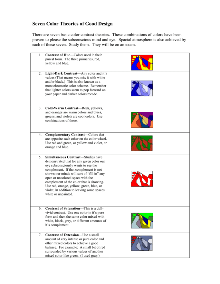
Seven Color Theories of Good Design There are seven basic color contrast theories. These combinations of colors have been proven to please the subconscious mind and eye. Spacial atmosphere is also achieved by each of these seven. Study them. They will be on an exam. 1. Contrast of Hue—Colors used in their purest form. The three primaries, red, yellow and blue. 2. Light-Dark Contrast—Any color and it’s values (That means you mix it with white and/or black.) This is also known as a monochromatic color scheme. Remember that lighter colors seem to pop forward on your paper and darker colors recede. 3. Cold-Warm Contrast—Reds, yellows, and oranges are warm colors and blues, greens, and violets are cool colors. Use combinations of these. 4. Complementary Contrast—Colors that are opposite each other on the color wheel. Use red and green, or yellow and violet, or orange and blue. 5. Simultaneous Contrast—Studies have demonstrated that for any given color our eye subconsciously wants to see the complement. If that complement is not shown our minds will sort of “fill in” any open or uncolored space with the complement of the color that is showing. Use red, orange, yellow, green, blue, or violet, in addition to leaving some spaces white or unpainted. 6. Contrast of Saturation—This is a dullvivid contrast. Use one color in it’s pure form and then the same color mixed with white, black, gray, or different amounts of it’s complement. 7. Contrast of Extension—Use a small amount of very intense or pure color and other mixed colors to achieve a good balance. For example: A small bit of red surrounded by various values of another mixed color like green. (I used gray.)
