Color Theory: Wheel, Schemes, & Application in Art
advertisement
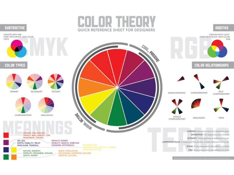
Color Theory ROY G BIV Color Wheel Color Values Color Schemes Element of Art Color—is the element of art that is produced when light, striking an object, is reflected back to the eye. Color Wheel—a tool used to organize color. It is a 12 step wheel that shows 3 primary colors, 3 secondary colors, and 6 intermediate colors. Primary Colors Red Yellow Blue Primary Colors—are colors that you can NOT make, but are used to make every other color with the addition of white, black, or the complement color. Secondary Colors + Red Orange = Green = Violet Yellow + Yellow Blue + Blue = Red Secondary Colors—are colors that are made by mixing two primary colors. Intermediate Colors + Red Orange + Yellow Red-Orange Red = Orange + Blue + = Violet + Yellow-Orange = + Blue-Green Yellow Red-Violet Violet Blue = Green = Blue-Violet = Green Yellow-Green Intermediate Colors— also called TERTIARY COLORS are colors that are made by mixing one primary color and one secondary color. Three Properties of Color 1. Hue—a color without black or white (red, yellow, blue, etc.) 2. Intensity—which refers to the brightness or dullness of a hue. For example, we may describe the color blue as "royal" (bright, rich, vibrant) or "dull" (grayed). 3. Value—meaning its lightness or darkness. The terms shade and tint are in reference to value changes in colors. Color Intensity The intensity of a HUE changes when its complement (opposite) is added. Mixing in a complementary color will dull or lower the intensity and eventually the hue will lose its own color qualities and appear a neutral gray or brownish color. In Edward Hopper’s, Gas, he uses color intensity to create intense saturation of color. (notice the dark brown black areas) Parts of the painting are made from one single color (red) or (green) and its intensity levels have been changed by adding its complement more or less or its complementary color. Color Value Pure Hue Shades Add Black or Complement Add White Tints The Old Guitarist by Pablo Picasso During his blue period, Picasso painted with primarily cold blues tinged with green, often depicting beggars as seen in this painting. Cold = Cool Colors (blue, green, purple) Tint = add white Shade = add black Intensity = add complement Color Schemes • Color Schemes—are plans for organizing colors according to the relationship on the color wheel. By following a color scheme you can avoid putting together colors in a confusing or unpleasant way. • Frequently Used Color Schemes— Monochromatic, Analogous, Complementary, Triad, Split Complement, Double Complement, Warm Colors, Cool Colors, Tweaked Triad, Tetrads, Flickering Effects, Adventurous Analogous, Value and Saturation In Titian’s Bacchus and Ariadne, he balances the painting by placing the two complementary colors, blue and orange, throughout the composition. This creates not just harmony but vibrancy also. Harmony = balance, unity Vibrancy = • Apply color value around the boarders of the sections in your Zentangles • When you shade you are to focus on depth in order to create a sense of 3-D (you may use colored pens or colored pencils to add color value) • When shading focus on tints, shades, and intensity of your colors • You may keep the same color scheme for your second Zentangle or switch it up COLOR VALUE WITHIN ZENTANGLES
