about Colors_29apr10
advertisement
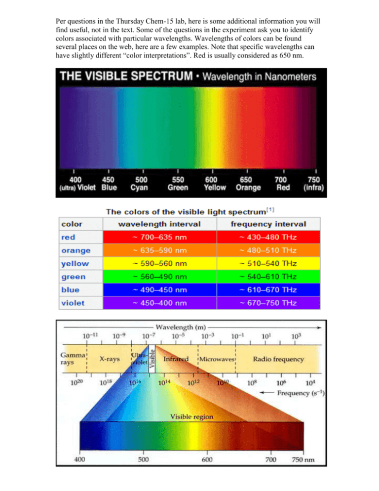
Per questions in the Thursday Chem-15 lab, here is some additional information you will find useful, not in the text. Some of the questions in the experiment ask you to identify colors associated with particular wavelengths. Wavelengths of colors can be found several places on the web, here are a few examples. Note that specific wavelengths can have slightly different “color interpretations”. Red is usually considered as 650 nm. It also turns out that not all colors are “real” in the sense that they have a specific wavelength. Magenta, for example, is a mixture of red and blue (from opposite ends of the visible spectrum) which our eye-brain perceives as a new color ... but it has no real wavelength, just two peaks in the red and blue which our vision combines. Part of our experiment utilized combinations of food dye solutions. Predictions of resulting color can be made on a “color wheel”. Here is some additional detail on use of the wheel. What happens if we make an additive mixture of equal amounts of green and violet? To gain a sense of the resulting hue, first draw a straight line between green and violet, as seen in the figure above. Then place a dot on the line halfway between the two colors. Next, draw a straight line from the middle of the color circle to the dot. The resulting line points towards blue, with a green tendency. To predict an additive mixture with a lot of violet and relatively little green, you would place the dot closer to violet. Notice that the resulting hue would be closer to blue. Similarly, try a mixture of mostly orange, with just a little green. Notice that the result is yellowish-orange. The color wheel below provides actual colors to predict mixtures, with a slightly different arrangement around the wheel. Note that when a particular color is absorbed (removal), the resulting transmission color is towards the opposite side of the wheel. Thus a solution which absorbs yellow appears blue when we look through it, so it would have high Transmittance in blue, and high Absorption in yellow. This is a key idea in answering the experiment questions. Beer’s law is the linear relationship between absorbance and concentration, and gives a straight line when plotted. In our case, “concentration” was qualitative, since we don’t know the molar concentration of dye in the grocery store food color, but we do know how we diluted it. Thus the concentrations would be 1/10mL, 2/10mL, 3/10mL, etc. (e.g. 0.1, 0.2, 0.3 ...) which can be used to make the plot of concentration versus absorbance. Remember that we use a calculated Absorbance value from Transmittance measurements, because the Absorbance scale on the spectrophotometer is a highly non-linear log value making it hard to read and therefore likely to be inaccurate It also turns out that not all colors seen are “real” in the sense that they have a specific wavelength. Magenta, for example, is a mixture of red and blue (from opposite ends of the visible spectrum) which our eyes + brain perceive as a new color ... but it has no real wavelength, just two peaks in the red and blue which our human vision combines. Our spectrophotometer sees it as a combination of two absorptions rather than a single color. Color in practice is a combination of actual wavelengths and human perception. The chromaticity diagram below attempts to combine the two, showing what the eye sees in colors and the associated wavelength (if real). In the lab we are focused more on wavelengths more than perception, so we rely on the spectrophotometer, which separates magenta into its component colors. Here’s an example of “Chromaticity Diagram’, used to analyze colors for printing and monitors according to limits of human perception. The diagram traces spectral colors (ones with a wavelength) around the perimeter, but the straight line connecting blue and red are non-spectral colors, without a wavelength assignment. Our brain combines red and blue colors into “purple”, but the spectrophotometer does not. Finally, here is some energy data, which might be useful for lecture material, illustrating the more energetic nature of blue colors.
