Torturing Excel into doing statistics
advertisement
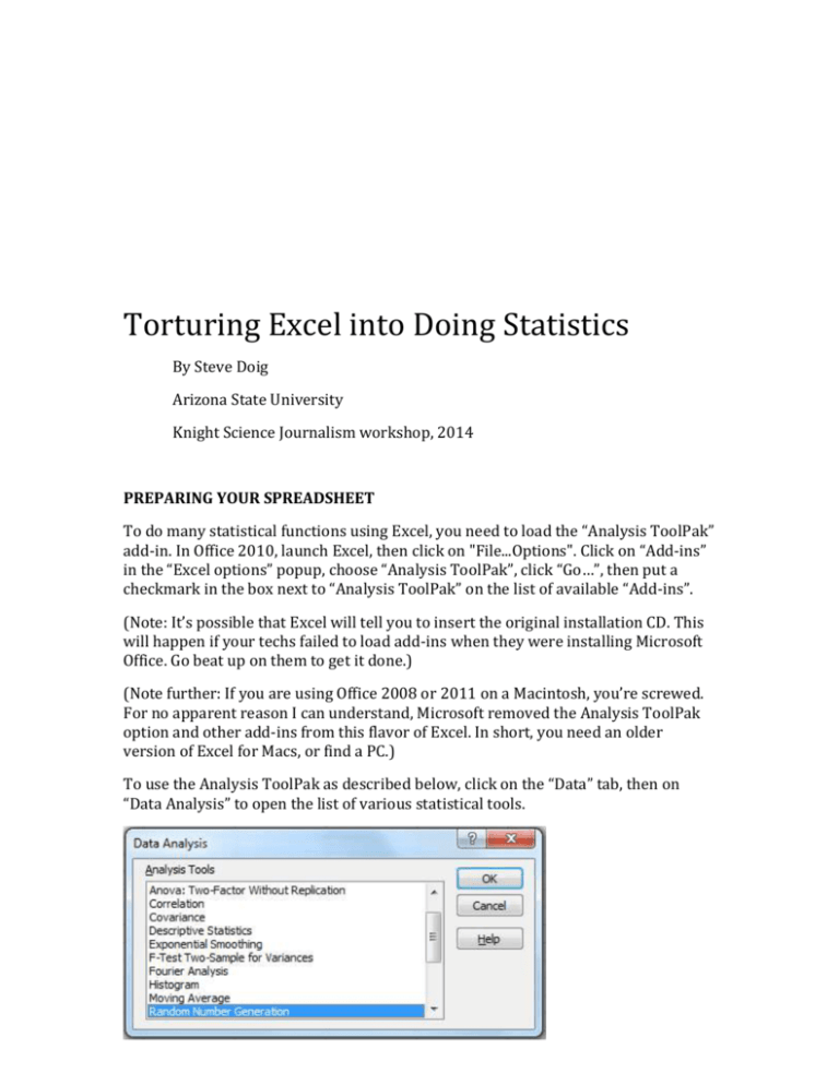
Torturing Excel into Doing Statistics By Steve Doig Arizona State University Knight Science Journalism workshop, 2014 PREPARING YOUR SPREADSHEET To do many statistical functions using Excel, you need to load the “Analysis ToolPak” add-in. In Office 2010, launch Excel, then click on "File...Options". Click on “Add-ins” in the “Excel options” popup, choose “Analysis ToolPak”, click “Go…”, then put a checkmark in the box next to “Analysis ToolPak” on the list of available “Add-ins”. (Note: It’s possible that Excel will tell you to insert the original installation CD. This will happen if your techs failed to load add-ins when they were installing Microsoft Office. Go beat up on them to get it done.) (Note further: If you are using Office 2008 or 2011 on a Macintosh, you’re screwed. For no apparent reason I can understand, Microsoft removed the Analysis ToolPak option and other add-ins from this flavor of Excel. In short, you need an older version of Excel for Macs, or find a PC.) To use the Analysis ToolPak as described below, click on the “Data” tab, then on “Data Analysis” to open the list of various statistical tools. UNIVARIATE (DESCRIPTIVE) STATISTICS You can use Excel functions to find the following statistics useful in describing single variables. “Range” means the appropriate beginning and ending cell addresses, such as B2:B100. General TOTAL: =SUM(range) Number of values: =COUNT(range) Measures of central tendency MEAN (the arithmetic average): =AVERAGE(range) MEDIAN (the middle of a sorted list): =MEDIAN(range) MODE (the most common value, though not necessarily near the middle): =MODE(range) Measures of dispersion Maximum value: =MAX(range) Minimum value: =MIN(range) Range: There’s no function for the distance between the MAX and MIN, but you can calculate it by subtracting MIN from MAX (duh!) N-tiles: Use the Percentile function to calculate the point in a range below which the given percentage of the values fall. For instance, to find the 90th percentile for a range of values, use =PERCENTILE(range, .9) Quartiles: This function is just a special case of the Percentile function. For instance, to find the top quartile (the 75th percentile), use =QUARTILE(range,3). The “3” refers to the third quartile. Standard Deviation The standard deviation of a range is another useful measure of dispersion. Think of it as the average distance of all the values from the mean, although that’s not exactly how it’s calculated. The standard deviation is useful in defining outliers. For instance, in a normal (bell curve) distribution like height or test scores, fewer than about 0.3% of the values will be more than three standard deviations above or below the mean of the values. Use =STDEV(range) to get the standard deviation. Standardized scores (Z-scores) The Z-score is simply the number of standard deviations a particular value is above or below the mean of all the values. The result will be positive if the value in question is greater than the mean, and negative if it’s less than the mean. The syntax of the function is =STANDARDIZE(value,average,standard deviation). For instance, to get the Z-score of the value in cell B2, part of a range from B2 to B100, write the formula like this: =STANDARDIZE(B2,AVERAGE(B$2:B$100),STDEV(B$2:B$100)) Again, a Z-score of greater than 3 or less than -3 would be a likely way to define outliers. Descriptive statistics using Analysis ToolPak Another option is to get all your descriptives in one pass. Go to the Data tab, then Data Analysis. Pick "Descriptive Statistics" and hit OK. You'll get a window that looks like this (depending on your version): Enter your input range, from the upper left corner to the lower right corner, like C1:D367. Check the "Labels in First Row" box and "Summary Statistics". Leave the output for a new worksheet. Hit OK. You'll get output on a new sheet that looks like this: It gives you all the useful descriptives for each variable, as well as some more exotic ones used for diagnostics of your data. MULTIVARIATE STATISTICS Often you want to compare two or more sets of values to see if there is an interesting relationship between them. A classic journalism example of this would be to compare school test scores with poverty in each school, as measured by the percent of students eligible for free lunch. There are three related methods commonly used to examine such data for relationships: Correlation, linear regression, and x-y scatter plots. Correlation The “coefficient of correlation” (also called “Pearson’s r”) between two sets of numerical variables is a number between -1 and 1. If one value gets larger as the other value gets larger, then r will be positive; the closer to 1, the stronger the relationship. On the other hand, if one value goes up as the other goes down, r will be negative and the closer to -1, the stronger the relationship. If r=0, it means there is no relationship. To calculate Pearson’s r for two columns of data, use the CORREL function. For example, assume you have the Poverty Percent numbers in range C2:C201 and the Median Test Score numbers in range D2:D201. Use this formula: =CORREL(C2:C201, D2:D201). The result will be a number between -1 and 1. In this example, it almost certainly will be something like -.6 to -.8, a strong negative correlation, which means that as poverty goes up, scores go down. Multiple Correlation of three or more variables Sometimes you want to check several columns of numerical data to see which variables have relationships of some magnitude with which other variables. For instance, it might be World Cup football team data showing matches, yellow cards, red cards, fouls committed, etc., like this: To do this, you want a Correlation Matrix. Once you have the Analysis ToolPak loaded, go to the Data tab, then click on Data Analysis, and choose “Correlation” from the list of tools. This window will pop up: In “Input Range”, put the upper left and lower right corners of your numerical data range, like B1:G32. (Be sure to check the “Labels in First Row” box.) For output, you’re usually best with “New Worksheet Ply”. Just leave it blank and Excel will put the result on a new sheet. Click “OK” and you’ll get results on a new sheet that look like this: The Pearson’s r for each combination of variables is found in the intersection of the appropriate row and column. For instance, there’s a moderate positive relationship (r=.42) between penalties scored and goals scored with right foot. On the other hand, there is little relationship (r=-.09) between penalties scored and goals scored with left foot And so on. (Note: The staircase of ones simply means there is a perfect relationship between any variable and itself.) Linear Regression More can be done with the concept of relationship between variables. A really useful tool is linear regression, which can be used to predict the value of a “dependent” variable given the value of one or more “independent” variables. Given that result, we can compare the predicted value with the actual one and see whether the actual was better or worse than expected, given the value of the other variable(s). A good example, again, is the relationship between poverty and school scores. Before reporters learned to use regression, we did school test score stories by listing schools in descending order of scores; not surprisingly, the “best” schools typically were rich suburban ones and the “worst” were schools in poverty-stricken urban neighborhoods. Regression, however, lets us level the playing field and look at school scores as though all students were in the same economic level. Consider this data set of 200 schools: The independent variable is “low income percent” and the dependent is “median score”. (How do you know which is which? Usually chronology will tell you. It makes sense that the poverty a child is reared in will affect his or her scores; it doesn’t make sense that a child getting a low score will plunge the family into poverty.) To do the regression, again go to the Data tab and “Data Analysis”. Choose “Regression” and get this window: This one is trickier to fill out. For “Input Y Range”, put in the top and bottom of the dependent variable column; in this case, that’s D1:D201. For “Input X Range” put in the upper left to lower right corners of your independent variables. In this example, there is only one independent variable, so put in C1:C201. Click the “Labels” box, and ignore “Confidence Level” and “Constant is Zero”. For now, don’t check any of the other boxes. Then hit OK. You’ll get a new sheet with output that looks like this: It looks imposing, but you mostly need to pay attention only to the three numbers marked here: The three numbers of interest are: R Square: This is simply the square of Pearson’s r. It is interpreted as “the percentage of variance from the mean explained”. It tells you how good the independent variable is at predicting the dependent variable. In the example above, r squared is .67, or 67%. This means that the single variable of poverty accounts for two-thirds of the reason different schools are as far above or below the mean of all schools as they happen to be. It also means that other factors (teacher training, mobility, salaries, whatever) explain the remaining third of the variance from the mean. Intercept and slope: This takes you back to middle school algebra and the equation for a line: y = mx + b. The b is the so-called y-intercept, the point where the line crosses the y axis. And m is the slope of the line (remember “rise over run”?) and can be positive (rising to the right) or negative (falling to the right) In this case, y = mx +b becomes SCORE = -.61 * LOW_INCOME_PERCENT + 71.2 This formula can be used in two interesting ways: It can be turned into a statement you could make in a story. Multiply the slope (-.61) by 10 and you can say “Every 10 percentage point increase in poverty means a 6 point decrease in test scores.” The formula also can be used to calculate the predicted dependent variable value given a particular independent variable. Then this predicted value can be compared to the actual value of a particular record to see whether it is better or worse than might be expect. This difference between predicted and actual is known as the RESIDUAL. You can create and use residuals using the Regression tool in the Analysis ToolPak. Fill out the Regression window like this: Hit OK and you'll get output that looks like this (I formatted it to two decimals to make it easier to read: From the data, Observation 1 is Parkland district's Fogelsville School, with 4% poverty and a median score of 63. The residual table tells us that with a poverty rate of just 4%, the model predicts a median score of 68.78. So the residual is -5.78 -below expectations. The z-score (standard residual) is -.51, so it really isn't that far off the mark. But you can copy this table and paste it back on the original data sheet, then sort to look for outliers. At least one really stands out, a school with 92% poverty and a median score of 67, compared to a predicted score of just 15. The Z-score is 4.6, way off the charts. One possibility is that this is a magnet school that gives special attention to its carefully selected students; another possibility is that cheating is going on. Using x-y scatter plots to look at your regression data It's a good idea to visualize the "shape" of your data. To do that, select your two columns of data. Then go to Insert, then pick the "Scatter" button and choose the style that just has dots without lines. By default, you'll get something that looks like this: You can see the clear linear pattern of the data: As the poverty percent on the horizontal X axis grows larger, the Median Scores get smaller. It's also easy to spot the outliers, like the school mentioned above with high poverty and high scores. Under "Chart Layouts" you can choose the grid that has both dots and a straight line running through the data. You'll get this: The straight line is the regression line that is defined by your y = mx + b formula. The closer all your points are to that line, the higher your r squared value will be. ANOTHER REGRESSION EXAMPLE The practice worksheet has a tab with recent life expectancy and infant mortality rate for 179 countries. If you do the regression analysis on this data and, use infant mortality to predict life expectancy, you get an r-squared of 0.85 -- very high -- and a regression formula of LifeExp = 78.9 - 0.33 * InfantMortality. The scatterplot looks like thisL OTHER STATISTICAL TOOLS Excel has a variety of other statistical tests and tools available. But they are increasingly clumsy and problematic to use. If you get serious about using statistics for your work, you should start whining to the boss about getting SPSS. If you want to do more serious statistical analysis and SPSS costs too much, a good alternative is the free open-source package PSPP. You can download it from http://www.gnu.org/software/pspp/ SPECIAL NOTE TO MAC USERS Despite my whiny complaint at the top about Macs not being equipped with the Analysis ToolPak, it is possible to do many of the same statistical analyses using Excel functions. Descriptive statistics: As noted above, values like the mean, median, maximum, minimum, standard deviation and such all can be calculated in Macs using the appropriate Excel function. There's no one-stop shopping like there is with the Analysis ToolPak, but you can get the descriptive stats you need using functions. Correlation: Use =CORREL(array1,array2), where each "array" is the range of a column of data. This is fine for correlation of two variables, but you can only do two variables at a time. The Analysis ToolPak lets you do multiple variables at once; you can't with the Mac. Regression: The numbers you care about can be gotten using these functions: =LINEST(y_range,x_range): This will produce the slope of the line. =INTERCEPT(y_range,x_range): This will produce the y-intercept, the point where the line will cross the y axis. Predicted values: You can take the LINEST value and the INTERCEPT value and build a formula in a new column that will calculate the predicted value for each actual value. If you then subtract the predicted from the actual, you will get the residuals for each value. =RSQ(y_range,x_range): This is the r-squared value, which tells you how strong your independent variable (x) is at explaining the variance of the dependent values (y) from their average. Finally, there is another option for Mac users. It is called StatPlus:mac LE, and it is billed as a replacement for the Analysis ToolPak. You can get a free 30-day demo from http://www.analystsoft.com/en/products/statplusmacle/ , but the full license is $250.
