Constructing Stem and Leaf Plots
advertisement
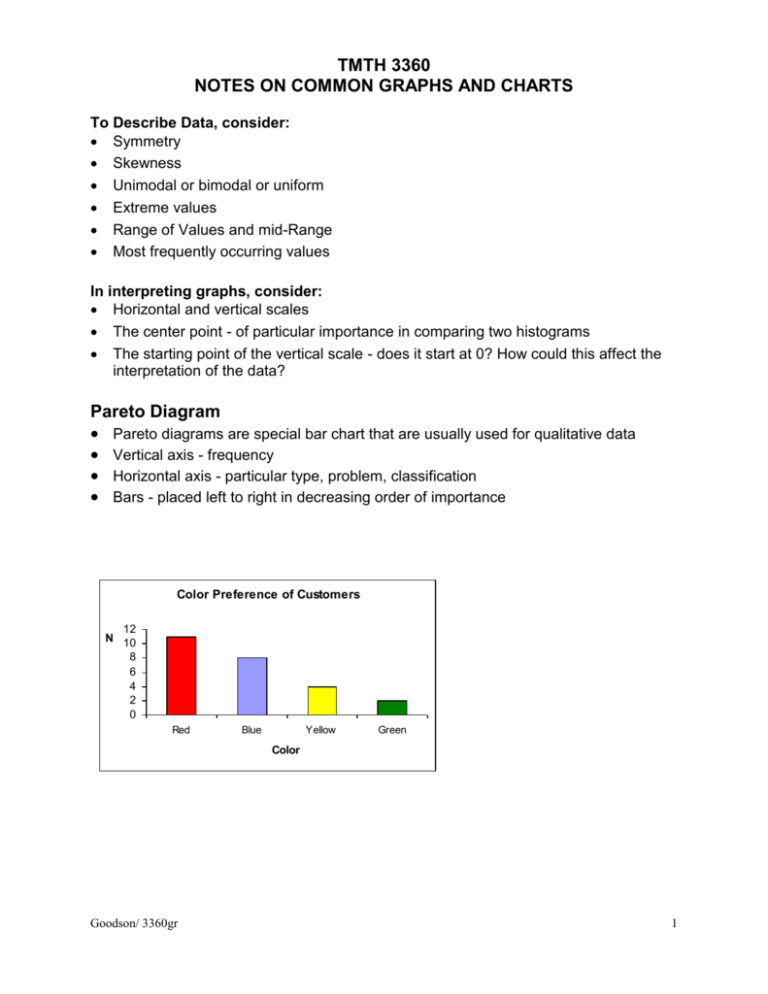
TMTH 3360 NOTES ON COMMON GRAPHS AND CHARTS To Describe Data, consider: Symmetry Skewness Unimodal or bimodal or uniform Extreme values Range of Values and mid-Range Most frequently occurring values In interpreting graphs, consider: Horizontal and vertical scales The center point - of particular importance in comparing two histograms The starting point of the vertical scale - does it start at 0? How could this affect the interpretation of the data? Pareto Diagram Pareto diagrams are special bar chart that are usually used for qualitative data Vertical axis - frequency Horizontal axis - particular type, problem, classification Bars - placed left to right in decreasing order of importance Color Preference of Customers 12 N 10 8 6 4 2 0 Red Blue Yellow Green Color Goodson/ 3360gr 1 Data The charts that follow use the following data which is time in minutes. Time 110 130 115 130 115 130 120 135 120 135 120 135 120 140 125 140 125 140 125 140 130 145 130 145 150 Dot plots Dot plots are used for quantitative data. Each observation is represented as a dot and placed over its number value on a number line. Time to Complete Task Dotplot Dotplot Time to Complete Task Time to Complete Task 110 110 110 120 130 140 Time 120 130 120 Time 150 140 130 150 140 150 Time Goodson/ 3360gr 2 Constructing Frequency Distributions and Histograms Determine the number of classes - usually you will have from 5 to 20; it depends on how many data values you have and the spread of the data. Determine the class width - Generally, divide the difference between the largest and smallest values by the number of classes desired; round up. All the classes should be of equal width to make uniform comparisons of the class frequencies. Write the class boundaries. The lowest class end point must be less than or equal to the smallest data value (note that it does not have to equal the lowest value). The uppermost class endpoint must be greater than the largest data value. Construct a table that includes each class and the corresponding frequencies or relative frequencies. Table 1 Frequency Distribution of Time Time Count 110 115 120 125 130 135 140 145 150 1 2 4 3 5 3 4 2 1 Note Table1 There are 8 classes. The class width is 5. The frequency of the first class is 1; i.e. there is 1 value within the class which has a midpoint at 110. This distribution was constructed using Minitab. If you are using XL, the format is different. Examine the histogram for Table 1. It is formulated by plotting the class boundaries on the horizontal axis and bars with heights that correspond to the frequency (or relative frequency) for each class. 5 Frequency 4 3 2 1 0 110 115 120 125 130 135 140 145 150 Time Goodson/ 3360gr 3 Constructing Stem and Leaf Plots Create the stem Divide the range of the data into equal units to be used as the stem The first few digits in each number will be the stem. Your data should result in five to fifteen stems, depending on the value of the data. List the stem values in order in a vertical column Draw a vertical line to the right of the stem values; the leaves will be placed to the right of this line. Attach the leaves. Digits to the right of the stem form the leaves. Specifically use the digit to the right of the stem and drop the rest of the digits. The leaves are ordered numerically on each branch. If the number of leaves in each stem row is too large, divide the stems into two groups, the first corresponding to leaves beginning with 0 through 4 and the second with 5 through 9 Advantages Easy to construct Can find the median and quartiles Can read the numerical values from the graph Note: it can be difficult to construct stem and leaf plots if the are many values and/or many digits. Stem-and-leaf of Time N = 25 Leaf 1 Unit 11 11 12 12 13 13 14 14 15 0 55 0 555 0 555 0 55 0 Goodson/ 3360gr 4 Constructing a Box Plot [Note more details are on the box plot handout.] 1. Draw a number line showing the range of values of your data 2. Above the number line, locate the median, and the lower and upper quartiles -- [The difference between the upper and lower quartiles is called the inter quartile range (IQR).] 3. The box extends over the number line from the lower to upper quartile, i.e. the sides of the box are on lines through each of the quartile points. 4. A line is drawn through the median within the box. 5. Draw lines extending to the left and to the right of the box, ending at: the smallest data point > Q(.25) - I.5IQR. the largest data point < Q(.25) + I.5IQR. 6. Plot extreme points as individual points. Advantages of the Box plot The graph provides a summary display. There is no clutter. It highlights the important features: median, quartiles and extreme values Additional data does not complicate the graph. Interpreting Box plots The box encloses the middle 50% of the data. If the data is symmetrical, the median will lay half way between the extreme values. If the median is close to the left quartile and far from the right extreme, the data is skewed right. If the median is close to the right quartile and far from the left extreme, the data is skewed right. Two or more Box plots drawn on the same scale and side by side provide an effective way of comparing samples. Boxplot of Time 150 Time 140 130 120 110 Goodson/ 3360gr 5
