Results heuristic evaluation:
advertisement
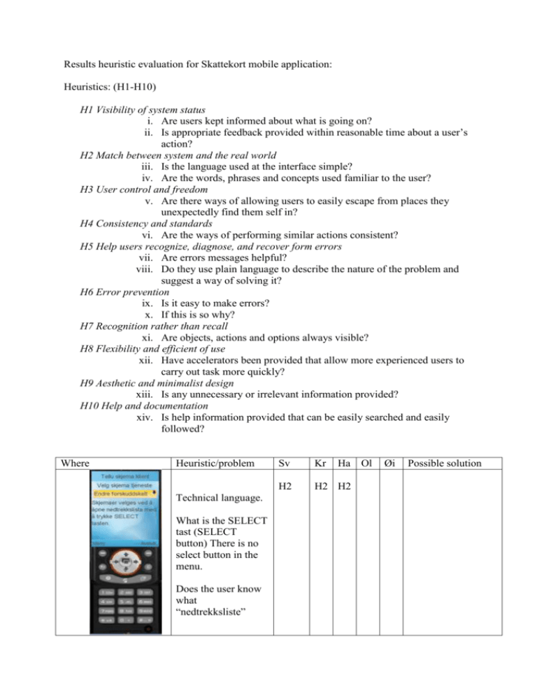
Results heuristic evaluation for Skattekort mobile application: Heuristics: (H1-H10) H1 Visibility of system status i. Are users kept informed about what is going on? ii. Is appropriate feedback provided within reasonable time about a user’s action? H2 Match between system and the real world iii. Is the language used at the interface simple? iv. Are the words, phrases and concepts used familiar to the user? H3 User control and freedom v. Are there ways of allowing users to easily escape from places they unexpectedly find them self in? H4 Consistency and standards vi. Are the ways of performing similar actions consistent? H5 Help users recognize, diagnose, and recover form errors vii. Are errors messages helpful? viii. Do they use plain language to describe the nature of the problem and suggest a way of solving it? H6 Error prevention ix. Is it easy to make errors? x. If this is so why? H7 Recognition rather than recall xi. Are objects, actions and options always visible? H8 Flexibility and efficient of use xii. Have accelerators been provided that allow more experienced users to carry out task more quickly? H9 Aesthetic and minimalist design xiii. Is any unnecessary or irrelevant information provided? H10 Help and documentation xiv. Is help information provided that can be easily searched and easily followed? Where Heuristic/problem Technical language. What is the SELECT tast (SELECT button) There is no select button in the menu. Does the user know what “nedtrekksliste” Sv Kr Ha Ol H2 H2 H2 Øi Possible solution Very cumbersome to select and fetch the form H8 What is BSU,? Not everybody is familiar H2 with this terminology H8 H8 H8 H8 H2 H2 H2 “Beskriv grunn” is this the reason for desired change, or has it anything to do with changing one parameter to another (like grunnbeløp) “Gjenlevende partner” Is misleading Where Heuristic/problem The use of “nedtrekksliste”/ drop down menu may be misleading. How do you press the arrow to the right? It is not obvious that you have to press the select button. Sv Kr Ha Ol H1 H3 Hjelp brukergrensesnitt The text saysgation with arrows. Not all telephones have arrows, confusing when the phone only has a joystick H5 H5 H5 Where Heuristic/problem Sv Kr Ha Ol Øi Possible solution This interaction form is best suited for direct manipulation such as mouse or pen. You cannot manipulate the scrollbar directly. Show buttons Øi Possible solution Users will not necessarily find this submenu. Not intuitive to go from the menu to the submenu. H7 H7 Positive that you can get help for each field. When you first know about this sub-menu it is easy to use. More investigations into icons are required. Overall consistency Need for explanation of the icons, and possible better icons. Eg. it is not easy to recognize the last icon. Green icon looks like a play button 90 degrees tilted. The delete icon looks like backspace, ie deletion of one single character, but it deletes all the characters in the field OK Not possible to see which of the two red tabs that is active. H7 H7 Use something similar to tool-tips. Make the active tab larger than the other tabs. Arrow showing progression could be useful. Make use of more colors. The text does not inform you that you have to evaluate and send. You have to go through the whole setup before you discover that it is not evaluated. Since evaluate and send form is only used in this screen it would be better to only show this in the last screen. There is no heading on this page. After sending, last page. The program is finished, but there is no way to end the program. General problems H1 Change the text. H1 H1 H1 H1 Select evaluate from the menu, and then send form. Velg evaluer skjema i menyen og deretter send skjema. H4 The form should be automatically evaluated without the need for selecting this from a menu. H4 H3 When pushing the H6 exit button on the telephone, the program is immediately terminated without asking if the user really wants to do so. “Hent skjema”, H4 ”Evaluer skjema” and ”Send skjema” is located under the Menu, even though they are only to be used at one place in the program. Confusing and inconsequent. The redo-button H6 restarts the whole Some way of terminating the application, confirming the user that she has changed her skattekort. Some kind of message/choice. Implement these features as buttons on the pages they are to be used. application instead of the last ting changed (as expected). Conclusions Hani Sven
