Chapter 5 – Cross Tabulations
advertisement
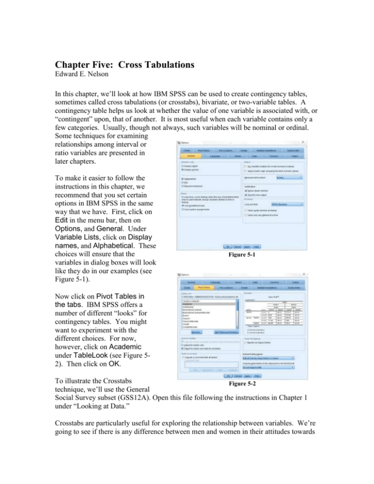
Chapter Five: Cross Tabulations Edward E. Nelson In this chapter, we’ll look at how IBM SPSS can be used to create contingency tables, sometimes called cross tabulations (or crosstabs), bivariate, or two-variable tables. A contingency table helps us look at whether the value of one variable is associated with, or “contingent” upon, that of another. It is most useful when each variable contains only a few categories. Usually, though not always, such variables will be nominal or ordinal. Some techniques for examining relationships among interval or ratio variables are presented in later chapters. To make it easier to follow the instructions in this chapter, we recommend that you set certain options in IBM SPSS in the same way that we have. First, click on Edit in the menu bar, then on Options, and General. Under Variable Lists, click on Display names, and Alphabetical. These choices will ensure that the variables in dialog boxes will look like they do in our examples (see Figure 5-1). Figure 5-1 Now click on Pivot Tables in the tabs. IBM SPSS offers a number of different “looks” for contingency tables. You might want to experiment with the different choices. For now, however, click on Academic under TableLook (see Figure 52). Then click on OK. To illustrate the Crosstabs Figure 5-2 technique, we’ll use the General Social Survey subset (GSS12A). Open this file following the instructions in Chapter 1 under “Looking at Data.” Crosstabs are particularly useful for exploring the relationship between variables. We’re going to see if there is any difference between men and women in their attitudes towards abortion.” To create a contingency table (crosstabs), from the menu, click on Analyze, Descriptive Statistics, and Crosstabs. This will open the dialog box shown in Figure 5-3. You then choose the row (usually the dependent) variable and column (usually the independent) variable.1 In Appendix A, you will see that there are seven variables that deal with opinions about abortion. Let’s choose abhlth (abortion if the woman health is endangered) for our row variable and sex (respondent’s sex) for the column variable. To do this, select the variable you want from the list and click on it to highlight it, then use the arrow keys to the right of the List box to move the variable into either the Row or the Column box (for now, ignore the Bottom box – more about it in Chapter 8). If you’ve done everything correctly, your screen will look like Figure 5-4, but don’t click OK yet! In the buttons within the Crosstabs dialog box, click on Cells. Here you have a number of choices for the information you would like to have in each cell of your table. The Observed box should already be selected—it shows the actual number of cases in each cell. You will also want to see percentages as well as raw numbers so that you can easily compare groupings of different sizes. You should always make sure that each category of the independent variable totals 100%; our general rule is to have the dependent variable in the row and the independent variable in the column. So choose Columns for the percentages as in Figure 5-5. Figure 5-3 Figure 5-4 Now click on Continue to get back to the Crosstabs dialog box. Once you are back 1 The independent variable is the causal variable. Figure 5-5 there, click OK. IBM SPSS will now open the Output window, which will show you your table (see Figure 5-6). The Case Processing Summary shows the Valid, Missing, and Total cases. The high percent of missing cases here reflects the people who were not asked this particular question in the survey. Only the valid cases are used in the table. The Crosstabs shows the 1,233 valid cases arranged in a table that shows what percent of men and women said either Yes or No to the abhlth question. Note that 85.4% of the men and 87.8% of the women said Yes, a percentage point difference of only 2.4. Figure 5-6 Your initial conclusion here might be that on abortion issues, there’s virtually no Figure 5-7 difference between men and women in their responses. Is this correct or did you stop your analysis a little too soon? Let’s look at a different abortion question. Repeat the steps above, but use abnomore as your dependent variable this time. Your results should look like Figure 5-7. Now we see that 45.0% of the men and 44.7% of the women said Yes to “Abortion if a woman is married and wants no more children.” When we compare Figure 5-6 with Figure 5-7, we see there is a large difference between total Yes answers (87% compared with 45%), which indicates that abortion as an issue needs to be broken down into specific conditions if you want to study it in depth. But there still isn’t much of a difference between men and women in these two variables. Even though this difference is small, we still might wonder if it is a significance difference. To answer this we will need to do some more statistical analysis. For our next cross tabulation, again go to the menu and choose Analyze, Descriptive Statistics, and Crosstabs. In the Crosstabs dialog box place abnomore as the row variable and sex as the column variable. Now click on the Statistics button, then Chi-Square to obtain a measure of statistical significance, and on Phi and Cramer’s V, which are measures of the strength of association between two variables when one or both are at the nominal Figure 5-8 level of measurement. Phi is appropriate for tables with two rows and two columns, while Cramer’s V is appropriate otherwise. Your dialog box should look like Figure 5-8. Click on Continue, then OK. The table in Figure 5-7 reappears, but with some additional information (you might have to scroll down to see it)—look for “Chi-Square Tests” (Figure 5-9). The Pearson Chi Square test indicates that the relationship is not statistically significant. It would occur by chance approximately 91 times out of 1000. The Cramer’s V of .003 in Figure 510 (Symmetric Measures) indicates that there is no relationship. Let’s look at a somewhat different table. We’re going to consider the relationship between education and political views. Click on Analyze, Descriptive Statistics, and Crosstabs. If the variables you used before are still there, click on the Reset button, then move polviews to the Row box and degree to the Column box. Since both of these variables are ordinal, we’ll want to obtain different statistics to measure their relationship. Click on Statistics and then on Chi-square and Kendall’s tau c. (Tau c is a measure of association that is appropriate when both variables are ordinal and do not have the same number of categories.) Figure 5-9 Figure 5-10 Now click on Continue and then on Cells and then on Column percents. Now click on Continue and then click on OK. What do the results show? While the Chi-square statistic is statistically significant, the value of Kendall’s tau c is quite low indicating that there is virtually no relationship between these two variables. The pattern to the percents shows the same lack of relationship. Chapter Five Exercises 1. Suppose we measure class by what people perceive their social class to be (using the variable named class). How closely is this measure related to a person’s selfidentified political views (polviews)? Note: before running this crosstab, look at the frequency distribution for class. (See Chapter 4 on univariate statistics.) You may want to recode this variable before proceeding. (See Chapter 3 on transforming data.) 2. Consult the codebook in Appendix A describing this dataset. Other than education and self-perceived class, what other background variables (such as age, marital status, religion, sex, race, or income) might help explain a person’s political views? (Here as well, you may need to recode some variables before proceeding.) 3. Is trust related to race? Run crosstabs for trust (Can people be trusted?) with race and see what you find. 4. Is ideology a general characteristic or is it issue specific? That is, are people who are liberal (or conservative) on one issue (such as capital punishment) also liberal (or conservative) on other issues (such as gun control or legalizing marijuana)?
