Stat 410/501 January 24, 2014: Intro to R & some models
advertisement
Stat 410/501 January 24, 2014: Intro to R & some models
> # Stat410/510: January 24, 2014
> # Demonstrate simple simulation using hypothetical model of data
>
> HealthCntr <- read.table(
file="http://users.humboldt.edu/rizzardi/Data.dir/jollyrancher.TXT", header=T)
> names( HealthCntr )
[1] "Treatment" "Before"
"After"
> # HealthCntr # Typing the object's name would show entire dataset
> head( HealthCntr, 5 ) # just show first 5 rows
Treatment Before After
1
hot
98.7 98.9
2
hot
96.9 99.7
3
hot
95.9 98.2
4
hot
98.2 99.1
5
hot
97.0 98.5
> attach( HealthCntr ) # Make variables within data frame more easily accessible
The following object is masked from HealthCntr (position 3):
97
98
99
100
101
102
After, Before, Treatment
> table( Treatment ) # add up counts for each category of Treatment variable
Treatment
cool
hot nothing
33
35
36
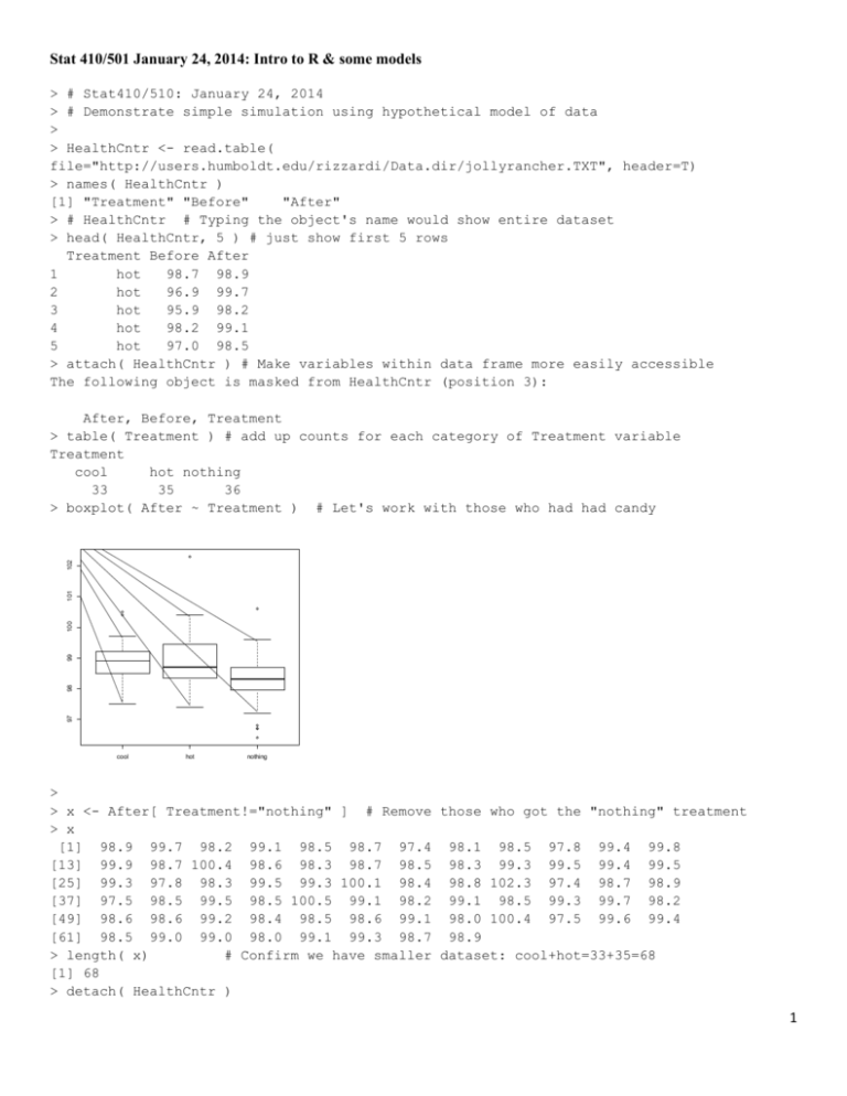
> boxplot( After ~ Treatment ) # Let's work with those who had had candy
cool
hot
nothing
>
> x <- After[ Treatment!="nothing" ] # Remove those who got the "nothing" treatment
> x
[1] 98.9 99.7 98.2 99.1 98.5 98.7 97.4 98.1 98.5 97.8 99.4 99.8
[13] 99.9 98.7 100.4 98.6 98.3 98.7 98.5 98.3 99.3 99.5 99.4 99.5
[25] 99.3 97.8 98.3 99.5 99.3 100.1 98.4 98.8 102.3 97.4 98.7 98.9
[37] 97.5 98.5 99.5 98.5 100.5 99.1 98.2 99.1 98.5 99.3 99.7 98.2
[49] 98.6 98.6 99.2 98.4 98.5 98.6 99.1 98.0 100.4 97.5 99.6 99.4
[61] 98.5 99.0 99.0 98.0 99.1 99.3 98.7 98.9
> length( x)
# Confirm we have smaller dataset: cool+hot=33+35=68
[1] 68
> detach( HealthCntr )
1
>
> summary( x )
Min. 1st Qu. Median
Mean 3rd Qu.
Max.
97.40
98.48
98.75
98.90
99.32 102.30
> sd( x ); var( x ) # semicolon allows multiple commands on same line
[1] 0.8189856
[1] 0.6707375
>
> dev.new() # create a new graph page while preserving the previous graph(s)
>
# not using dev.new() would cause the new graph to erase the old
> hist( x ) # histogram of After temperatures
> rug( jitter(x) ) #jitter adds random variation to reduce overlapping of points
10
0
5
Frequency
15
Histogram of x
97
98
99
100
101
102
x
> x!=102.3 # Let's remove the obviously feverish student
[1] TRUE TRUE TRUE TRUE TRUE TRUE TRUE TRUE TRUE
[13] TRUE TRUE TRUE TRUE TRUE TRUE TRUE TRUE TRUE
[25] TRUE TRUE TRUE TRUE TRUE TRUE TRUE TRUE FALSE
[37] TRUE TRUE TRUE TRUE TRUE TRUE TRUE TRUE TRUE
[49] TRUE TRUE TRUE TRUE TRUE TRUE TRUE TRUE TRUE
[61] TRUE TRUE TRUE TRUE TRUE TRUE TRUE TRUE
> x <- x[ x!=102.3 ]
# x no longer has 102.3 data
> length( x)
[1] 67
> mean( x); sd( x ); var( x )
[1] 98.84627
[1] 0.7091028
[1] 0.5028268
>
TRUE
TRUE
TRUE
TRUE
TRUE
TRUE
TRUE
TRUE
TRUE
TRUE
TRUE
TRUE
TRUE
TRUE
TRUE
2
> dev.new()
> qqnorm( x )
> qqline( x )
# normal quantile-quantile(qq) plot to inspect normality
# perfectly normal data would follow line
99.0
98.5
97.5
98.0
Sample Quantiles
99.5
100.0
100.5
Normal Q-Q Plot
-2
-1
0
1
2
Theoretical Quantiles
>
>
>
>
>
# Thick tail causes S shape; for example, compare to t-distribution data.
y <- rt( 67, df=3 )
dev.new()
qqnorm( y ); qqline( y )
0
-4
-2
Sample Quantiles
2
4
Normal Q-Q Plot
-2
-1
0
1
2
Theoretical Quantiles
>
> t.test( x, mu=98.6 )
# do a t-test on the hypothesis mean=98.6
One Sample t-test
data: x
t = 2.8427, df = 66, p-value = 0.005946
alternative hypothesis: true mean is not equal to 98.6
95 percent confidence interval:
98.67330 99.01923
sample estimates:
mean of x
98.84627
3
>
>
>
>
>
>
>
>
>
#Use model to simulate data: y = 98.6 + error, error ~ N( 0, 0.71^2 )
set.seed(1234) # Set the random generating seed so I can duplicate "random" data
error <- rnorm( 67 , mean=0, sd=0.71 ) #67 error points from Normal distribution
y <- 98.6 + error # could have just done y <- rnorm( 67, mean=98.6, sd=0.71 )
# demonstrate what random normal data can look like in q-q plot
dev.new()
qqnorm( y ); qqline( y )
97.0
97.5
98.0
98.5
99.0
Sample Quantiles
99.5
100.0
100.5
Normal Q-Q Plot
-2
-1
0
1
2
Theoretical Quantiles
# Normal random data doesn't look like theoretical normal data because of randomness
# Below show natural variability or normal data in 9 normal quantile plots
dev.new()
par( mfrow=c(3,3) ) # Three rows and three columns of graphs per page
for( i in 1:9 )
# A for-loop to repeat procedure 9 times
{
Y <- rnorm( 67, mean=98.6, sd=0.71 )
qqnorm( Y ); qqline( Y )
}
1
2
-2
-1
0
1
97 98 99
Sample Quantiles
99 100
98
Sample Quantiles
0
97
99.5
98.5
-1
Normal Q-Q Plot
2
-2
-1
0
1
2
Normal Q-Q Plot
Normal Q-Q Plot
Normal Q-Q Plot
-1
0
1
2
-1
0
1
98.0
Sample Quantiles
-2
97.0
98
97
99.5
98.5
-2
99.0 100.0
Theoretical Quantiles
99 100
Theoretical Quantiles
Sample Quantiles
Theoretical Quantiles
97.5
2
-2
-1
0
1
2
Normal Q-Q Plot
Normal Q-Q Plot
Normal Q-Q Plot
-1
0
1
Theoretical Quantiles
2
-2
-1
0
1
Theoretical Quantiles
2
98.5
Sample Quantiles
98.5
97.5
99 100
98
97
-2
99.5
Theoretical Quantiles
99.5
Theoretical Quantiles
Sample Quantiles
Theoretical Quantiles
96.5
Sample Quantiles
-2
Sample Quantiles
Normal Q-Q Plot
97.5
Sample Quantiles
Normal Q-Q Plot
97.5
>
>
>
>
>
+
+
+
+
-2
-1
0
1
2
Theoretical Quantiles
4
> par( mfrow=c(1,1) )
>
> t.test( y, mu=98.6 )
# set graphing back to one graph a page
# test randomly generated data (lower case y) against 98.6
One Sample t-test
data: y
t = -2.7155, df = 66, p-value = 0.008437
alternative hypothesis: true mean is not equal to 98.6
95 percent confidence interval:
98.18977 98.53741
sample estimates:
mean of x
98.36359
> tresults <- t.test( y, mu=98.6 ) # can save results to an object
> names(tresults)
# object contains a list of many components
[1] "statistic"
"parameter"
"p.value"
"conf.int"
"estimate"
[6] "null.value" "alternative" "method"
"data.name"
> tresults$p.value
# we can extract the components from the list
[1] 0.008437235
>
> ### Next we will show t-statistics and p-values from t-tests done on 1000 randomly
generated datasets
> ### where the null hypothesis is true. The t-statistics, theoretically, should follow
a
> ### t-distribution with df=67-1=66 and the p-values should follow a uniform
distribution
> ### with the lower bound of 0 and upper bound of 1.
> tstats <- rep( NA, 1000 ) #Create a place to store the 1000 t-statistics, NA=not
available; i.e., missing
> pvals <- rep( NA, 1000) #Create a place to store 1000 p-values
> for( i in 1:1000 )
+ {
+
Y <- rnorm( 67, mean=98.6, sd=0.71 )
+
testResult <- t.test( Y, mu=98.6 )
+
tstats[i] <- testResult$statistic
+
pvals[i] <- testResult$p.value
+ }
>
> dev.new()
> par(mfrow=c(2,2) )
> hist( tstats )
> qqplot(qt(ppoints(1000), df=66), tstats , main="QQ plot for t (df=66) and \n simulated
t-stats" )
> qqline( tstats, distribution=function(p) qt(p,df=66) ) #compares data to t distribution
with df=66
5
QQ plot for t (df=66) and
simulated t-stats
1
0
0
-3
-2
-1
tstats
100
50
Frequency
150
2
3
200
Histogram of tstats
-2
-1
0
1
2
3
-3
-2
-1
0
1
2
3
tstats
qt(ppoints(1000), df = 66)
Histogram of pvals
QQ plot for Uniform(0,1) and
simulated p- values
0.6
0.2
0.0
0
0.0
>
0.4
pvals
0.8
80 100
60
40
20
Frequency
1.0
-3
0.2
0.4
0.6
pvals
0.8
1.0
0.0
0.2
0.4
0.6
0.8
1.0
qunif(ppoints(1000))
> hist( pvals )
> qqplot(qunif(ppoints(1000)), pvals, main="QQ plot for Uniform(0,1) and \n simulated pvalues" )
> #Note: in the above, we could have just used ppoints(1000) since those are Uniform(0,1)
quantiles
> qqline( pvals, distribution=function(p){qunif(p)} )
> par( mfrow=c(1,1) ) # back to one graph per page
>
> # Show that about 5% of simulations resulted in type 1 errors
> sum( pvals < 0.025 )
[1] 29
> sum( pvals < 0.025 )/1000
[1] 0.029
> mean( pvals < 0.025 )
[1] 0.029
> mean( pvals > 0.975 )
[1] 0.026
> mean( (pvals < 0.025 | pvals > 0.975) ) # using the logical "|" which is the syntax for
"or"
[1] 0.055
> sum( (pvals < 0.025 | pvals > 0.975) ) / 1000
[1] 0.055
#################################################################################
# Stat410/510: January 24, 2014
# Demonstrate simple simulation using hypothetical model of data
HealthCntr <- read.table(
file="http://users.humboldt.edu/rizzardi/Data.dir/jollyrancher.TXT", header=T)
6
names( HealthCntr )
# HealthCntr # Typing the object's name would show entire dataset
head( HealthCntr, 5 ) # just show first 5 rows
attach( HealthCntr ) # Make variables within data frame more easily accessible
table( Treatment ) # add up counts for each category of Treatment variable
boxplot( After ~ Treatment ) # Let's work with those who had had candy
x <- After[ Treatment!="nothing" ] # Remove those who got the "nothing" treatment
x
length( x)
# Confirm we have smaller dataset: cool+hot=33+35=68
detach( HealthCntr )
summary( x )
sd( x ); var( x )
# semicolon allows multiple commands on same line
dev.new()
# create a new graph page while preserving the previous graph(s)
# not using dev.new() would cause the new graph to erase the old
hist( x ) # histogram of After temperatures
rug( jitter(x) ) #jitter adds random variation to reduce overlapping of points
x!=102.3 # Let's remove the obviously feverish student
x <- x[ x!=102.3 ]
# x no longer has 102.3 data
length( x)
mean( x); sd( x ); var( x )
dev.new()
qqnorm( x )
qqline( x )
# normal quantile-quantile(qq) plot to inspect normality
# perfectly normal data would follow line
# Thick tail causes S shape; for example, compare to t-distribution data.
y <- rt( 67, df=3 )
dev.new()
qqnorm( y ); qqline( y )
t.test( x, mu=98.6 )
# do a t-test on the hypothesis mean=98.6
#Use model to simulate data: y = 98.6 + error, error ~ N( 0, 0.71^2 )
set.seed(1234) # Set the random generating seed so I can duplicate "random" data
error <- rnorm( 67 , mean=0, sd=0.71 ) #67 error points from Normal distribution
y <- 98.6 + error # could have just done y <- rnorm( 67, mean=98.6, sd=0.71 )
# demonstrate what random normal data can look like in q-q plot
dev.new()
qqnorm( y ); qqline( y )
# Normal random data doesn't look like theoretical normal data because of randomness
# Below show natural variability or normal data in 9 normal quantile plots
dev.new()
par( mfrow=c(3,3) ) # Three rows and three columns of graphs per page
for( i in 1:9 )
# A for-loop to repeat procedure 9 times
{
Y <- rnorm( 67, mean=98.6, sd=0.71 )
qqnorm( Y ); qqline( Y )
}
par( mfrow=c(1,1) )
# set graphing back to one graph a page
t.test( y, mu=98.6 ) # test randomly generated data (lower case y) against 98.6
tresults <- t.test( y, mu=98.6 ) # can save results to an object
names(tresults)
# object contains a list of many components
tresults$p.value
# we can extract the components from the list
### Next we will show t-statistics and p-values from t-tests done on 1000 randomly generated datasets
### where the null hypothesis is true. The t-statistics, theoretically, should follow a
### t-distribution with df=67-1=66 and the p-values should follow a uniform distribution
### with the lower bound of 0 and upper bound of 1.
tstats <- rep( NA, 1000 ) #Create a place to store the 1000 t-statistics, NA=not available; i.e., missing
7
pvals <- rep( NA, 1000) #Create a place to store 1000 p-values
for( i in 1:1000 )
{
Y <- rnorm( 67, mean=98.6, sd=0.71 )
testResult <- t.test( Y, mu=98.6 )
tstats[i] <- testResult$statistic
pvals[i] <- testResult$p.value
}
dev.new()
par(mfrow=c(2,2) )
hist( tstats )
qqplot(qt(ppoints(1000), df=66), tstats , main="QQ plot for t (df=66) and \n simulated t-stats" )
qqline( tstats, distribution=function(p) qt(p,df=66) ) #compares data to t distribution with df=66
hist( pvals )
qqplot(qunif(ppoints(1000)), pvals, main="QQ plot for Uniform(0,1) and \n simulated p- values" )
#Note: in the above, we could have just used ppoints(1000) since those are Uniform(0,1) quantiles
qqline( pvals, distribution=function(p){qunif(p)} )
par( mfrow=c(1,1) ) # back to one graph per page
# Show that about 5% of simulations resulted in type 1 errors
sum( pvals < 0.025 )
sum( pvals < 0.025 )/1000
mean( pvals < 0.025 )
mean( pvals > 0.975 )
mean( (pvals < 0.025 | pvals > 0.975) ) # using the logical "|" which is the syntax for
sum( (pvals < 0.025 | pvals > 0.975) ) / 1000
"or"
8
