QJ-13-0243 Proposal of an empirical velocity spectrum formula in
advertisement
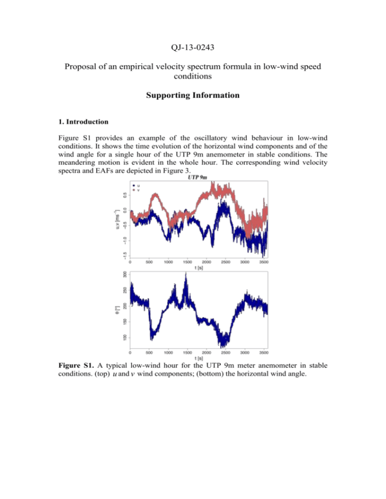
QJ-13-0243 Proposal of an empirical velocity spectrum formula in low-wind speed conditions Supporting Information 1. Introduction Figure S1 provides an example of the oscillatory wind behaviour in low-wind conditions. It shows the time evolution of the horizontal wind components and of the wind angle for a single hour of the UTP 9m anemometer in stable conditions. The meandering motion is evident in the whole hour. The corresponding wind velocity spectra and EAFs are depicted in Figure 3. Figure S1. A typical low-wind hour for the UTP 9m meter anemometer in stable conditions. (top) u and v wind components; (bottom) the horizontal wind angle. Figure S2. The three measurements sites, from top: the UTP site (a), the Tisby site (b) and the Graz site (c). The anemometers where placed at the centre of each figure. The black dots indicate the anemometers position. Source http://maps.google.it/. 2. Brief datasets description Figure S3 sketches an idealized Kaimal and Finnigan (1994) profile (Eq. 10) together with n0 and nmax . Figure S3. Red line: idealized Kaimal and Finnigan (1994) profile (Eq. 10). The blue dotted represents the extrapolated inertial range that meets nF(n) =1 at n0 . The dotted vertical lines represent n0 and nmax respectively. 4. Data analysis. It is possible to compare the skill of Eq. (10) and Eq. (19) in fitting the low-frequency part of the wind spectra averaged on n0 . Eq. (19) can be simply added to Figure 1. Since in the analysis of the averaged spectra we showed that for one-hour data Eq. (37) and hence Eq. (19) perform fine only for m < 3, introducing Eq. (19) (rescaled on n0 ) in Figure 1 would imply the anticipation of the discussion on the m values that, for the sake of clarity, we believe it should be in Section 5. In Figure S4 the average low-wind spectra for the horizontal wind components ( 1< m < 2 ) at 9 m in stable and unstable condition are plotted together with the Kaimal and Finnigan (1994) curve (Eq. 10) and with Eq. (19). Figure S1 shows that Eq. (19) is able to reproduce the low-frequency maximum associated to the meandering motion. Figure S4. UTP Average low-wind spectra for the horizontal wind components at 9 m in stable (right) and unstable (left) condition. The plots on top refer to data with 1< m < 2. The continuous line refers to the u-component, the dashed line to the v- component. The dotted red line represents Eq. (10), while the continuous and dashed red lines represent Eq. (19) (rescaled on n0 ) for u and v respectively. 5. Normalization of the low-wind spectrum. As a measure of the skill of Eq. (37) in reproducing the observed spectra, we evaluated the area of the overlap regions of the observed and analytical spectra for the cases depicted in Figures 8,10,11,12 and we normalized it with the area of the calculated spectra. Table S1 summarizes our results. Table S1 one hour UTP 9m Stable Unstable UTP 25m Stable Unstable two hours UTP 9m Stable Unstable UTP 25m Stable 1< m < 2 2<m<3 1< m < 2 2<m<3 1< m < 2 2<m<3 1< m < 2 2<m<3 1< m < 2 2<m<3 1< m <10 1< m < 2 2<m<3 1< m <10 u [%] 97 83 94 75 98 90 99 98 93 91 96 97 93 86 v [%] 91 69 87 73 80 93 99 83 93 90 98 99 88 91
