IB Physics - Uncertainties and Data Graphing
advertisement
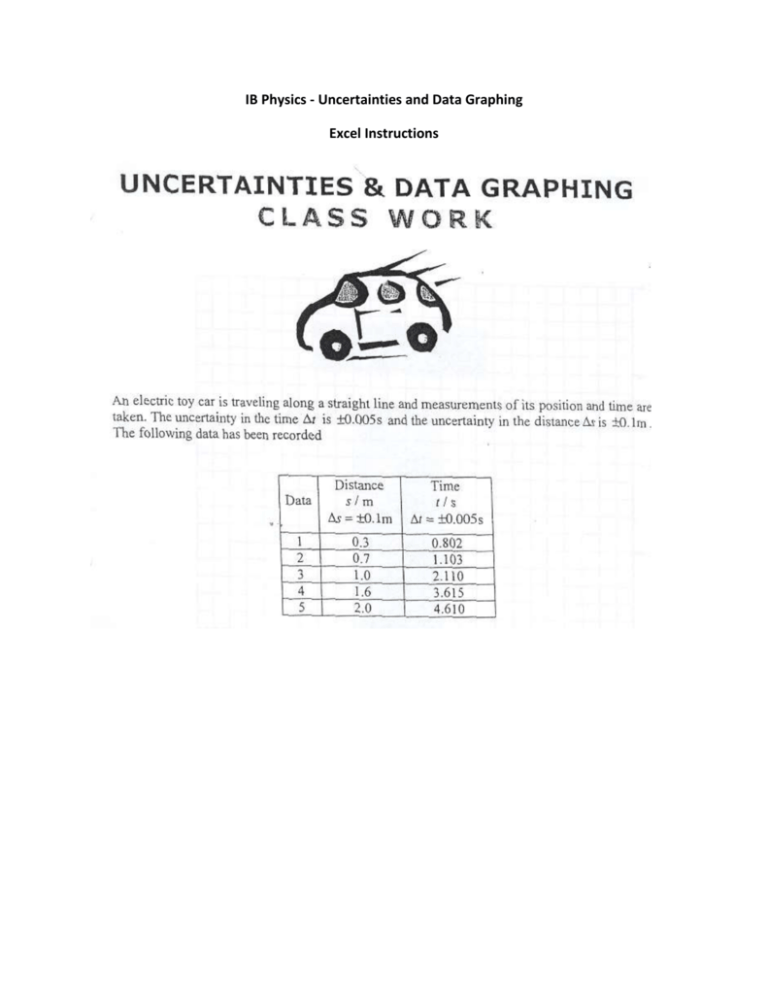
IB Physics - Uncertainties and Data Graphing
Excel Instructions
Objective: the complete the Uncertainties and Data Graphing assignment in Microsoft Excel
Procedure:
1) Enter the table from the class work handout into excel like so
Note: I have flipped time and distance; this is done for graphing ease
Note: you can add the lines around the table by using this tool
at the top of the page
2) To graph the data we highlight the data required
3) Now go to insert at the top of the page and hit scatter with only markers
This will produce a graph like so
What you notice is that distance is graphed on the y axis and time is graphed on the x axis
When highlighting data in excel for graphing, the column on the left will be graphed on the y
axis, this is the reason I flipped time and distance in my table from what was given to you.
4) To add titles and labels to the graph we click on the graph, this should bring up chart tools at the
top of the screen , in chart tools click layout
5) Add to your graph by clicking the appropriate buttons
-
Chart title
-
Axis titles
6) We can now add a trend line (line of best fit), notice this can be done in the same window (chart
tools – layout)
Add a linear trend line to your data
7) We can now add error bars to our data, remember we only need to add error bars to the
measurement with the highest percentage uncertainty, thus a calculation is needed.
I want you to do this in excel as well.
Create the following table
To perform calculations in excel we need to enter the = sign first; from here we can enter our
specific operation.
In this case to find the percentage uncertainly for time we divide the absolute uncertainty by a
measurement and multiply by 100. Notice I did not have to enter in the measurement I simple
entered the cell of which the measurement was in (cell b2 = 0.802s), now hit enter
Do the same for distance
So in the cell below enter =0.1/c2 * 100 and hit enter
Note: we can change the number of digits that are shown in the cells by right clicking and
selecting format cells, on the left it gives you some options, I use the number option and then
specify the number decimal places I want
We notice that distance has the larger percentage error therefore we will add error bars for
distance only
8) The error bar tab is also found in chart tools – layout
Select error bars with standard error, this will automatically add them to your graph.
You must however format them as they are not accurate
First we can delete the horizontal error bars (those for time), simply right click on one of the
horizontal bars and hit delete.
To format the vertical error bars right click and select format error bars, now select fixed value
and enter in your value of uncertainty (0.1 m)
9) We must add our maximum and minimum lines of best fit.
There is no direct way to do this in excel. The way I do it is to add 2 more sets of data to the
graph
For the max line of best fit I add a data point corresponding to the negative uncertainty of the
first point and a data point corresponding to the positive uncertainty of the last point, I then
connect these with a trend line.
I do the same for the min line of best fit but with the points reversed, I add a point
corresponding to the positive uncertainty of the first data point and a point corresponding to
the negative uncertainty of the last data point.
To do this you must first calculate the points (add or subtract the uncertainty from the data
point)
10) To add the max. and min. lines
Right click on the one of the data points, a window will pop up, click select data
You should see what is shown below
Hit the add button, when this happens you will see the following
We can now name the series (max or min slope) and select the values we want.
To do this click on the blue box with the red arrow beside the series x values box
You can now simply highlight the desired x values for the points you want to add (I will do max
first)
I highlighted the appropriate cells, now click on the box with the red arrow beside the edit series
box
This will bring you back to the original edit series box, do the same with the y values (I think you
need to clear what is in the y values box first (={1})
Notice the points on the error bars
You can now add a trend line between those points by right clicking one of them and selecting
add trend line
Repeat these steps for the minimum line of best fit
We can add a legend from chart tools – layout screen
You may have to resize your graph
11) Determining slope
There is a very easy way to determine the slope of these lines
You can simple right click on each line and select Format Trend line then select display equation
on chart, this will then show the equation of each line (y = mx +b)
