Two-Variable Data Table
advertisement
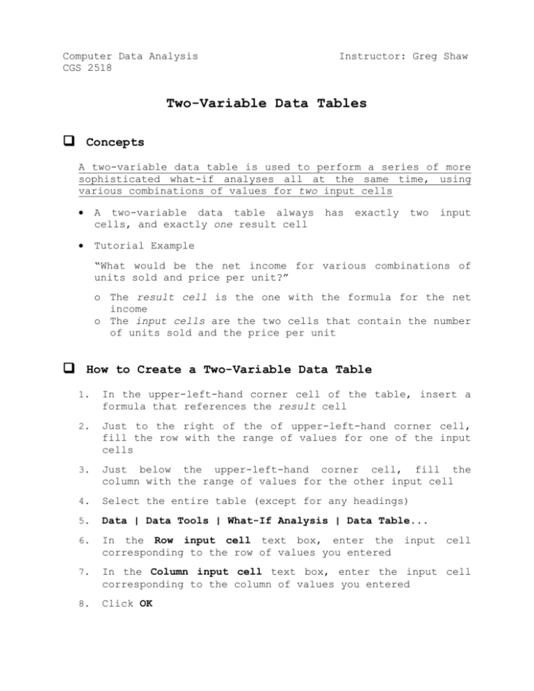
Computer Data Analysis CGS 2518 Instructor: Greg Shaw Two-Variable Data Tables Concepts A two-variable data table is used to perform a series of more sophisticated what-if analyses all at the same time, using various combinations of values for two input cells A two-variable data table always cells, and exactly one result cell Tutorial Example has exactly two input “What would be the net income for various combinations of units sold and price per unit?” o The result cell is the one with the formula for the net income o The input cells are the two cells that contain the number of units sold and the price per unit How to Create a Two-Variable Data Table 1. In the upper-left-hand corner cell of the table, insert a formula that references the result cell 2. Just to the right of the of upper-left-hand corner cell, fill the row with the range of values for one of the input cells 3. Just below the upper-left-hand corner cell, fill the column with the range of values for the other input cell 4. Select the entire table (except for any headings) 5. Data | Data Tools | What-If Analysis | Data Table... 6. In the Row input cell text box, enter the corresponding to the row of values you entered 7. In the Column input cell text box, enter the input cell corresponding to the column of values you entered 8. Click OK input cell Creating a Custom Format “Lets us display whatever we want in a cell regardless of the actual contents of that cell!” Example: We want to “hide” the reference to the result cell in the upper-left-hand corner of the two-variable table because it could be confusing. Instead, let’s display a proper column heading. 1. 2. 3. 4. 5. Right-click the cell and choose Format Cells... Click the Number tab In the Category list, Click on Custom In the Type text box, replace the format code shown with your text, enclosed in double quotes - for example, “Units Sold” Click OK Charting a Two-Variable Data Table 1. Select the entire table except for the top row! Recall that the top row contains the column headings, which are usually labels. But when charting a two-variable data table, the column headings are numbers, not labels, so Excel would consider them to be part of the data and include them in the chart 2. Insert | Charts | Scatter and select the Scatter with Straight Lines subtype 3. By default, Excel assumes that the data series are in the rows. If instead the data series are in the columns – as in the tutorial example – the chart will look weird and we will need to tell Excel to plot the data by column: Chart Tools | Design | Data | Switch Row/Column 4. Move the chart to a separate sheet and add chart and axis titles Note the “generic” entries in the chart legend (Series 1, Series 2, etc)! Since the data series were in the columns, the legend was automatically created from the column headings, and we did not select any column headings! So, the last step is to rename each data series (see next page) Renaming the Data Series 1. Chart Tools | Design | Data | Select Data (Opens the Select Data Source dialog) 2. Now, for each label in the Legend Entries (Series) text box, do this: i. ii. iii. 3. Click the label to select it and click the Edit button Click on the cell containing the column heading you want to use. (Since the chart is in a separate sheet, this will involve a worksheet reference) Click OK When all series have been renamed, click OK to close the Select Data Source dialog
