Spreadsheet Modeling Example
advertisement
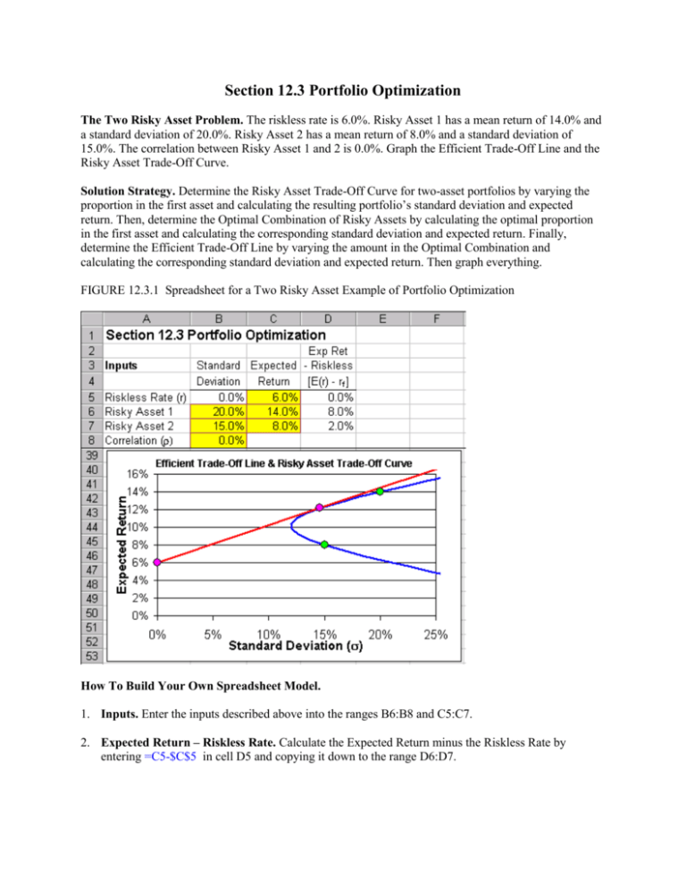
Section 12.3 Portfolio Optimization The Two Risky Asset Problem. The riskless rate is 6.0%. Risky Asset 1 has a mean return of 14.0% and a standard deviation of 20.0%. Risky Asset 2 has a mean return of 8.0% and a standard deviation of 15.0%. The correlation between Risky Asset 1 and 2 is 0.0%. Graph the Efficient Trade-Off Line and the Risky Asset Trade-Off Curve. Solution Strategy. Determine the Risky Asset Trade-Off Curve for two-asset portfolios by varying the proportion in the first asset and calculating the resulting portfolio’s standard deviation and expected return. Then, determine the Optimal Combination of Risky Assets by calculating the optimal proportion in the first asset and calculating the corresponding standard deviation and expected return. Finally, determine the Efficient Trade-Off Line by varying the amount in the Optimal Combination and calculating the corresponding standard deviation and expected return. Then graph everything. FIGURE 12.3.1 Spreadsheet for a Two Risky Asset Example of Portfolio Optimization How To Build Your Own Spreadsheet Model. 1. Inputs. Enter the inputs described above into the ranges B6:B8 and C5:C7. 2. Expected Return – Riskless Rate. Calculate the Expected Return minus the Riskless Rate by entering =C5-$C$5 in cell D5 and copying it down to the range D6:D7. FIGURE 12.3.2 Spreadsheet Details for a Two Risky Asset Example of Portfolio Optimization. 3. Proportion in Risky Asset 1. In order graph the Risky Asset Trade-off Curve, we need to evaluate a wide range of values (-60.0% to 140%) for the Proportion in Risky Asset 1. Enter –60.0% in cell B14, –50.0% in cell B15, and highlight the range B14:B15. Then hover the cursor over the lower right corner and it turns to a “fill handle” (which looks like a “+” sign). Drag the fill handle down to B34. 4. Standard Deviation. The x-axis of our graph is the portfolio’s standard deviation, which is calculated by the formula w 2 12 1 w 22 2w1 w 1 2 . Enter 2 =SQRT(B14^2*$B$6^2+(1-B14)^2*$B$7^2+2*B14*(1-B14)*$B$8*$B$6*$B$7) in cell C14 and copy the cell C14 to the range C15:C34. 5. Expected Return. The formula for a portfolio’s expected return is Er wEr1 1 wEr2 . Enter =B14*$C$6+(1-B14)*$C$7 in cell D14 and copy the cell D14 to the range D15:D34. 6. Optimal Combination of Risky Assets. Using the notation that E1 E r1 rf and E 2 E r2 r f , then the formula for the optimal proportion in the first asset is w1 E1 22 E2 1 2 / E1 22 E2 12 E E2 1 2 . In cell B35, enter =(D6*B7^2-D7*B8*B6*B7)/(D6*B7^2+D7*B6^2-(D6+D7)*B8*B6*B7) Calculate the corresponding Mean and Standard Deviation by copying the range C34:D34 to the range D34:D35. We want to create a separate column for the Efficient Trade-Off Line, so cut the cell D35 and paste in it in cell E35. 7. Efficient Trade-Off Line. The Efficient Trade-Off Line is a combination of the Riskless Asset and the Risky Asset Optimal Combination. It can be calculated as follows: Enter 0.0% in cell B36, 100.0% in cell B37, and 200.0% in cell B38. Since the Riskless Asset has a standard deviation of zero, the standard deviation formula simplifies to w R , where T T = standard deviation of the Optimal Combination of Risky Assets (or Tangent Portfolio). Enter =B36*$C$35 in cell C36 and copy to the range C37:C38. The Expected Return formula is E r E rT w r f 1 w , were ErT expected return of the Tangent Portfolio. Enter =$E$35*B36+$C$5*(1-B36) in cell E36 and copy to the range E37:E38. 8. Create And Locate The Graph. Highlight the range C14:E48 and then choose Insert Chart from the main menu. Select an XY(Scatter) chart type and make other selections to complete the Chart Wizard. Place the cursor in cell A11, click on Window Freeze Panes, and then scroll down so that the Graph is just below the input area. 9. (Optional) Formatting The Graph. Here are some tips to make the chart look attractive: Click on one of the Chart curves, then click on Format Selected Data Series. In the Format Data Series dialog box under the Patterns tab, select None for the Marker and click on OK. Repeat for the other curve. Highlight individual points, such as the Riskless Asset, Tangent Portfolio, and Risky Assets 1 and 2, by clicking on a chart curve, then click a second time on an individual point (the four-way arrows symbol appears), then click on Format Selected Data Point. In the Format Data Point dialog box under the Patterns tab under the Marker, select a market Style, Foreground Color, Background Color, and increase the size to 8 pts and click on OK. Click on the x-axis, then click on Format Selected Axis. In the Format Axis dialog box under the Scale tab, enter 0.25 for the Maximum and click on OK. Investors prefer points on the graph that yield higher mean returns (further “North”) and lower standard deviations (further “West”). The graph shows that best combinations of high return and low risk (furthest in the “Northwest” direction) are given by the Efficient Trade-Off Line. Better combinations are simply not feasible. Since the Efficient Trade-Off Line is a combination of the Riskless Asset and a Tangent Portfolio, then all investors prefer to invest only in the Riskless Asset and a Tangent Portfolio. Using The Power Of Your Spreadsheet Model. Suppose that you had N risky assets, rather than just two risky asset. How would you calculate the Efficient Trade-Off Line and the Risky Asset Trade-Off Curve in this case? It turns out that it is much easier to handle N risky assets in a spreadsheet than any other way. The figure below shows the results of the N=5 risky assets case, including a bar chart of the portfolio weights of the optimal (tangent) portfolio. FIGURE 12.3.3 Spreadsheet for a Five Risky Asset Example of Portfolio Optimization. 1. Inputs. Enter the standard deviation inputs (as shown in the figure above) into the range B6:B10, the expected return inputs into the range C5:C10, 100% into the range E6:E10, and the correlation inputs in the triangular range from H7 to H10 to K10. 2. One plus the Expected Return. It will be useful to have a column based on 1 r . Enter =1+C5 in cell D5 and copy it to D6:D10. 3. Fill Out the Correlations Table (Matrix). The correlations table (matrix) from H6:L10 has a simple structure. All of the elements on the diagonal represent the correlation of an asset return with itself. For example, H6 is the correlation of the Asset 1 return with the Asset 1 return, which is one. I7 is the correlation of Asset 2 with 2, and so on. Enter 100.0% into the diagonal cells from H6 to L10. The off-diagonal cells in the upper triangular range from I6 to L6 to L9 are the “mirror image” of the lower triangular range from H7 to H10 to K10. In other words, the correlation of Asset 2 with Asset 1 in I6 is equal to the correlation of Asset 1 with Asset 2 in H7. Enter =H7 in cell I6, =H8 in J6, =I8 in J7, etc. Each cell of the upper triangular range from I6 to L6 to L9 should be set equal to its mirror image cell in the lower triangular range from H7 to H10 to K10. FIGURE 12.3.4 Spreadsheet Details for a Five Risky Asset Example of Portfolio Optimization. 4. Transposed Standard Deviations. In addition to the standard deviation input range which runs vertically from top to bottom, it will be useful to have a range of standard deviations that runs horizontally from left-to-right. This can be done easily by using the matrix command to transpose a range. Highlight the range H14:L14 and type =TRANSPOSE(B6:B10). Then, hold down the Shift and Control buttons simultaneously, and while continuing to hold them down, press Enter. 5. Variances and Covariance’s Table (Matrix). The Variances and Covariances Table (Matrix) in the range H18:L22 has a simple structure. All of the elements on the diagonal represent the covariance of an asset return with itself, which equals the variance. For example, H18 is the covariance of the Asset 1 return with the Asset 1 return, which equals the variance of asset 1. I19 is the variance of Asset 2, and so on. The off-diagonal cells are covariances. For example, H19 is the covariance of the Asset 1 return with the Asset 2 return and is calculated with the formula for the Covariance(Asset 1, Asset 2) = (Std Dev 1) * (Std Dev 2) * Correlation(Asset 1, Asset 2). Enter =H$14*$B7*H7 in cell H19. Be very careful to enter the $ absolute references exactly right. Then copy H19 to the range H18:L22. 6. Hyperbola Coefficients. In a Mean vs. Standard Deviation graph, the Efficient Frontier is a hyperbola. The exact location of the hyperbola is uniquely determined by three coefficients, unimaginatively called A, B, and C. The derivation of the formulas can be found in Merton (1972).1 They are easy to implement using the matrix functions of Excel. In each case, you type the formula and then, hold down the Shift and Control buttons simultaneously, and while continuing to hold them down, press Enter. For A: =MMULT(MMULT(TRANSPOSE(E6:E10),MINVERSE(H18:L22)),E6:E10) in cell I24. For B: =MMULT(MMULT(TRANSPOSE(E6:E10),MINVERSE(H18:L22)),D6:D10) in cell I25. For C: =MMULT(MMULT(TRANSPOSE(D6:D10),MINVERSE(H18:L22)),D6:D10) in cell I26 7. Miscellaneous. It will simplify matters to create range names for various cells. Put the cursor in cell I24, click on Insert Name Define, enter the name “A” and click on OK. Repeat this procedure to give cell I25 the name “B”, give cell I26 the name “C.” (Excel does not accept plain “C”), give cell I27 the name “Delta”, give cell I28 the name “Gamma”, and give cell D5 the name “R.” (again, Excel does not accept plain “R”). Enter =A*C.-(B^2) in cell I27 and enter =1/(B-A*R.) in cell I28. Some restrictions do apply on the range of permissible input values. The variable Delta must always be positive or else the calculations will blow-up or produce nonsense results. Simply avoid entering large negative correlations for multiple assets and this problem will be taken care of. 8. Individual Risky Assets. In order to add the individual risky assets to the graph, reference their individual standard deviations and expected returns. Enter =B6 in cell C17 and copy down to the range C18:C21. Enter =C6 in cell F17 and copy down to the range F18:F21. 9. Expected Return. Using the three Hyperbola coefficients, we can solve for the expected return on the upper and lower branches of the hyperbola which correspond to a standard deviation of 25% and then fill in intermediate values in order to generate the Efficient Frontier graph. 1 For the upper branch, enter =(2*B-(4*B^2-4*A*(C.-(0.25^2)*Delta))^(0.5))/(2*A)-1 in cell D22. For the lower branch, enter =(2*B+(4*B^2-4*A*(C.-(0.25^2)*Delta))^(0.5))/(2*A)-1 in cell D42. See Robert C. Merton, "An Analytic Derivation of the Efficient Portfolio Frontier," Journal of Financial and Quantitative Analysis, September 1972, pp. 1851-72. The article uses slightly different notation. Fill out in index for expected return by entering 0 in cell B22, entering 1 in cell B23, selecting the range B22:B23, and dragging the fill handle (in the lower right corner) down the range B24:B42. Fill in the intermediate values by entering =$D$22+($D$42-$D$22)*(B23/20) in cell D23 and copying down the range D24:D41. 10. Standard Deviation. Again using the three Hyperbola coefficients, we can solve for the Efficient Frontier standard deviation which corresponds to any particular value of expected return. Enter =((A*(1+D22)^2-(2*B*(1+D22))+C.)/(A*C.-(B^2)))^(1/2) in cell C22 and copy it down the range C23:C42. 11. Tangent Portfolio. The Optimal Combination of Risky Assets (or Tangent Portfolio) can be calculated using the matrix functions of Excel. In each case, you type the formula and then, hold down the Shift and Control buttons simultaneously, and while continuing to hold them down, press Enter. For the portfolio weights: Select the range H34:H38, then type =Gamma*MMULT(MINVERSE(H18:L22),(D6:D10-R.*E6:E10)) For expected returns: enter =MMULT(TRANSPOSE(H34:H38),D6:D10)-1 in cell E43. For standard deviations: enter =SQRT(MMULT(MMULT(TRANSPOSE(H34:H38),H18:L22),H34:H38)) in cell C43. 12. Efficient Trade-Off Line. The Efficient Trade-Off Line is a combination of the Riskless Asset and the Risky Asset Optimal Combination. It can be calculated as follows: Enter 0.0% in cell B44, 100.0% in cell B45, and 200.0% in cell B46. As before, the standard deviation formula simplifies to w T . Enter =B44*$C$43 in cell C44 and copy to the range C45:C46. The Expected Return formula is E r E rT w r f 1 w . Enter =$E$43*B44+$C$5*(1-B44) in cell E44 and copy to the range E45:E46. 13. Create And Locate The Graphs. Highlight the range C17:F46 and then choose Insert Chart from the main menu. Select an XY(Scatter) chart type and make other selections to complete the Chart Wizard. Highlight the range H34:H38 and then choose Insert Chart from the main menu. Select a Column chart type and make other selections to complete the Chart Wizard. Place the cursor in cell A11, click on Window Freeze Panes, and then scroll down so that the Graph is just below the input area. Optionally, one can format the graph as discussed in the previous section. The graphs show several interesting things. First, look at the Efficient Frontier Curve. At a standard deviation of 20% (same as all of the individual assets), it is possible to achieve a mean return of nearly 13% despite the fact that 12% is the highest mean return offered by any individual asset. How is this possible? The answer is that it is possible to sell (or short sell) low mean return assets and use the proceeds to invest in high mean return assets. Said differently, put a negative portfolio weight (short sell) in low mean assets and “more than 100%” in high mean assets. Second, the bar chart shows that the optimal (tangent) portfolio represents a trade-off between exploiting higher means vs. lowering risk by diversifying (e.g., spreading the investment across assets). On the one hand it is desirable to put a larger portfolio weight in those assets with higher mean assets (#4 and #5 in this example). On the other hand, spreading assets more (getting closer to 20% per each of the five risky assets) would lower the overall risk of the portfolio. Hence, the optimal portfolio does not put 100% in the high mean assets, nor does it put 20% in each asset, but instead finds the best trade-off possible between theses two goals. Third, you should be delighted to find any mispriced assets, because these are delightful investment opportunities for you. Indeed, many investors spend money to collect information (do security analysis) which identifies mispriced assets. The bar chart shows you how to optimally exploit any mispriced assets that you find. Below is a list of experiments that you might wish to perform. Notice as you perform these experiments that the optimal portfolio exploits mispriced assets to the appropriate degree, but still makes the fundamental trade-off between gaining higher means vs. lowering risk by diversifying. What happens when an individual asset is underpriced (high mean return)? What happens when an individual asset is overpriced (low mean return)? Is it possible for a very low mean return to optimally generate a negative weight (short sell)? What happens when an individual asset is mispriced due to a low standard deviation? What happens when an individual asset is mispriced due to a high standard deviation? What happens when the riskless rate is lowered? What happens when the riskless rate is raised? What happens when risky assets 1 and 2 have a 99% correlation? Fourth, in general terms the optimal (tangent) portfolio is not the same as the market portfolio. Each individual investor should determine his or her own tangent portfolio based on his or her own beliefs about asset means, standard deviations, and correlations. If an individual investor believes that an particular asset is mispriced, then this belief should be optimally exploited. Only under the special conditions and the restrictive assumptions of CAPM theory would the tangent portfolio also be the market portfolio. Here are some additional projects / enhancements you can do: Obtain historical data for different asset classes (and/or assets in different countries) and calculate the means, standard deviations, and correlations. Then, forecast future means, standard deviations, and correlations using the historical data as your starting point, but making appropriate adjustments. Input those means, standard deviations, and correlations into the spreadsheet model in order to determine the optimal portfolio. If you have monthly data, you can switch from annual returns to monthly returns by simply entering the appropriate monthly returns numbers and then rescaling the graph appropriately (see how to format the graph scale in the previous section). Make the spreadsheet model interactive by adding “spinners” (see the Black-Scholes model for an example of how to do this) or by downloading the interactive portfolio optimizer at www.kelley.iu.edu/finweb/holden.htm Expand the number of risky assets to any number that you want. For example, expanding to six risky assets simply involves adding a sixth: (1) standard deviation in cell B11, (2) expected return in cell C11, (3) one plus expected return in cell D11, (4) 100% in cell E11, (5) row of correlations in the range H11:M11 and column in the range M6:M10, (6) row of variances / covariances in the range H23:M23 and column in the range M18:M22. Finally, reenter all of the matrix functions changing their references to the expanded ranges. Specifically, reenter matrix functions for: transposed standard deviations, A, B, C, tangent portfolio weights, tangent portfolio expected return, and tangent portfolio standard deviation.
