Frequency Tables & Line Plots: How to Create & Interpret
advertisement

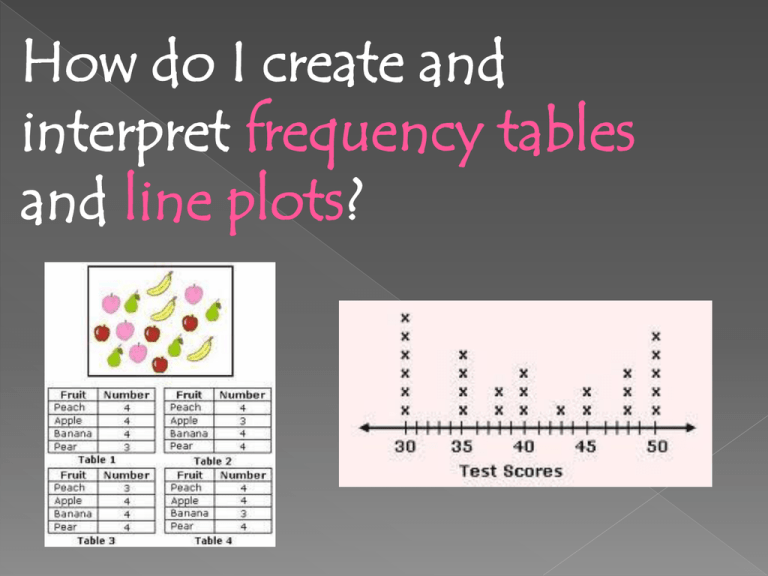
How do I create and interpret frequency tables and line plots? Click to activate… Frequency Table – a table that displays the number of times each item or category occurs in a data set. Line Plot – a number line diagram that uses X marks to show the frequencies of items being tallied. # of Books 1 2 3 4 5 6 7 Tallies llll llll llll l ll Frequency 5 5 6 2 llll 4 students Create a frequency table with data from the class. What is your favorite food? Spaghetti, Mac and Cheese or Chicken How many TV’s do you have in your home? 0,1,2,3,4,5 We can use our data to make a line plot. When the items being tallied are numbers, a line plot can be used to visually display numerical data. A line plot uses X marks above a number line to show the frequencies. X The Number Line X shows the number X of books read. X X 1 X X X X X X X X X X X The X marks above the number line show the frequencies. X X X X X X 2 3 4 5 Number of Books Read 6 7 › Outliers-Unusually high or low values in a distribution. › Clusters-A group of data values with higher frequency than surrounding values. › Gaps-Areas in the scale where there is a lack of data values. Create a frequency table and line plot from the information below. How many pets do you have? Data: 3,4,4,4,5,0,1,2,2,1,4,4,3,2,2,1


