Charts in Microsoft Excel
advertisement
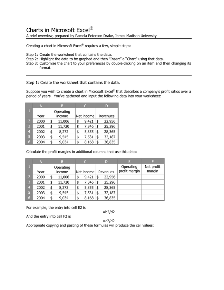
Charts in Microsoft Excel® A brief overview, prepared by Pamela Peterson Drake, James Madison University Creating a chart in Microsoft Excel® requires a few, simple steps: Step 1: Create the worksheet that contains the data. Step 2: Highlight the data to be graphed and then “Insert” a “Chart” using that data. Step 3: Customize the chart to your preferences by double-clicking on an item and then changing its format. Step 1: Create the worksheet that contains the data. Suppose you wish to create a chart in Microsoft Excel® that describes a company’s profit ratios over a period of years. You’ve gathered and input the following data into your worksheet: A B Year 2000 2001 2002 2003 2004 Operating income 11,006 11,720 8,272 9,545 9,034 1 2 3 4 5 6 $ $ $ $ $ C Net $ $ $ $ $ income 9,421 7,346 5,355 7,531 8,168 D $ $ $ $ $ Revenues 22,956 25,296 28,365 32,187 36,835 Calculate the profit margins in additional columns that use this data: A B Year 2000 2001 2002 2003 2004 Operating income 11,006 11,720 8,272 9,545 9,034 1 2 3 4 5 6 $ $ $ $ $ C Net $ $ $ $ $ income 9,421 7,346 5,355 7,531 8,168 For example, the entry into cell E2 is And the entry into cell F2 is D Revenues $ 22,956 $ 25,296 $ 28,365 $ 32,187 $ 36,835 E Operating profit margin F Net profit margin =b2/d2 =c2/d2 Appropriate copying and pasting of these formulas will produce the cell values: A B Year 2000 2001 2002 2003 2004 Operating income 11,006 11,720 8,272 9,545 9,034 1 2 3 4 5 6 $ $ $ $ $ C Net $ $ $ $ $ income 9,421 7,346 5,355 7,531 8,168 D $ $ $ $ $ Revenues 22,956 25,296 28,365 32,187 36,835 E Operating profit margin 47.944% 46.331% 29.163% 29.655% 24.526% F Net profit margin 41.039% 29.040% 18.879% 23.398% 22.175% Step 2: Highlight the data to be graphed and then “Insert” a “Chart” using that data. Highlight the data you want to chart: A B Year 2000 2001 2002 2003 2004 Operating income 11,006 11,720 8,272 9,545 9,034 1 2 3 4 5 6 $ $ $ $ $ C Net $ $ $ $ $ income 9,421 7,346 5,355 7,531 8,168 D Revenues $ 22,956 $ 25,296 $ 28,365 $ 32,187 $ 36,835 E Operating profit margin 47.944% 46.331% 29.163% 29.655% 24.526% F Net profit margin 41.039% 29.040% 18.879% 23.398% 22.175% Then click on “Insert” and then choose “Chart” The Chart Wizard should appear and you will choose your chart / graph from the types shown. To make sure that you have labels on your x-axis, select the tab in the dialog for “Series”. In the , and Category (X) axis labels, click on the spreadsheet icon in the far right of the blank space, then select the X-axis labels: A B Year 2000 2001 2002 2003 2004 Operating income 11,006 11,720 8,272 9,545 9,034 1 2 3 4 5 6 $ $ $ $ $ C Net $ $ $ $ $ income 9,421 7,346 5,355 7,531 8,168 D Revenues $ 22,956 $ 25,296 $ 28,365 $ 32,187 $ 36,835 E Operating profit margin 47.944% 46.331% 29.163% 29.655% 24.526% F Net profit margin 41.039% 29.040% 18.879% 23.398% 22.175% And then click the spreadsheet icon after you make your selection. Click on “Next” and then follow the dialog box for “Chart Options” and you’ve got yourself a chart. For example, without any special adjustments, the chart using the above procedure produces the following graph (that has been copied from Excel® and shrunk to fit below): 60.000% 50.000% 40.000% Operating profit margin 30.000% Net profit margin 20.000% 10.000% 0.000% 2000 2001 2002 2003 2004 Step 3: Customize the chart to your preferences by double-clicking on an item and then changing its format. Now you get to add your own style to the chart. You can make your graph more readable by adding axis titled, adding or removing gridlines, moving the legend around to the top or wherever you’d like, and adding data or labels to graph items. But with a little adjustment, it could look like: Operating and net profit margins for Microsoft Corporation 2000-2004 50% Operating profit margin 40% Net profit margin 30% Margin 20% 10% 0% 2000 2001 2002 2003 2004 Fiscal year Just double-click on the item you want to change and a dialog box will open up and you can “play” with the item. For example, in the above graph, I did the following: • Format chart: Removed the border and area background; Changed the fonts • Format axis: Changed the y-axis format • Format data series: Changed the gap width and overlap; removed border; added shading; added fill effects Of course, you could get carried away and do too much stuff to your chart, which will cause it to lose effectiveness. Consider the following, which is a bit too much “formatting”: Operating and net profit margins for Microsoft Corporation 2000-2004 Operating profit margin Net profit margin 60% 50% 40% Margin 30% 20% 10% 0% 2000 2001 2002 2003 2004 Fiscal year • If you would like to view the Excel® workbook that was used in this example, check out: http://www.fau.edu/~ppeter/fin3403/tools/excel.xls • Other instructional help with Excel® charting: o http://www.ncsu.edu/labwrite/res/gt/gt-cul-home.html o http://www.sun-associates.com/mercer/handouts/excelmer.pdf o http://www.ehow.com/how_9698_create-bar-graph.html
