PowerPoint
advertisement
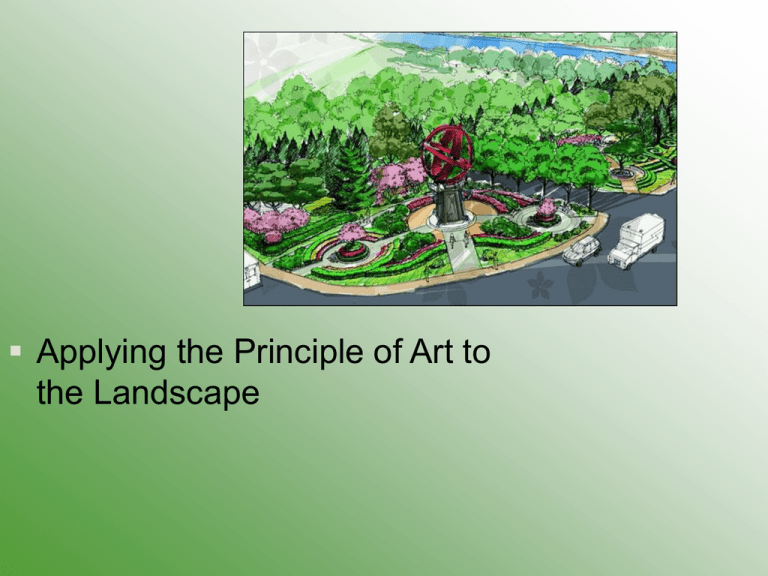
Applying the Principle of Art to the Landscape Next Generation Science / Common Core Standards Addressed! CCSS. Math. Content.HSN‐Q.A.1 Use units as a way to understand problems and to guide the solution of multi‐step problems; choose and interpret units consistently in formulas; choose and interpret the scale and the origin in graphs and data displays. CCSS. Math. Content. HS N‐Q.A.2 Define appropriate quantities for the purpose of descriptive modeling. CCSS. Math.Content.HSG‐CO.A.1 Know precise definitions of angle, circle, perpendicular line, parallel line, and line segment, based on the undefined notions of point, line, distance along a line, and distance around a circular arc. CCSS .Math. Content. HS G‐CO.D.12Make formal geometric constructions with a variety of tools and methods (compass and straightedge, string, reflective devices, paper folding, dynamic geometric software, etc.). Copying a segment; copying an angle; bisecting a segment; bisecting an angle; constructing perpendicular lines, including the perpendicular bisector of a line segment; and constructing a line parallel to a given line through a point not on the line. Bell Work / Student Learning Objectives 1. Describe the basic principles of art. 2. Explain how to use the principles of art in landscaping. 3. Design two planting beds that demonstrate the principles of design. Terms Accent Balance Color Corner planting Form Line planting Repetition Scale Texture Variety Interest Approach Look at the plant materials that I have set around the room. Describe these plants to me in detail. Which plants would work well together in the landscape? What are the basic principles of art? I. Artwork appeals to the visual senses. The basic art principles are: A. Accent B. Balance C. Color D. Form The trunk, branches, and leaves together create the form of a tree and give definition to its shape. E. Repetition F. Scale G. Texture Large leaves cast distinctive shadows in the plant canopy, offering a coarse appearance. Finer-textured foliage offers a more uniform shade pattern. H. Variety How are the principles of art used in landscaping? II. Landscape design is an art as well as a science. A designer must look at the physical features of a plant like the color of the leaves, the shape or form of the plant, and its texture. They just then decide how to group those plants together and make the most of those physical features. The goal of a designer is to achieve a unified design that is balanced and attractive to look at. A. Plants come in a variety of colors, forms, and textures. By picking out one particular striking feature on a plant and placing it among unlike specimens, an accent can be created. A plant that flowers can be nestled among evergreens to provide a striking appearance. Notice how the white color stands out! 1. Color has the greatest impact on a design. Warm colors such as red-green and yellowgreen are visually active and give the feeling that the plants a closer to the viewer. Cool colors such as green and blue-green are visually passive and give the feeling of distance. Most plants selected for the landscape should have a green color. 2. Form is the outline of an object. The most common forms of plants are: round, weeping, oval, pyramidal, and columnar. Most plants used in a landscape should have rounded forms to provide a natural setting. A few upright forms or visually active forms can be used to provide accent within a design. 3. Texture refers to the visual coarseness or fineness of a material Coarse materials are more visually active. Large, dull leaves and thick twigs are some characteristics that give a plant a coarse appearance. Fine textured materials are less visually active. Small, shiny leaves, and narrow twigs contribute to a fine textured appearance. B. The size and style of the home can help the designer use balance and scale within the landscape. Large trees placed near the home will dwarf the home and make it appear smaller than it actually is. Small trees placed near a large home would make the home appear very large and the design would be out of scale. The architecture of the home would help a designer decide if they should use a more symmetrical design or a less formal one. C. By repeating plant shapes, colors, or textures throughout the design, the design will be more visually pleasing . Too much repetition leads to boredom and the viewer will look elsewhere, so remember to add some variety into the design as well. Try to achieve an even balance between repetition and variety. How would you design a planting bed to demonstrate the principles of design? III. Planting beds are designed to include trees, shrubs, flowers, and ground covers. Plants can be placed along the corners of an area or they can form a line. When selecting and placing plants in a bed, the designer needs to consider the characteristics of the plant and the function of the planting. A. Corner Planting ties the house to the foundation B. Line Planting Review Landscape design is an art. In order to make your design most appealing, you should follow the general principals of art. Evaluation 1. How can a designer achieve variety in the landscape? 2. List three common forms (shapes) of plant material. 3. What colors are visually stimulating and advance toward the viewer? 4. What type of planting can either block a view or frame a view? The End!

