New Economic School (NES), Moscow Russia
advertisement
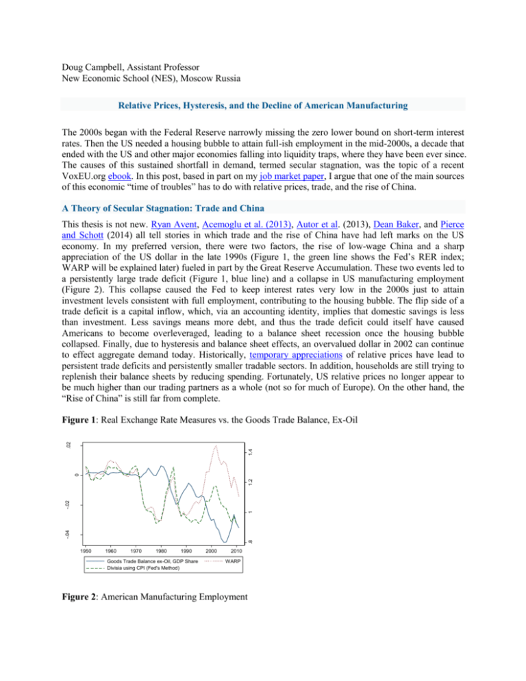
Doug Campbell, Assistant Professor New Economic School (NES), Moscow Russia Relative Prices, Hysteresis, and the Decline of American Manufacturing The 2000s began with the Federal Reserve narrowly missing the zero lower bound on short-term interest rates. Then the US needed a housing bubble to attain full-ish employment in the mid-2000s, a decade that ended with the US and other major economies falling into liquidity traps, where they have been ever since. The causes of this sustained shortfall in demand, termed secular stagnation, was the topic of a recent VoxEU.org ebook. In this post, based in part on my job market paper, I argue that one of the main sources of this economic “time of troubles” has to do with relative prices, trade, and the rise of China. A Theory of Secular Stagnation: Trade and China This thesis is not new. Ryan Avent, Acemoglu et al. (2013), Autor et al. (2013), Dean Baker, and Pierce and Schott (2014) all tell stories in which trade and the rise of China have had left marks on the US economy. In my preferred version, there were two factors, the rise of low-wage China and a sharp appreciation of the US dollar in the late 1990s (Figure 1, the green line shows the Fed’s RER index; WARP will be explained later) fueled in part by the Great Reserve Accumulation. These two events led to a persistently large trade deficit (Figure 1, blue line) and a collapse in US manufacturing employment (Figure 2). This collapse caused the Fed to keep interest rates very low in the 2000s just to attain investment levels consistent with full employment, contributing to the housing bubble. The flip side of a trade deficit is a capital inflow, which, via an accounting identity, implies that domestic savings is less than investment. Less savings means more debt, and thus the trade deficit could itself have caused Americans to become overleveraged, leading to a balance sheet recession once the housing bubble collapsed. Finally, due to hysteresis and balance sheet effects, an overvalued dollar in 2002 can continue to effect aggregate demand today. Historically, temporary appreciations of relative prices have lead to persistent trade deficits and persistently smaller tradable sectors. In addition, households are still trying to replenish their balance sheets by reducing spending. Fortunately, US relative prices no longer appear to be much higher than our trading partners as a whole (not so for much of Europe). On the other hand, the “Rise of China” is still far from complete. .8 -.04 1 -.02 1.2 0 1.4 .02 Figure 1: Real Exchange Rate Measures vs. the Goods Trade Balance, Ex-Oil 1950 1960 1970 1980 1990 Goods Trade Balance ex-Oil, GDP Share Divisia using CPI (Fed's Method) 2000 2010 WARP Figure 2: American Manufacturing Employment American Manufacturing Employment Millions 22 Share 12% 20 employment (left axis) 10% 18 8% 16 6% 14 share of population (right axis) 4% 12 10 1960 2% 1970 1980 1990 2000 2010 The Evidence What is the evidence that a temporary appreciation of US relative prices led to the surprisingly sudden collapse of US manufacturing employment? In my job market paper, “Relative Prices, Hysteresis, and the Decline of American Manufacturing”, I try to get at this question by studying the impact of relative price (or real exchange rate) movements on manufacturing. There are two key difficulties with answering this question. The first difficulty, surprisingly, was to design a theoretically appropriate measure of the real exchange rate. Longtime readers of Econbrowser, of course, know from this post that commonly-used real exchange rate measures produced by the Federal Reserve and the IMF suffer from an index numbers problem. This problem is almost identical to “outlet substitution bias” in the CPI, the bias that arises when new stores, such as Walmart, open and offer lower prices than existing stores. This effective price reduction does not get reflected in the CPI. In the case of real exchange rate indices, China is essentially the new giant low cost entrant, wreaking havoc on various government statistics including the Fed’s widely used Broad Trade-Weighted RER index. In Figure 1 (green dashes), the Fed’s index is compared to a simple Weighted-Average of Relative Prices (WARP), which adequately reflects the growing role of trade with China, computed using price level data from version 8.0 of the PWT.1 In my research, I extend WARP back to 1820 for the US, and find that the US price level in 2002 had not been that high relative to trading partners since the worst year of the Great Depression. 2 WARP, however, does not take productivity into account (Bangladesh may have low wages, but since it also has low productivity it may not be a competitive threat), and so I introduce two new series, a Balassa-Samuelson adjustment to WARP and Weighted Average Relative Unit Labor Costs (WARULC), both of which I use as my main measures of relative prices in my dissertation. The second problem is ubiquitous in economics – how to identify a causal relationship as opposed to correlation. One strategy I use is to look at disaggregated, sectoral data. In the early 2000s, the manufacturing sectors that did the worst were those who were the most exposed to trade (and not just to China), and their worst years were when the dollar was the most overvalued (controlling for the most likely potential other factors, such as recessions and interest rates). Secondly, I look at several natural experiments, periods in which we can plausibly identify the cause of movements in relative prices. Several of the episodes I study are the US experience in the 1980s, when the Reagan deficits led to a 1 It is worth mentioning that the PWT is being revised in a way in which WARP for the US could be more comparable to the PWT v7.1, in which case the relative price shock in the early 2000s would have been about as large as the appreciation in the 1980s. This likely would not change the basic story. 2 In addition, I found that Japan’s price level was on average nearly twice that of its trading partners during its two decades spent in a liquidity trap. sharp dollar bubble, and Canada’s experience since 2000, when a weak US dollar and rising oil prices led to an appreciation of Canadian relative prices. In each case, I find that relative price appreciations have a large adverse impact on trade, productivity, output, and employment concentrated in those sectors most exposed to trade. (I also found that productivity growth has not resulted in more jobs lost since 2000 than in previous decades when aggregate manufacturing employment was flat, a finding supported by others.) That the results appear to hold up out of sample in different time periods and countries give reason to believe that the relationship is causal. The methodology in my study on manufacturing is readily apparent in Figure 3 below. In panel (a), I compare the most open manufacturing sectors in 1972 (where openness is the trade share of output) with the least open sectors. In the 1970s, when US relative unit labor costs were similar to our trading partners, there was no difference in employment (or output) performance of the most open sectors relative to the least open sectors. However, when US RULC’s appreciated sharply in the mid-1980s, the more open sectors lost ground relative to the sectors which were less exposed, controlling for other factors. Interestingly, once US RULCs returned close to fundamentals, the jobs lost in the most open sectors did not return – a striking example of hysteresis. Panel (b) of Figure 3 shows that much the same thing happened in the early 2000s. The finding of hysteresis is important, because the implicit model most economists assume when they think about trade policy, particularly vis-à-vis China, does not incorporate the potential for hysteresis. 1.4 120 WARULC 100 90 1.1 1.2 1.3 110 1.4 1.3 1.2 1.1 1972 1976 1980 Most Open: Top 25% 2 s.d. Error Bounds 1984 1988 1992 1996 Least Open: Bottom 50% Rel. ULC Index (a) The 1980s Dollar Bubble 1 80 1 85 90 95 100 Weighted-Avg. Rel. ULCs 105 1.5 110 Figure 3: Employment Growth by Initial Openness 1989 1992 1995 1998 Most Open: Top 25% 2 s.d. Error Bounds 2001 2004 2007 2010 Least Open: Bottom 50% Rel. ULC Index (b) The 2000s Manufacturing Collapse (NAICs) The Trade Deficit and the Rise of China: Big Enough to Matter? Was the collapse in manufacturing large enough to lead to secular stagnation? My panel estimates imply that two million jobs were lost directly due to the appreciation of US relative prices through 2008. However, the input-output tables tell us that every dollar of manufacturing output requires 60 cents of input (a bit more than half of this is direct, the rest indirect) from other manufacturing sectors. This could seemingly put the actual number of jobs lost in manufacturing due to trade closer to three million. Additionally, manufacturing also consumes input from other sectors of the economy in a proportion similar to which it consumes other manufactures, and affects local labor markets and local government revenue. While we might not know what elasticity to apply, exactly, we do know that areas which lose manufacturing jobs typically struggle to attract other industries. If these areas were totally unable to attract other tradable sectors, then the long-run elasticity would simply be the inverse of the share of tradable employment in the economy. Defining tradable sectors very generously, I get a number of perhaps 3 or 4 to 1 for the US as a whole. Thus it isn’t hard to wind up with a total long-run shock to employment, in the absence of a central bank response, of more than 10 million. This is easily large enough to be the primary cause of secular stagnation, even if other factors, such as demography, are also at play. Policy Implications: A Return to Free Trade Now that we know one of the chief causes of the poor growth since 2000, how does this change our knowledge of what needs to be done? Certainly one implication is the necessity of encouraging China to let the free market determine the value of its currency, particularly as manufacturing sectors which compete with China continued to shed jobs through 2011 even as overall manufacturing employment increased. And there are still millions more US manufacturing jobs which could eventually be relocated. Unilateral attempts by the Fed and/or Treasury to weaken the dollar directly or via fiscal policy may have been helpful in the early 2000s, but they wouldn’t work against China with its capital controls, and would (rightfully) meet with international opposition. I favor an indirect approach: the Fed should aim for higher inflation, which functions as a tax on China’s estimated 2.5 trillion in dollar-denominated foreign reserves. This policy makes sense for other reasons given that US inflation has been extremely low for years and prime aged employment has only just started to recover. Can the Fed achieve higher inflation? In short, yes. All recent evidence points to the conclusion that, for better or worse, the limits of monetary policy in a liquidity trap lie in the minds of FOMC members rather than in their policy tools. One strategy the Fed and the ECB might want to consider is to stop tightening monetary policy when core inflation is well below target and there is mass unemployment – something both central banks have done repeatedly since 2009 (in emulation of the Bank of Japan during its lost decades?). And, the lesson of hysteresis tells us that the legacy of continued slow growth as the world waits for the Fed (and the ECB) to discover their wits will be diminished economic possibilities for years to come.


