Heuristic Evaluation
advertisement
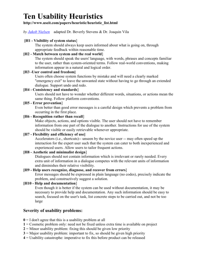
Ten Usability Heuristics http://www.useit.com/papers/heuristic/heuristic_list.html by Jakob Nielsen adapted Dr. Beverly Stevens & Dr. Joaquin Vila [H1 - Visibility of system status] The system should always keep users informed about what is going on, through appropriate feedback within reasonable time. [H2 - Match between system and the real world] The system should speak the users' language, with words, phrases and concepts familiar to the user, rather than system-oriented terms. Follow real-world conventions, making information appear in a natural and logical order. [H3 -User control and freedom] Users often choose system functions by mistake and will need a clearly marked "emergency exit" to leave the unwanted state without having to go through an extended dialogue. Support undo and redo. [H4 - Consistency and standards] Users should not have to wonder whether different words, situations, or actions mean the same thing. Follow platform conventions. [H5 - Error prevention] Even better than good error messages is a careful design which prevents a problem from occurring in the first place. [H6 - Recognition rather than recall] Make objects, actions, and options visible. The user should not have to remember information from one part of the dialogue to another. Instructions for use of the system should be visible or easily retrievable whenever appropriate. [H7 - Flexibility and efficiency of use] Accelerators (i.e., shortcuts)-- unseen by the novice user -- may often speed up the interaction for the expert user such that the system can cater to both inexperienced and experienced users. Allow users to tailor frequent actions. [H8 - Aesthetic and minimalist design] Dialogues should not contain information which is irrelevant or rarely needed. Every extra unit of information in a dialogue competes with the relevant units of information and diminishes their relative visibility. [H9 - Help users recognize, diagnose, and recover from errors] Error messages should be expressed in plain language (no codes), precisely indicate the problem, and constructively suggest a solution. [H10 - Help and documentation] Even though it is better if the system can be used without documentation, it may be necessary to provide help and documentation. Any such information should be easy to search, focused on the user's task, list concrete steps to be carried out, and not be too large Severity of usability problems: 0 = I don't agree that this is a usability problem at all 1 = Cosmetic problem only: need not be fixed unless extra time is available on project 2 = Minor usability problem: fixing this should be given low priority 3 = Major usability problem: important to fix, so should be given high priority 4 = Usability catastrophe: imperative to fix this before product can be released Write up for Heuristic Evaluation ITK 467 Evaluation from one evaluator (Each member must do this heuristic evaluation independently): Example: [H1 Simple & natural dialog] (Severity 2) Description: On the home page, the “Sign In” box is not prominent enough. Suggestion/Solution: Suggest moving it up to the header or otherwise making it stand out. Summary of four evaluators organized by tasks (not required to organize by tasks) Example: Complete Course Listing Violation Severity [H3 User control and freedom] 2 Description On both Individual Course Page and Complete Course Page, users can view the listing only in the prestructured way. # of Evaluators Solution Provide sort by "topic", sort by "date" to allow more user control. 2 Summary Overall Recommendation: Summary of findings maybe a few paragraphs or list each applicable heuristic, [H1 - Visibility of system status] and give recommendations for improvement. Overall Heuristic Statistics: Heuristic # of Violations H1 - Visibility of system status 4 H2 - Match between system and the real world 7 H3 - User control and freedom 3 H4 - Consistency and standards 4 H5 - Error Prevention 0 H6 - Recognition rather than recall. 1 H7 - Flexibility and efficiency of use 1 H8 - Aesthetic and minimalist design 2 H9 - Help users recognize, diagnose, and recover from errors 0 H10 - Help and documentation 0 Total Severity 25 # of Violations 0. Don't think this is a usability problem 1 1. Cosmetic problem 9 2. Minor usability problem 12 3. Major usability problem; important to fix 3 4. Usability catastrophe; imperative to fix 0 Debriefing: Present your results to the group in class (Presentation). Hand off all of the above documentation (files) to the group.
