Word
advertisement
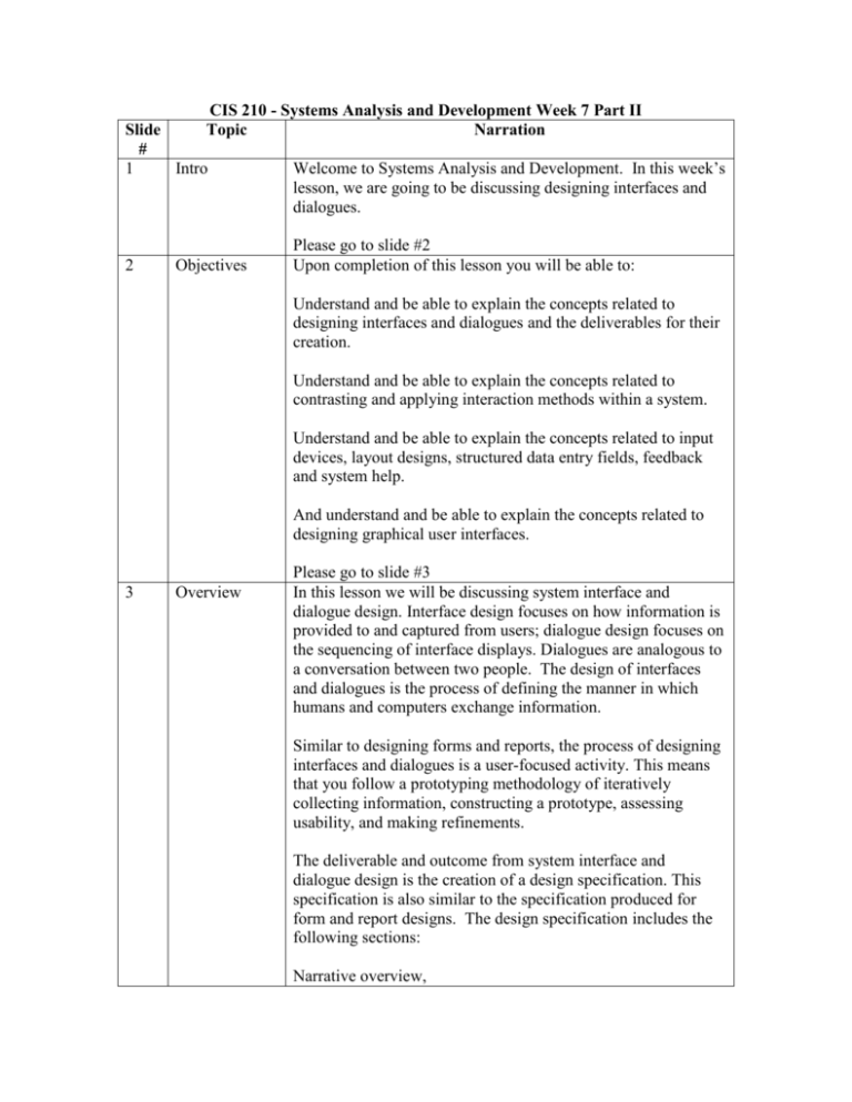
CIS 210 - Systems Analysis and Development Week 7 Part II Topic Narration Slide # 1 Intro 2 Objectives Welcome to Systems Analysis and Development. In this week’s lesson, we are going to be discussing designing interfaces and dialogues. Please go to slide #2 Upon completion of this lesson you will be able to: Understand and be able to explain the concepts related to designing interfaces and dialogues and the deliverables for their creation. Understand and be able to explain the concepts related to contrasting and applying interaction methods within a system. Understand and be able to explain the concepts related to input devices, layout designs, structured data entry fields, feedback and system help. And understand and be able to explain the concepts related to designing graphical user interfaces. 3 Overview Please go to slide #3 In this lesson we will be discussing system interface and dialogue design. Interface design focuses on how information is provided to and captured from users; dialogue design focuses on the sequencing of interface displays. Dialogues are analogous to a conversation between two people. The design of interfaces and dialogues is the process of defining the manner in which humans and computers exchange information. Similar to designing forms and reports, the process of designing interfaces and dialogues is a user-focused activity. This means that you follow a prototyping methodology of iteratively collecting information, constructing a prototype, assessing usability, and making refinements. The deliverable and outcome from system interface and dialogue design is the creation of a design specification. This specification is also similar to the specification produced for form and report designs. The design specification includes the following sections: Narrative overview, Sample design, Testing and usability assessment, and Dialogue sequence. Dialogue sequence is the way a user can move from one display to another. 4 Interaction Methods and Devices Please go to slide #4 The human-computer interface defines the ways in which users interact with an information system. All human-computer interfaces must have an interaction style and use some hardware devices for supporting this interaction. The most fundamental decision you make when designing the user interface relates to the methods used to interact with the system. In command line interaction, the user enters explicit statements to invoke operations within a system. This type of interaction requires users to remember command syntax and semantics. Most new systems no longer rely entirely on a command language interface. Command languages are good for experienced users, for systems with a limited command set, and for rapid interaction with the system. Menu interaction is a means by which many designers have accomplished ease of use and usability. A menu is simply a list of options; when an option is selected by the user, a specific command is invoked or another menu is activated. For large and complex systems, you can use menu hierarchies to provide navigation between menus. These hierarchies can be simple tree structures or variations wherein children menus have multiple parent menus. There are two common methods for positioning menus. With a pop-up menu, menus are displayed near the current cursor position so users don’t have to move the position of their eyes to view system options. With a drop-down menu, menus drop down from the top line of the display. Drop-down menus have become very popular in recent years because they provide consistency in menu location and operation among applications and efficiently use display space. The following are some guidelines to keep in mind when designing a menu: Each menu should have a meaningful title, Command verbs should clearly describe operations, Menu items should be displayed consistently, A consistent method of organization should be used, The number of menu choices should not exceed the length of the screen, Sub-menus should be used to break up long menus, Selection and entry methods should be consistent, and Highlighting should be minimized and only used to convey selected options. 5 Interaction Methods and Devices Please go to slide #5 The premise of form interaction is to allow users to fill in the blanks when working with a system. Form interaction is effective for both the input and presentation of information. An effectively designed form includes a self-explanatory title and field headings, has fields organized into logical groupings with distinctive boundaries, provides default values when practical, displays data in appropriate field lengths, and minimizes the need to scroll. The most common method for implementing object-based interaction is through the use of icons. Icons are graphic symbols that look like the processing option they are meant to represent. Users select operations by pointing to the appropriate icon with some type of pointing device. One branch of artificial intelligence research studies techniques for allowing systems to accept inputs and produce outputs in a conventional language such as English. This method of interaction is referred to as natural language interaction. Presently, this is not a as viable an interaction option as other methods presented. 6 Interaction Please go to slide #6 In addition to the variety of methods for interacting with a Methods and Devices system, there is also a growing number of hardware devices employed to support these interactions. Some common devices for interacting with an information system include the following: A keyboard, A mouse, A joystick, A trackball, A touch screen, A light pen, A graphics tablet, or Voice activated commands. 7 Designing Interfaces Please go to slide #7 To ease user training and data recording, you should use standard formats for computer-based forms and reports similar to those used on paper-based forms. A typical paper-based form has the following common features: Header information, Sequence and time-related information, Instructions or formatting information, Body or data details, Totals or a data summary, Authorization or signatures, and Comments. A concern when designing the layout of computer-based forms is the design of between field navigation. Standard screen navigation should flow from left to right and top to bottom just as when you work on paper-based forms. When designing the navigation procedures within your system, flexibility and consistency are primary concerns. Users should be able to freely move forward and backward or to any desired entry fields. Users should be able to navigate each form in the same way or in as similar a manner as possible. Consistency extends to the selection of keys and commands. Each key or command should have only one function, and this function should be consistent throughout the entire system and across systems, if possible. The following are some guidelines for structuring data entry fields: Never require data that are already online or that can be computed, Always provide default values when appropriate, Make clear the types of data units requested for entry, Use character replacement when appropriate, Always place a caption adjacent to fields, Provide formatting examples when appropriate, Automatically justify data entries, and Provide context-sensitive help when appropriate. One objective of interface design is to reduce data entry errors. As data are entered into an information system, steps must be taken to ensure that the input is valid. As a systems analyst, you must anticipate the types of errors users may make and design features into the system’s interface to avoid, detect, and correct data entry mistakes. Online systems can notify a user of input problems as data are being entered. In addition to validating the data values entered into a system, controls must be established to verify that all input records are correctly entered and that they are only processed once. A common method used to enhance the validity of entering batches of data records is to create an audit trail of the entire sequence of data entry, processing, and storage. When designing system interfaces, providing appropriate feedback is an easy method for making a user’s interaction more enjoyable. There are three types of system feedback: Status information, Prompting cues, and Error or warning messages. Designing how to provide help is one of the most important interface design issues you will face. Many commercially available systems provide extensive system help. Many systems are also designed so that users can vary the level of detail provided. Help may be provided at the system, screen, form, or individual level. 8 Designing Dialogues Please go to slide #8 The process of designing the overall sequences that users follow to interact with an information system is called a dialogue design. A dialogue is the sequence in which information is displayed to and obtained from a user. The dialogue design process consists of the following steps: Designing the dialogue sequence, Building a prototype, and Assessing usability. The following are some general rules to follow when designing a dialogue: Be consistent in the sequence of actions, Allow advanced users to take shortcuts, Provide feedback, Logically group dialogues, Detect and report all users, Allow users to reverse actions, Make the user feel in control, and Make navigation and data entry simple. Your first step in dialogue design is to define the sequence. You must gain an understanding of how users might interact with the system. A formal method for designing and representing dialogues is dialogue diagramming. Dialogue diagrams have only one symbol, a box with three sections; each box represents one display within a dialogue. Building dialogue prototypes and assessing usability are often optional activities. Some systems may be very simple and straightforward. Others may be more complex but are extensions to existing systems where dialogue and display standards have already been established. However, for many systems it is critical that you build prototype displays and then assess the dialogue. 9 GUI Environments Please go to slide #9 Graphical user interface, or GUI, environments have become the de facto standard for human-computer interaction. When designing GUIs for an operations environment, numerous factors need to be considered. In most GUI programming, the following two rules repeatedly emerge as comprising the first step to becoming an effective GUI designer: Become an expert user of the GUI environment, and Understand the available resources and how they can be used. The greatest strength of designing within a standard operating environment is that standards for the behaviors of the system operation have already been defined. In order to design effective interfaces in such environments, you must understand how other applications have been designed so you can adopt the established standards. When designing a dialogue, your goal is to establish the sequence of displays that users will encounter when working with the system. Within many GUI environments, this process can be a bit more challenging due to the GUI’s ability to suspend activities and switch to another application or task. Using tools such as dialogue diagramming helps analysts to better manager the complexity of designing graphical user interfaces. 10 Summary Please go to slide #10 We have now reached the end of this lesson. Let’s take a look at the material we have just covered: Interaction methods and devices, Designing interfaces, Designing dialogues, and GUI environments. This marks the end of the audio lecture.
