Presenting with PowerPoint
advertisement
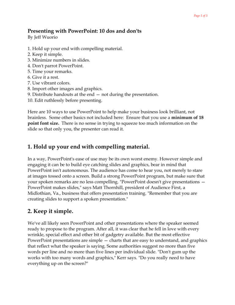
Page 1 of 3 Presenting with PowerPoint: 10 dos and don'ts By Jeff Wuorio 1. Hold up your end with compelling material. 2. Keep it simple. 3. Minimize numbers in slides. 4. Don't parrot PowerPoint. 5. Time your remarks. 6. Give it a rest. 7. Use vibrant colors. 8. Import other images and graphics. 9. Distribute handouts at the end — not during the presentation. 10. Edit ruthlessly before presenting. Here are 10 ways to use PowerPoint to help make your business look brilliant, not brainless. Some other basics not included here: Ensure that you use a minimum of 18 point font size. There is no sense in trying to squeeze too much information on the slide so that only you, the presenter can read it. 1. Hold up your end with compelling material. In a way, PowerPoint's ease of use may be its own worst enemy. However simple and engaging it can be to build eye catching slides and graphics, bear in mind that PowerPoint isn't autonomous. The audience has come to hear you, not merely to stare at images tossed onto a screen. Build a strong PowerPoint program, but make sure that your spoken remarks are no less compelling. "PowerPoint doesn't give presentations — PowerPoint makes slides," says Matt Thornhill, president of Audience First, a Midlothian, Va., business that offers presentation training. "Remember that you are creating slides to support a spoken presentation." 2. Keep it simple. We've all likely seen PowerPoint and other presentations where the speaker seemed ready to propose to the program. After all, it was clear that he fell in love with every wrinkle, special effect and other bit of gadgetry available. But the most effective PowerPoint presentations are simple — charts that are easy to understand, and graphics that reflect what the speaker is saying. Some authorities suggest no more than five words per line and no more than five lines per individual slide. "Don't gum up the works with too many words and graphics," Kerr says. "Do you really need to have everything up on the screen?" Page 2 of 3 3. Minimize numbers in slides. PowerPoint's lure is the capacity to convey ideas and support a speaker's remarks in a concise manner. That's hard to do through a haze of numbers and statistics. For the most part, most effective PowerPoint displays don't overwhelm viewers with too many figures and numbers. Instead, leave those for a later, more thorough digestion in handouts distributed at presentation's end. If you want to emphasize a statistic in PowerPoint, consider using a graphic or image to convey the point. "For instance, when I once was talking about the prevalence of Alzheimer's patients, I used a photograph of an old woman rather than just throwing up a number on the screen," Kerr says. 4. Don't parrot PowerPoint. One of the most prevalent and damaging habits of PowerPoint users is to simply read the visual presentation to the audience. Not only is that redundant — short of using the clicker, why are you even there? — but it makes even the most visually appealing presentation boring to the bone. PowerPoint works best with spoken remarks that augment and discuss, rather than mimic, what's on the screen. "Even with PowerPoint, you've got to make eye contact with your audience," says Roberta Prescott of The Prescott Group, a Connecticut-based communications consulting firm. "Those people didn't come to see the back of your head." 5. Time your remarks. Another potential land mine is a speaker's comments that coincide precisely with the appearance of a fresh PowerPoint slide. That merely splits your audience's attention. A well-orchestrated PowerPoint program brings up a new slide, gives the audience a chance to read and digest it, then follows up with remarks that broaden and amplify what's on the screen. "It's an issue of timing," Kerr says. "Never talk on top of your slides." 6. Give it a rest. Again, PowerPoint is most effective as a visual accompaniment to the spoken word. Experienced PowerPoint users aren't bashful about letting the screen go blank on occasion. Not only can that give your audience a visual break, it's also effective to focus attention on more verbally-focused give and take, such as a group discussion or question and answer session. Page 3 of 3 7. Use vibrant colors. A striking contrast between words, graphics and the background can be very effective in conveying both a message and emotion. 8. Import other images and graphics. Don't limit your presentation to what PowerPoint offers. Use outside images and graphics for variety and visual appeal, including video. "I often have one or two very short video clips in my presentations," says New York technology consultant Ramon Ray. "It helps with humor, conveys a message and loosens up the crowd." 9. Distribute handouts at the end — not during the presentation. Some people may disagree with me here. But no speaker wants to be chatting to a crowd that's busy reading a summation of her remarks. Unless it is imperative that people follow a handout while you're presenting, wait until you're done to distribute them. 10. Edit ruthlessly before presenting. Never lose the perspective of the audience. Once you're finished drafting your PowerPoint slides, assume you're just one of the folks listening to your remarks as you review them. If something is unappealing, distracting or confusing, edit ruthlessly. Chances are good your overall presentation will be the better for it. Jeff Wuorio is a veteran freelance writer and author based in southern Maine. He writes about small-business management, marketing and technology issues. Send Jeff an email. (http://www.microsoft.com/smallbusiness/resources/technology/ business_software/presenting_with_powerpoint_10_dos_and_donts.mspx)
