Artistic Block — the interruption of
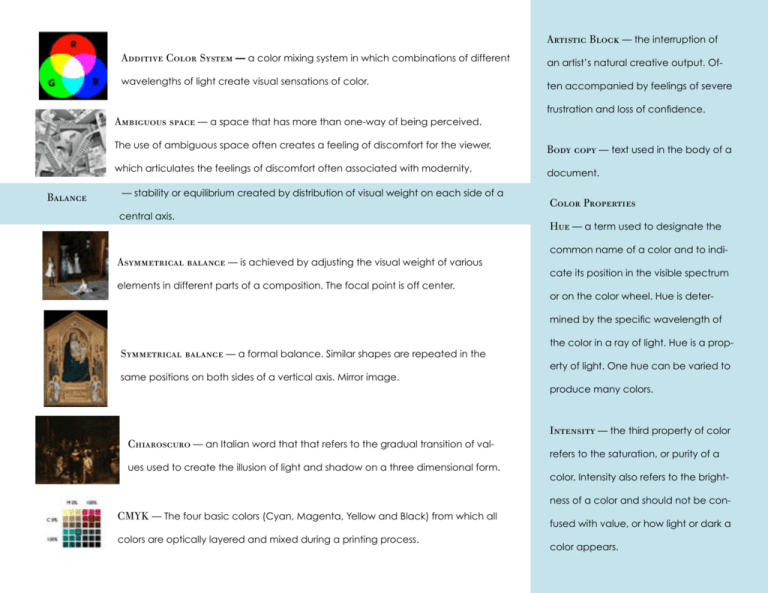
Additive Color System — a color mixing system in which combinations of different
an artist’s natural creative output. Of-
wavelengths of light create visual sensations of color.
ten accompanied by feelings of severe
Ambiguous space — a space that has more than one-way of being perceived.
Balance
frustration and loss of confidence.
The use of ambiguous space often creates a feeling of discomfort for the viewer,
Body copy — text used in the body of a
which articulates the feelings of discomfort often associated with modernity.
document.
— stability or equilibrium created by distribution of visual weight on each side of a
central axis.
Asymmetrical balance — is achieved by adjusting the visual weight of various
elements in different parts of a composition. The focal point is off center.
Color Properties
Hue — a term used to designate the
common name of a color and to indicate its position in the visible spectrum
or on the color wheel. Hue is determined by the specific wavelength of
Symmetrical balance — a formal balance. Similar shapes are repeated in the
same positions on both sides of a vertical axis. Mirror image.
the color in a ray of light. Hue is a property of light. One hue can be varied to
produce many colors.
Chiaroscuro — an Italian word that that refers to the gradual transition of values used to create the illusion of light and shadow on a three dimensional form.
Intensity — the third property of color
refers to the saturation, or purity of a
color. Intensity also refers to the brightness of a color and should not be con-
CMYK — The four basic colors (Cyan, Magenta, Yellow and Black) from which all
colors are optically layered and mixed during a printing process.
fused with value, or how light or dark a
color appears.
Value — the lightness or darkness of a color. A color may be classified as equivalent to some member of a series of shades ranging from black
to white.
Color scheme — is a group of selected colors that establish a color harmony and act as a unifying factor in a work of art. (Monochromatic, Complementary, Split complementary, Triadic and Analogous color
schemes).
Color temperature — refers to whether a color appears warm or cold. Warm colors are the reds, oranges and yellows,
while cool colors are blues greens and violets. Color temperature may also refer to the temperature bias of a particular
color.
Color wheel — a circular chart that organizes and displays the interrelationship of colors. Based in the visible spectrum. First
developed by Sir Isaac Newton.
Complementary colors — colors directly opposite each other on the color wheel. Together they represent the strongest hue
contrast, such as red and green. Mixed, the complements will begin to darken and neutralize each other. (See intensity)
Conceptual design — the thought behind the design or work of art and
what it is communicating.
Contrast — the
difference in
visual properties
(such as value,
Context — where and when a design or work of art
was created or where and how the work will be seen
and used.
color, texture,
size and weight) that make a shape, form or
image stand out from other shapes, forms or
images and from the back-ground.
Design (verb) — to design is to plan,
to organize. Design is a part of many
Elements of design — the means by which an artist makes visible their ideas, including line,
shape, value, color and texture.
different discplines. Design is the
opposite of chance. Design is the
Eye-level — the height at which your eyes are located in relation to the ground plane.
visual organization of the elements.
An imaginary line placed in a position equal to the viewer or artist’s eyes.
The guidelines or principles of design
include unity and variety, emphasis,
balance, rhythm, movement, scale
and space.
Design (noun) — is the end result of
Focal point — a compositional device emphasizing a certain area or object
to draw attention to the artwork and to encourage scrutiny of the work. Also
called a point of emphasis. Focal points are required to achieve balance in a
composition. Not all designs have a focal point.
the plan, the finished product.
Gestalt — a school of psychology
Grid — a network of horizontal, vertical and sometimes diagonal
started in Germany around 1912. The
intersecting lines that divide the format and create a framework.
direction of study was on how humans
see and organize information into a
Harmony — agreement within a composition, where elements are constructed, arranged and function
meaningful whole. The idea developed
in relation to one another to an agreeable effect.
that the whole is more than the sum of
its parts. For instance the brain con-
Layout — the placement of images, or type within a two-dimensional format.
nects the dots placed in a square as a
Linear perspective — as parallel lines recede, they appear to converge and to meet
whole shape not as individual dots. In
on an imaginary line called the horizon or eye level at a common spot called the
design the process of Gestalt is used to
vanishing point. There can be several vanishing points but they are all located along
unify information into a whole image.
the same horizon line.
Kinetic art — actual movement,
Measuring or sighting — the use of a tool such as a pencil to gauge the relative size or
artwork that moves, such as mo-
proportion of one object to another.
biles or mechanized sculpture.
Mass — the
weight or density
of an object.
Movement (eye movement) — the deliberate or intuitive arrangement of elements in a
design or work of art that allow the viewers eyes to move from one element to another. This form of movement helps to unify.
Nonobjective art — does not represent any specific object, meant to symbolize an idea, rather than refer to a thing.
Point of view — is determined by the position of the artist or viewer and the angle of ones vision in
relation to the thing being seen.
Primary colors — are colors that cannot be mixed from other colors. Primaries are the source for all other hues on the color wheel.
Principles of Design — the means by which artists organize and integrate the elements into a unified arrangement, including unity with variety, emphasis, balance, rhythm, movement, scale and space.
Proportion — refers to the relative size of an element as measured against other elements. Size is measured against other
elements or against some mental norm or standard. That norm or standard is often the human body.
Representational art — depicts a recognizable object or thing in a highly realistic way or modified
for expressive purpose.
RGB — Primary colors of light (additive system) from which all other colors are mixed: Red, Green and Blue.
ROYGBIV — the hues of the visible spectrum, in order: red, orange, yellow, green, and blue, indigo, violet.
Scale —not the actual size of the object but the feeling of how large or small a viewer perceives a given object. The
perception of scale is usually related to the objects relationship to something else or its relationship to the size of a human.
Scale can be influenced by the objects position in space (depth) relationship to other objects or the relationship of the
object to the format or edge of the picture.
Shading — an attempt at recreating the way light moves across the surface of an object. Works best with
pencil, charcoal, chalk, pastel, or paint. Types of shading include hatching, crosshatching and stippling.
Simultaneous contrast ­­— when a value appears to change due to the other values surrounding it. A middle gray value seems darker against a light
background and lighter against a dark background. The effect is created by two values seen in juxtaposition (side by side). Intensified contrast results
whenever two different values come into direct contact. Any value will appear different when next to a lighter value or a darker value. When two
colors are placed together, each affects our perception of the other, and a small but noticeable change in the appearance of the colors usually
occurs. (This effect works for both color and value perceptions.) Usually both colors will lose some of their intrinsic character and become tinged with
new effects. A color seems to shift our perception of an adjacent color or a neutral toward the first color’s complement; a color is created in the eye
and brain, and not objectively present.
Bibliography
Enstice, Wayne and Peters, Melody. (2003) Drawing:
Subtractive color system —a color mixing system in which a
Space Form and Expression. Pearson Prentice Hall.
physical substance called pigment is combined to create visual
Landa, Robin, Gonnella, Rose and Brower, Steven.
(2007)2D Visual Basics for Designers.Thomson/Delmar
sensations of color. Wavelengths of light absorbed by the sub-
Learning.
Lauer, David A. and Stephen Pentak. (2007) Design
stance are subtracted and the reflected wavelengths constitute
Basics. Wadsworth.
Martinez, Benjamin and Jacqueline Block. (1995)Visual
the perceived color. Mixing all hues of pigment produces black.
Forces. Prentice Hall
Cited:
M.C. Escher, Relativity, 1951
John Singer Sargent, The Daughters of Edward Darley Boit.
Surface — is a flat, two-dimensional area onto which the elements of design are placed.
The treatment of the surface can vary from a flat surface to one that shows depth. The ele-
1882.
Giotto di Bondone. Virgin and Child Enthroned. 1305-1310.
Rembrandt van Rijn. The Company of Captain
Leonardo da Vinci. The Virgin of the Rocks. c. 1485.
Ellsworth Kelly, Blue Green Red. 1963.
Marcel Duchamp. Fountain. 1917.
Soldiers, Qin Dynasty, c. 210 BCE.
Sandro Botticelli. Birth of Venus. c. 1484-1486.
Walker Evans, Alabama Tenant Farmer Wife, 1936.
Raphael, School of Athens. 1510-1511
ments can be arranged so the surface looks three dimensional like a window or threshold
into the picture’s space. This is referred to as a picture plane. The designer may also choose
to arrange the elements in such a way that the flatness of the surface is not changed.
Typeface — a single set of letterforms, numerals, and signs unified by consistent
visual properties.
Frans Banning Cocq (The Night Watch). 1642.
Robert Frank. Trolley. New Orleans. 1955-1956.
Masaccio. Trinity with the Virgin, St. John the Evangelist,
and Donors. c. 1425-1427/1428.
Visual Hierarchy — arranging elements
Alexander Calder. Lobster Trap and Fish Tail. 1939.
Richard Serra. Tilted Arc. 1981-1989.
according to emphasis.
Bishop Odo Blessing the Feast, the Bayeux Embroidery. c.
1066-1082.
Robert Delaunay. Homage to Bierlot. 1914.
Caravaggio. The Conversion of St. Paul. c. 1601.
Edward Hopper, Early Sunday Morning, 1930.
Leonardo da Vinci. Vitruvian Man. c. 1490.
Aphrodite of Melos (Also called Venus De Milo). c. 150100BCE.
Ti Watching a Hippopotamus Hunt, Tomb of Ti, Saqqara,
Fifth Dynasty, c. 2450-2325BCE.
Henry Moore, The Artist’s Hands c. 1974
Leonardo da Vinci. The Last Supper. 1495-1498.
Auguste Rodin. The Burghers of Calais. 1884-1889.
Visual weight — forms in an artwork that appear to have either
heaviness or importance.
