Step-by-step guide to making a simple graph in Excel 2011 for Mac
advertisement
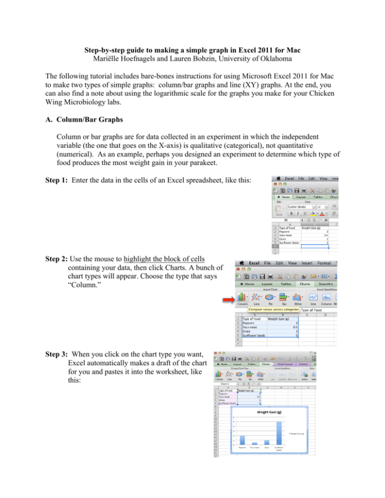
Step-by-step guide to making a simple graph in Excel 2011 for Mac Mariëlle Hoefnagels and Lauren Bobzin, University of Oklahoma The following tutorial includes bare-bones instructions for using Microsoft Excel 2011 for Mac to make two types of simple graphs: column/bar graphs and line (XY) graphs. At the end, you can also find a note about using the logarithmic scale for the graphs you make for your Chicken Wing Microbiology labs. A. Column/Bar Graphs Column or bar graphs are for data collected in an experiment in which the independent variable (the one that goes on the X-axis) is qualitative (categorical), not quantitative (numerical). As an example, perhaps you designed an experiment to determine which type of food produces the most weight gain in your parakeet. Step 1: Enter the data in the cells of an Excel spreadsheet, like this: Step 2: Use the mouse to highlight the block of cells containing your data, then click Charts. A bunch of chart types will appear. Choose the type that says “Column.” Step 3: When you click on the chart type you want, Excel automatically makes a draft of the chart for you and pastes it into the worksheet, like this: Step 4: This is looking pretty good, but you’re not done because there aren’t any axis labels or units, and the title is kind of lame. So the next step is to click on the “Chart Layout” tab, which brings up the layout options of the graph. Part of it is shown at right. Within this tab, you can select and change options such as the axis labels. You can also add a title to the chart and format the legend. To edit an existing chart title, simple click the text box containing text to rename it. The graph below shows the new titles in place. We don’t need the legend on the right either, to remove it simply click the text box and press the backspace button. Step 5: I also like the idea of putting the chart on its own sheet, where it looks a little less crowded and a little tidier. To do that, right click the chart (control+ click or command+ click) and select Move Chart. You get a little window that looks like this: Give it a name you like. When you click OK, your chart will look really nice. Of course, you can fool around all you want with the fonts, text sizes, bar colors, gridlines, background color, and so forth, but I left it pretty basic. B. Line (or XY) Graphs Line (or XY) graphs are for data collected in an experiment in which the independent variable (the one that goes on the X-axis) is quantitative (numerical). As an example, perhaps you designed an experiment to determine how long it takes to boil various volumes of water. Step 1: Enter the data in the cells of an Excel spreadsheet, like this: Step 2: Use the mouse to highlight the block of cells containing your data, then click Insert Chart. A bunch of chart types will appear. For Mac Excel 2011, the chart type you want is listed under “other” labeled “Straight Marked Scatter”. I know you’re tempted by the Line graph option, but don’t let it seduce you; choose the X Y (Scatter) chart, the one with dots and jagged lines (see the arrow in the figure at right). **Pay attention!** If you accidentally choose the Line graph, Excel will NOT consider the relative values of the numbers on your X axis! In our example, the X-axis values are 100, 200, 500, and 1000. If you choose Line, you will get those numbers equally spaced. If you pick Scatter, as you should, Excel will create a graph in which 1000 is ten times as far away from 0 as 100 is. If you don’t believe me, try both graph types with the data I have given you, and look at the difference. Step 3: When you click on the chart type you want, Excel automatically makes a draft of the chart for you and pastes it into the worksheet (see example at right). Step 4: You’re still not done, though, because there aren’t any axis labels or units, and the title is lame. So the next step is to click on the “Chart Layout” tab, which brings up the chart format options. You can see a picture of it under step 4 of the instructions for making a column graph. To start with, click on the tab called “AxisTitles,” where you can change the labels for the horizontal (X) axis and the vertical (Y) axis. You can also add a chart title using the tab labeled “Chart Title” much like we did in the column graph. Just for the heck of it, I also deleted the legend, because it doesn’t add any information to this graph. Step 5: The only thing left to do is to move the chart to its own sheet so that the spacing looks more attractive and proportionate. To do that, click Chart Move Chart. When the little window pops up, click on “New Sheet” and click OK (see step 5 for the column graph instructions if you want to see what this looks like). Here’s what the final graph looks like (of course, you can fool around all you want with the fonts, text sizes, line color, gridlines, background color, and so forth, but I left it pretty basic). And that’s it! You’re done! One last note … For Chicken Wing Microbiology, the logarithmic scale will be your friend In BIOL 1005, you sometimes have to graph data for which differences among the Y-axis values are huge. For chicken wing microbiology, for example, your control wings might have billions of bacteria per ml, whereas the treated ones “only” have thousands. In Excel’s default graphing mode, the scale that accommodates the huge numbers will dwarf your puny values, and you will hardly be able to see the smaller bars at all. What to do? Answer: use the logarithmic scale! Each increment on the logarithmic scale represents a 10-fold change. That is, whereas a linear scale goes 1, 2, 3, 4 …, the logarithmic scale goes 1, 10, 100, 1000, … Using the logarithmic scale only makes sense when the differences among your data points are very large. To use it, double click on the Y axis of your graph. A box called “Format Axis” will appear. Click on “Scale,” and then tick the “Logarithmic Scale” box. The data won’t change, but their presentation on the Y axis will, and it will make your graph much easier for you (and your TA) to read.
![How to create a Graph in Excel [3/1/2012]](http://s2.studylib.net/store/data/010103557_1-9a59b79fa385c6b07c88637e88f1732e-300x300.png)
