Studio visit: Colby Bird Inside and out with a careful observer. By T.J.
advertisement
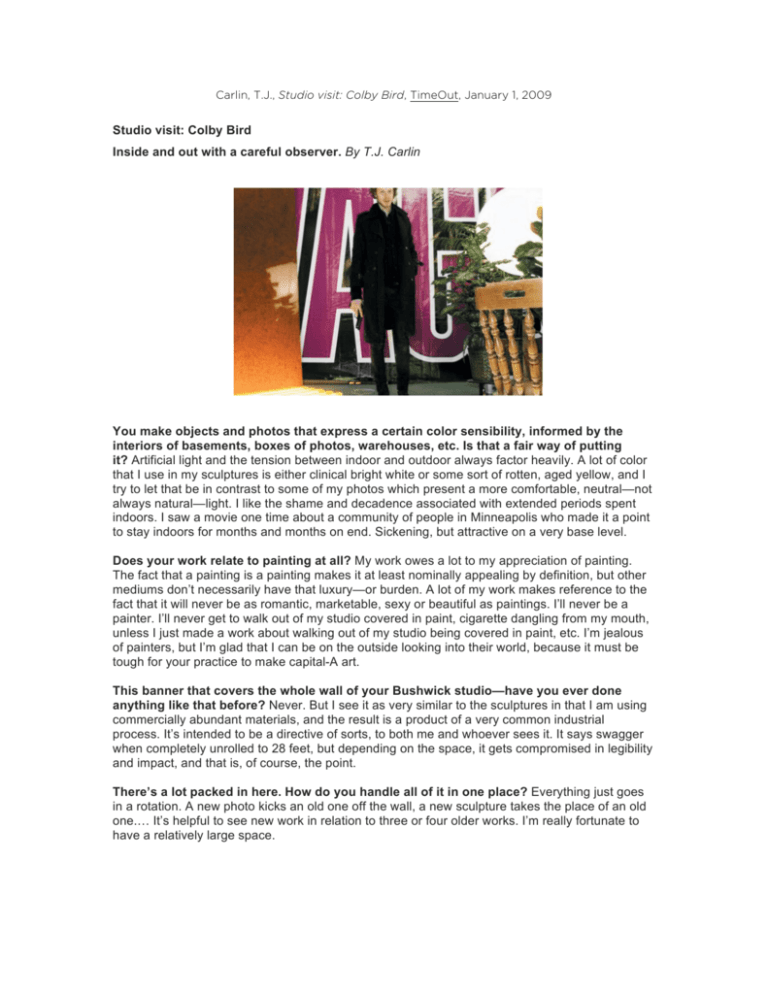
Carlin, T.J., Studio visit: Colby Bird, TimeOut, January 1, 2009 Studio visit: Colby Bird Inside and out with a careful observer. By T.J. Carlin You make objects and photos that express a certain color sensibility, informed by the interiors of basements, boxes of photos, warehouses, etc. Is that a fair way of putting it? Artificial light and the tension between indoor and outdoor always factor heavily. A lot of color that I use in my sculptures is either clinical bright white or some sort of rotten, aged yellow, and I try to let that be in contrast to some of my photos which present a more comfortable, neutral—not always natural—light. I like the shame and decadence associated with extended periods spent indoors. I saw a movie one time about a community of people in Minneapolis who made it a point to stay indoors for months and months on end. Sickening, but attractive on a very base level. Does your work relate to painting at all? My work owes a lot to my appreciation of painting. The fact that a painting is a painting makes it at least nominally appealing by definition, but other mediums don’t necessarily have that luxury—or burden. A lot of my work makes reference to the fact that it will never be as romantic, marketable, sexy or beautiful as paintings. I’ll never be a painter. I’ll never get to walk out of my studio covered in paint, cigarette dangling from my mouth, unless I just made a work about walking out of my studio being covered in paint, etc. I’m jealous of painters, but I’m glad that I can be on the outside looking into their world, because it must be tough for your practice to make capital-A art. This banner that covers the whole wall of your Bushwick studio—have you ever done anything like that before? Never. But I see it as very similar to the sculptures in that I am using commercially abundant materials, and the result is a product of a very common industrial process. It’s intended to be a directive of sorts, to both me and whoever sees it. It says swagger when completely unrolled to 28 feet, but depending on the space, it gets compromised in legibility and impact, and that is, of course, the point. There’s a lot packed in here. How do you handle all of it in one place? Everything just goes in a rotation. A new photo kicks an old one off the wall, a new sculpture takes the place of an old one.… It’s helpful to see new work in relation to three or four older works. I’m really fortunate to have a relatively large space.
