Presentations - JochenEnglish
advertisement
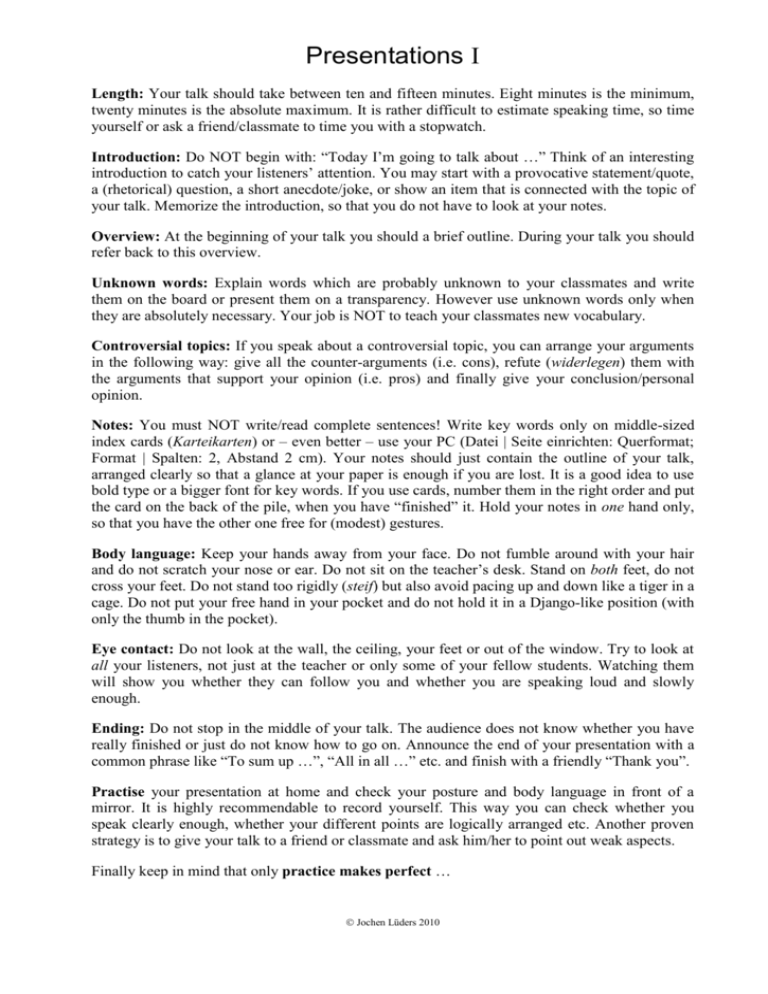
Presentations I Length: Your talk should take between ten and fifteen minutes. Eight minutes is the minimum, twenty minutes is the absolute maximum. It is rather difficult to estimate speaking time, so time yourself or ask a friend/classmate to time you with a stopwatch. Introduction: Do NOT begin with: “Today I’m going to talk about …” Think of an interesting introduction to catch your listeners’ attention. You may start with a provocative statement/quote, a (rhetorical) question, a short anecdote/joke, or show an item that is connected with the topic of your talk. Memorize the introduction, so that you do not have to look at your notes. Overview: At the beginning of your talk you should a brief outline. During your talk you should refer back to this overview. Unknown words: Explain words which are probably unknown to your classmates and write them on the board or present them on a transparency. However use unknown words only when they are absolutely necessary. Your job is NOT to teach your classmates new vocabulary. Controversial topics: If you speak about a controversial topic, you can arrange your arguments in the following way: give all the counter-arguments (i.e. cons), refute (widerlegen) them with the arguments that support your opinion (i.e. pros) and finally give your conclusion/personal opinion. Notes: You must NOT write/read complete sentences! Write key words only on middle-sized index cards (Karteikarten) or – even better – use your PC (Datei | Seite einrichten: Querformat; Format | Spalten: 2, Abstand 2 cm). Your notes should just contain the outline of your talk, arranged clearly so that a glance at your paper is enough if you are lost. It is a good idea to use bold type or a bigger font for key words. If you use cards, number them in the right order and put the card on the back of the pile, when you have “finished” it. Hold your notes in one hand only, so that you have the other one free for (modest) gestures. Body language: Keep your hands away from your face. Do not fumble around with your hair and do not scratch your nose or ear. Do not sit on the teacher’s desk. Stand on both feet, do not cross your feet. Do not stand too rigidly (steif) but also avoid pacing up and down like a tiger in a cage. Do not put your free hand in your pocket and do not hold it in a Django-like position (with only the thumb in the pocket). Eye contact: Do not look at the wall, the ceiling, your feet or out of the window. Try to look at all your listeners, not just at the teacher or only some of your fellow students. Watching them will show you whether they can follow you and whether you are speaking loud and slowly enough. Ending: Do not stop in the middle of your talk. The audience does not know whether you have really finished or just do not know how to go on. Announce the end of your presentation with a common phrase like “To sum up …”, “All in all …” etc. and finish with a friendly “Thank you”. Practise your presentation at home and check your posture and body language in front of a mirror. It is highly recommendable to record yourself. This way you can check whether you speak clearly enough, whether your different points are logically arranged etc. Another proven strategy is to give your talk to a friend or classmate and ask him/her to point out weak aspects. Finally keep in mind that only practice makes perfect … Jochen Lüders 2010 Presentations II Overhead Transparencies Key words: Keep in mind that the main function of transparencies is to visualize something with the help of photos, graphics, diagrams etc. They are not a good medium for presenting large amounts of text. Use bulleted lists with key words only. Font size: Text must have at least 16 pt, so that it is legible also from a distance. Keep in mind that many projectors are quite old and/or dirty and do not present the whole transparency in focus. Pointing: Do not point at something on the transparency with the help of your finger. Take a pencil or a biro instead. Visibility: Before you begin make sure that the projector works, that your transparency is not turned upside down and that the projector is correctly adjusted, so that the picture is sharp. During your talk you should step aside so that everybody can see it. Cover parts of the transparency which you do not need at the moment. Post-it notes are very helpful for this purpose. Eye contact: Do not look at the wall/transparency all the time. Keep eye contact with your audience. Switch off the projector when you do not need it any more. The “empty” picture and the humming sound distract your audience. Presentation Software Consistency: Give all your slides a consistent layout. Changing e.g. the colour scheme in the middle of a presentation irritates your audience. 5-5 rule: Do not present more than circa five bullets per slide. There should not be more than circa five words per bullet. Insert one bullet point at a time. For experts: Dim the previous bullet to highlight the current one or use bold type for the current one. Capitalization: The titles of slides are capitalized like normal titles (cf. Layout). Start each bulleted item with a capital letter. Colours: Take care that you have a strong contrast between your text and the background, otherwise your slides are hard to read. Fonts: Do not use more than two different fonts. Use sans-serif fonts like Arial or Verdana. Be consistent in your use of fonts. If you like you can format titles in a different font. Font size: Use at least 24 pt for your body text and at least 34 pt for titles. The major reason for using small fonts is to squeeze too much information onto one slide. Rather than making the font smaller, put less information onto each slide. Emphasis: Use bold type or italics to emphasize words, do not underline. Gadgets: Be extremely careful with gadgets like animations, flying letters etc. In many cases they just cover up lack of content. Most of those effects are so overused that they quickly become tedious. Images: Use images sparingly. Appropriate images (with a high “informative” value) can reduce explanation time and can enhance understanding. However, overusing graphic elements, above all clipart, distracts and bores your audience. Take only high quality/resolution images. Make sure that e.g. diagrams are big enough. Sound: Do not use any sound effects (e.g. for transitions) unless they really belong to your topic. Jochen Lüders 2010
