Twelve Tips for Creating Effective Presentations
advertisement
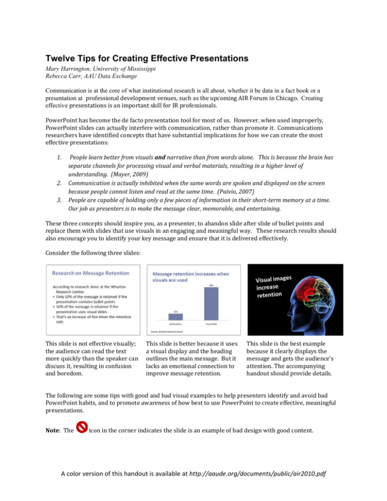
Twelve Tips for Creating Effective Presentations Mary Harrington, University of Mississippi Rebecca Carr, AAU Data Exchange Communication is at the core of what institutional research is all about, whether it be data in a fact book or a presentation at professional development venues, such as the upcoming AIR Forum in Chicago. Creating effective presentations is an important skill for IR professionals. PowerPoint has become the de facto presentation tool for most of us. However, when used improperly, PowerPoint slides can actually interfere with communication, rather than promote it. Communications researchers have identified concepts that have substantial implications for how we can create the most effective presentations: 1. People learn better from visuals and narrative than from words alone. This is because the brain has separate channels for processing visual and verbal materials, resulting in a higher level of understanding. (Mayer, 2009) 2. Communication is actually inhibited when the same words are spoken and displayed on the screen because people cannot listen and read at the same time. (Paivio, 2007) 3. People are capable of holding only a few pieces of information in their short‐term memory at a time. Our job as presenters is to make the message clear, memorable, and entertaining. These three concepts should inspire you, as a presenter, to abandon slide after slide of bullet points and replace them with slides that use visuals in an engaging and meaningful way. These research results should also encourage you to identify your key message and ensure that it is delivered effectively. Consider the following three slides: This slide is not effective visually; the audience can read the text more quickly than the speaker can discuss it, resulting in confusion and boredom. This slide is better because it uses a visual display and the heading outlines the main message. But it lacks an emotional connection to improve message retention. This slide is the best example because it clearly displays the message and gets the audience’s attention. The accompanying handout should provide details. The following are some tips with good and bad visual examples to help presenters identify and avoid bad PowerPoint habits, and to promote awareness of how best to use PowerPoint to create effective, meaningful presentations. Note: The icon in the corner indicates the slide is an example of bad design with good content. A color version of this handout is available at http://aaude.org/documents/public/air2010.pdf 1. Design a template that is free from distracting items. Strive for simplicity and readability. Most PowerPoint templates contain distracting elements such as borders or shading that can detract from your message. It’s best to create a template of your own that has a solid background and is free from non‐essential items, such as footers and logos. When creating your template, keep in mind the advice of French writer Antoine de Saint-Exupéry, “A designer knows he has achieved perfection not when there is nothing left to add, but when there is nothing left to take away.” 2. Ensure your template promotes readability. Choose color combinations that make it easy for the audience to read your slides. If your audience is unable to read your slides, then your message has been compromised. Consider the following advice from Reynolds (n.d.). If you will be presenting in a darkened room, then light text on a dark background works well. But if you will be in a room with the lights on or considerable ambient light, then dark text on a light background works better. 3. Select a sans serif font. Limit your fonts to two, at most. Serif fonts, such as Garamond, Times New Roman or Century Schoolbook, have protruding “feet” (called serifs) that extend beyond the main shape of the letters. The serifs are beneficial in printed documents with a lot of text, but they will produce a blurred look on the screen. Sans serif fonts (translated as “without serifs”), such as Calibri, Arial and Trebuchet, produce a cleaner, less cluttered, easier to read look. By limiting your fonts to two (at most), your presentation will have a consistent look and feel. This limitation does not include the use of bold, italic or bold italic; these alterations are considered the same as the base font. Be sure to select standard fonts or embed the fonts in your presentation. If the fonts you use are not installed on the presentation machine, it will use a substitute font and potentially change the entire look of your presentation. Rules about Font Selection Select a sans serif font such as Calibri, Arial, or Trebuchet. Limit your fonts to two, at most. 4. Always use fonts that are 24 point or larger. Displaying text that is too small to read compromises your message and frustrates your audience. If you have more text than can reasonably fit on a screen using at least 24 point fonts, then either: (a) create another slide or (b) shorten your text. As noted in tip #11, let your handout contain the detailed information and use your presentation to highlight your most significant points. 5. Incorporate high quality photos, images or diagrams that reinforce your verbal message. Research has shown that communication is enhanced when a verbal message is combined with a powerful image on the screen. Many free high quality photos are available on‐line (but pay attention to copyrights) and a plethora of professional photos are available at very reasonable costs (such as at iStockphoto.com). Avoid clip art, since it can make your presentation look dated and unprofessional. Incorporating your text into the photo presents a more unified and visually pleasing message than having them completely separate. 6. Use phrases or abbreviated sentences, rather than full sentences. With the possible exception of short direct quotes, keep full sentences in your oral presentation and off the screen. “Humans are incapable of reading and comprehending text on a screen and listening to a speaker at the same time. Therefore, lots of text (almost any text!), and long, complete sentences are bad, Bad, BAD” (Reynolds, 2010, p. 57). 7. Use bullet points sparingly. If using bullet points, be sure they are less than six words long. The most effective slides are often those with the least text. “Your presentation is for the benefit of the audience. But boring an audience with bullet point after bullet point is of little benefit to them” (Reynolds, n.d.). If you want to use an outline to organize your talk, keep it on paper rather than putting it on screen as bullets. 8. Eliminate the use of headings or titles unless they communicate the main message. Headings should not be used to introduce or identify the topic of the slide, though they may be useful to call attention to the main finding in a chart or graph. Otherwise, headings tend to be redundant and should be eliminated. 98% of headers are redundant 1 0.5 0 Redundant headers Useful headers 9. Use animation, slide transitions, audio, and video sparingly. ..and if used, do so only to reinforce a key concept. No examples are provided because they would be difficult to illustrate in this written format. Research has shown that when there is movement on the screen, the audience’s attention is immediately drawn to the movement, thus breaking their concentration on the presentation content. Audiences judge presentations on their interest in the content, not on how many fancy features are used in the slides. 10. Highlight the most important information in tables and graphs. If needed, use builds to present data in a series of bite-sizes pieces. There are many resources about how to create effective tables and graphs (e.g., Few, 2004; Sanders & Filkins, 2009). The rules of good design will be the same as for printed documents, but you need to consider the pace when presenting tables/graphs on screen. By highlighting the most important information and presenting only as much data as can be readily understood (perhaps by presenting it incrementally), the audience will easily be able to discern the main message. If you have complicated data to present, this is one application for using of slide transitions, which can be used to “build” your table/graph and focus your audience’s attention. The following slides show an example of both a better graph choice and how to highlight data for your audience. See Paradi (2009) for an example of using builds to present a chart in PowerPoint. 11. Create a handout to accompany your presentation. Many presenters try to make their slides function as both a handout and a presentation and end up failing at both attempts. Slides should be designed to visually enhance (not summarize) your presentation. Handouts should be well‐written comprehensive reports, containing detailed information such as (depending on your content) complex charts, data, analyses, and references. Your audience will be grateful to take a well‐written document with them, rather than just their scribbled notes on your printed slides. This approach takes a significant investment of time, but will serve both you and your audience well. 12. Be passionate about your topic. Regardless of how well designed your slides are, the success or failure of your presentation will hinge on how effectively you engage your audience. If the audience can’t tell that the topic you’re presenting is interesting to you, it won’t be interesting to them. The slides should serve to enhance your oral presentation, let them help you. Bullet points are not passionate, not even when they’re highly decorated. References and Recommended Reading Atkinson, C. (2008). Beyond Bullet Points. Redmond, WA: Microsoft Press. Few, S. (2004). Show Me the Numbers: Designing Tables and Graphs to Enlighten. Oakland, CA: Analytics Press. Mayer, R. (2009). Multimedia Learning. New York, NY: Cambridge University Press. Paivio, A. (2007). Mind and its Evolution: A Dual Coding Theoretical Approach. Mahwah, NJ: Lawrence Erlbaum Associates, Inc. Paradi, D. (n.d.). Think Outside the Slide. Retrieved from http://www.thinkoutsidetheslide.com. Paradi, D. (2009). Slide Makeover Video Podcast, 3/29/2009. Retrieved from http://www.thinkoutsidetheslide.com/podcasts/Issue003609‐29‐2009.mov on 3/3/2010. Reynolds, G. (2008). Presentation Zen: Simple Ideas on Presentation Design and Delivery. Berkeley, CA: New Riders. Reynolds, G. (2010). Presentation Zen Design: Simple Design Principles and Techniques to Enhance your Presentations. Berkeley, CA: New Riders. Reynolds, G. (n.d.). Top Ten Slide Tips. Retrieved from http://www.garrreynolds.com/Presentation/slides.html on 2/26/2010. Sanders, L. and Filkins, J (2009). Effective Reporting( 2nd ed.). Tallahassee, FL: Association for Institutional Research. Note: All photos purchased from iStockphoto.com 5/17/2010 This is an example of what NOT to do as a handout Cast of Characters Expert PowerPoint User Novice PowerPoint User …… Rebecca Carr …… Mary Harrington 8351443 The results of our Regression Analysis on 2170 first-time first-year students showed the following factors were The color There are statistically significant predictors of first term GPA in That font is hard combination I don’t know what Why is she reading college. (Incremental R-squared is in parenthesis) too many words Prologue to read. makes it hard to g (her point is! ), screen! / ( ), ( ), High school GPA (.288), ACT/SAT (.033), Male(‐.009), this to me?! on on the screen! the read too. Parents’ Education Level (.006), Pell eligible (‐.002) The following factors were included in the analysis but did not have a significant explanatory value: Residency, Ethnicity, Citizenship, Application Date, Intended Major The University of MS Exclude non‐ essential items The results of our Regression Analysis on 2170 first-time first-year students showed the following factors were statistically significant predictors of first term GPA in college. (Incremental R-squared is in parenthesis) g ( ), / ( ), ( ), High school GPA (.288), ACT/SAT (.033), Male(‐.009), Parents’ Education Level (.006), Pell eligible (‐.002) The following factors were included in the analysis but did not have a significant explanatory value: Residency, Ethnicity, Citizenship, Application Date, Intended Major 1 1
