AP Stats Chapter 3 Notes: Examining Relationships
advertisement
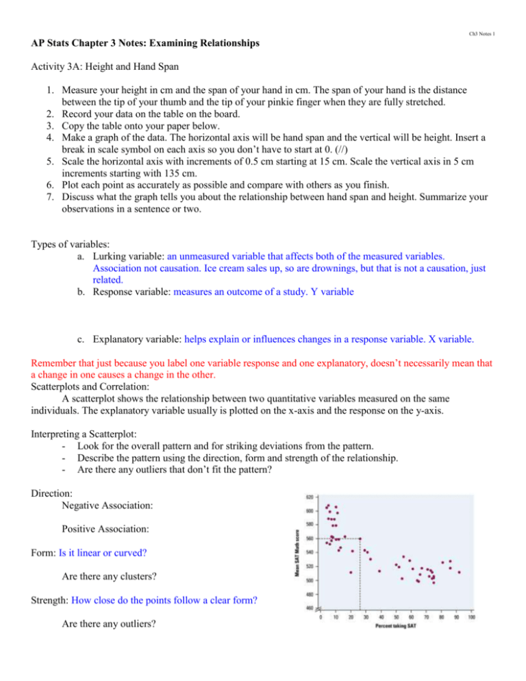
Ch3 Notes 1 AP Stats Chapter 3 Notes: Examining Relationships Activity 3A: Height and Hand Span 1. Measure your height in cm and the span of your hand in cm. The span of your hand is the distance between the tip of your thumb and the tip of your pinkie finger when they are fully stretched. 2. Record your data on the table on the board. 3. Copy the table onto your paper below. 4. Make a graph of the data. The horizontal axis will be hand span and the vertical will be height. Insert a break in scale symbol on each axis so you don’t have to start at 0. (//) 5. Scale the horizontal axis with increments of 0.5 cm starting at 15 cm. Scale the vertical axis in 5 cm increments starting with 135 cm. 6. Plot each point as accurately as possible and compare with others as you finish. 7. Discuss what the graph tells you about the relationship between hand span and height. Summarize your observations in a sentence or two. Types of variables: a. Lurking variable: an unmeasured variable that affects both of the measured variables. Association not causation. Ice cream sales up, so are drownings, but that is not a causation, just related. b. Response variable: measures an outcome of a study. Y variable c. Explanatory variable: helps explain or influences changes in a response variable. X variable. Remember that just because you label one variable response and one explanatory, doesn’t necessarily mean that a change in one causes a change in the other. Scatterplots and Correlation: A scatterplot shows the relationship between two quantitative variables measured on the same individuals. The explanatory variable usually is plotted on the x-axis and the response on the y-axis. Interpreting a Scatterplot: - Look for the overall pattern and for striking deviations from the pattern. - Describe the pattern using the direction, form and strength of the relationship. - Are there any outliers that don’t fit the pattern? Direction: Negative Association: Positive Association: Form: Is it linear or curved? Are there any clusters? Strength: How close do the points follow a clear form? Are there any outliers? Ch3 Notes 2 Example 3.5: Beer and blood alcohol How well does the number of beers a student drinks predict his or her blood alcohol content? Sixteen student volunteers at Ohio State University drank a randomly assigned number of cans of beer. Thirty minutes later, a police officer measured their BAC (blood alcohol content). Here are the data: Student 1 2 3 4 5 6 7 8 9 10 11 12 13 14 15 16 Beers 5 2 9 8 3 7 3 5 3 5 4 6 5 7 1 4 BAC 0.10 0.03 0.19 0.12 0.04 0.095 0.07 0.06 0.02 0.05 0.07 0.10 0.085 0.09 0.01 0.05 Create a scatterplot of the data. Number of beers (explanatory) and BAC (response) Adding Categorical Variables: To add a categorical variable use a different plotting color or symbol for each category. Example: If you are plotting data about states, such as median income and ACT scores. You might use a different color dot for each region (south, Midwest, etc.). Assignment: p. 173 and 174—3.1, 3.2, 3.3 p. 179-184—3.5, 3.7, 3.8, 3.9, 3.10, Be sure you can make a scatterplot using your calculator, directions are on page 183. Ch3 Notes 3 Measuring Linear Association: Correlation Correlation: measures the direction and strength of the linear relationship between two quantitative variables. Correlation is usually written as r. Freshmen at the Webb School go on a backpack trip every school year. Students are divided into hiking groups of size 8 by selecting names from a hat. Prior to departure, each student’s body weight and backpack weight are measured. Here are the data from a hiking group: Body Weight (lbs) 120 187 109 103 131 165 158 116 Backpack Weight (lbs) 26 30 26 24 29 35 31 28 a. Enter the body weights into L1 and the backpack weights into L2. b. Calculate two-variable statistics for L1, L2 c. Define L3= ((L1 - x ) / sx) and L4 = ((L2 - y ) / sy) a. Look under VARS/5:Statistics for the above d. Look at the results in the Stat Editor. L3 gives the z-score for his/her body weight and L4 gives the z score for the backpack weight. e. Define L5 = L3*L4 f. To finish calculating the correlation r, we need to add up the values in L5 and divide by n-1. a. (1/(8-1))*sum(L5) Note: The correlation r is an average of the products of the standardized body weight and backpack weight for the 8 hikers. Facts about Correlation: 1. Correlation makes no distinction between explanatory and response variables. 2. r does not change when we change the units of measurement of x, y, or both. r has no unit of measure, it is just a number, calculated from a standardized value. 3. Positive r indicates positive association and negative r indicates negative association. 4. The correlation r is always a number between -1 and 1. Values near 0 indicate a weak linear relationship and closer to -1 or 1 indicate a more straight line in the scatterplot, or better strength in the relationship. 5. Correlation requires that both variables be quantitative, so that it makes sense to do arithmetic indicated by the definition. 6. Correlation does not describe curved relationships between variables, no matter how strong they are. 7. Like the mean and standard deviation, the correlation is not resistant: r is strongly affected by a few outlying observations. 8. Correlation is not a complete summary of two variable data. Ch3 Notes 4 Assignment: p. 188-189—3.13, 3.14 p. 193-195—3.15, 3.17, 3.18, 3.20 Section 3.1 Review Problems: p. 196-199—3.21, 3.23, 3.25, 3.26, 3.28 Ch3 Notes 5 3.2 Least-Squares Regression Regression Line: A line that describes how a response variable y changes as the explanatory variable x changes. We often use a regression line to predict the value of y given the value of x. (y = mx + b) Example 3.9: Does fidgeting keep you slim? Obesity is a growing problem around the world. Here is an account of a study that sheds some light on gaining weight. Some people don’t gain weight even when they overeat. Perhaps fidgeting, and other non exercise activity (NEA) explain why—some people may spontaneously increase NEA when fed more. Researchers deliberately overfed 16 healthy young adults for 8 weeks. They measured fat gain ( in kilograms) and, as an explanatory variable, change in energy use (in calories) from activity other than deliberate exercise—fidgeting, daily living, and the like. NEA change (cal) Fat gain (kg) -94 -57 -29 135 143 151 245 355 392 473 486 535 571 580 620 690 4.2 3.0 3.7 2.7 3.2 Who? Individuals are 16 healthy young adults. 3.6 2.4 1.3 3.8 1.7 1.6 2.2 1.0 0.4 2.3 1.1 What? Explanatory: change in NEA--Response: fat gain Why? Researchers wanted to know if fidgeting or NEA would explain weight gain in overeating individuals When, where, how and by whom? Data from controlled 8 week experiment in which subjects were forced to overeat. Results published Science magazine 1999 Correlation: r = -0.7786 Model: We can draw a line on the scatterplot to predict fat gain from change in NEA. Interpretation: There is a moderately strong negative linear association between NEA change and fat gain, with no outliers. People with larger increases in NEA do indeed gain less fat. A line drawn through the points will describe the overall pattern well. Ch3 Notes 6 Interpreting a Regression Line: Equation: y = a + bx b is the slope and a is the y-intercept. The slope of the regression line in example 3.9 tells us how much fat gained in kilograms goes down for each additional calorie of NEA. The y-intercept would be the amount of fat gained if NEA does not change when a person overeats. All values are estimated and not an exact amount. We could use the equation of the line to predict fat gain for an individual whose NEA increased by 400 calories when she overeats. We could also use the scatterplot with the line graphed on it to make a prediction. Extrapolation: The use of a regression line for prediction outside the range of values of the explanatory variable x used to obtain the line. Such predictions are often not accurate. Assignment: p. 204-205—3.29, 3.30, 3.32 The Least Squares Regression Line: What is the least squares regression line? The line of y on x that makes the sum of the squared vertical distances of the data points from the line as small as possible. Equation of the least squares regression line: yˆ a bx With slope: b= r s s y x Ch3 Notes 7 Example 3.13: Fat gain and NEA continued You can use your calculator to verify that the mean and standard deviation of the 16 changes in NEA are x = 324.8 calories and sx = 257.66 calories and that the mean and standard deviation of 16 fat gains are y = 2.388 kg and sy = 1.1389 kg. The correlation between fat gain and NEA change is r = -0.7786. The least squares regression line of fat gain y on NEA change x therefore has slope b= r s s y x = (-0.7786) 1.1389 0.00344 kg per calorie 257.66 To find the y-intercept, we use the fact that the least squares line passes through ( x, y ) : y = a + bx 2.388 = a + (-0.00344)(324.8) a = 3.505 kg The equation of the least squares line is: yˆ 3.505 0.00344 x To find the least squares on your calculator: a. Enter the data into L1 and L2 b. Press STAT, choose CALC, then 8: LinReg (a + bx). Finish the command to read LinReg(a+bx)L1, L2, Y1. c. If you do not see the r and r2: Press 2nd 0, scroll down to DiagnosticOn and press ENTER. Press ENTER again so DONE appears on the screen. Assignment: p. 211-214—3.33, 3.35, 3.36 Ch3 Notes 8 Residuals: How well the line fits the data A residual is the difference between the observed value of the response variable and the value predicted by the regression line. That is, residual = observed y – predicted y = y yˆ In the fat gain and NEA data, one individual’s NEA rose by 135 calories. That subject gained 2.7 kg of fat. The predicted gain for 135 calories is ŷ 3.505 – 0.00344(135) = 3.04 kg The residual for this subject is therefore Residual = observed y- predicted y = y yˆ = 2.7 – 3.04 = -0.34 kg The residual is negative because the data point fell below the line. A residual plot is a scatterplot of the regression residuals against the explanatory variable (or equivalently, against the predicted y-values). Residual plots help us assess how well a regression line fits the data. Ch3 Notes 9 Assignment: p. 220-221—3.39, 3.40, 3.42 How Well the Line Fits the Data: The Role of r2 in Regression The idea of rr is this: how much better us the least squares line at predicting responses y than is we just used y as our prediction for every point? r2 is the coefficient of determination. It is a numerical value that tells us how well the least squares line does at predicting values of the response variable y. It is a numerical representation of the residual plot. Ch3 Notes 10 Formula for r2: SST SSE SSE 1 SST SST Where SSE residual 2 ( y yˆ )2 and SST ( y y)2 When you report a regression, give r2 as a measure of how successful the regression was in explaining the response. When you see a correlation, square it to get a better feel for the strength of the linear relationship. Facts about Least Squares Regression Fact 1: The distinction between explanatory and response variables is essential in regression. Least squares only works, minimizes distance, for the y direction. Reversing the order changes the line. Fact 2: There is a close connection between correlation and the slope of the least squares line. See p. 226 for more info. Fact 3: The least squares regression line of y on x always passes through the point (x bar, y bar). Fact 4: The correlation r explains the strength of a straight line relationship. In the regression setting, this description takes a specific form: the square of the correlation, r2, is the fraction of the variation in the values of y that is explained by the least-squares regression of y on x. Assignment: p. 227-228—3.43, 3.44, 3.47 Section 3.2 Review Questions: p. 230-233—3.49, 3.50, 3.53, 3.54, 3.58 3.3 Correlation and Regression Wisdom What we already know (or should already know): - Correlation and regression describe only linear relationships. - Extrapolation often produces unreliable predictions. - Correlation is not resistant. Always plot your data and look for unusual observations before you interpret correlation. Look for Outliers and Influential Observations You know that the correlation is not resistant. Is the least squares line resistant? Example 3.16 Gesell scores, identifying unusual points in regression Ch3 Notes 11 Does the age at which a child begins to talk predict later score on a test of mental ability? A study of the development of young children recorded the age in months at which each of 21 children spoke their first word and their Gesell Adaptive Score, the result of an aptitude test taken much later. The data appear in the table. Child 1 2 3 4 5 6 7 Age 15 26 10 9 15 20 18 Score 95 71 83 91 102 87 93 Child 8 9 10 11 12 13 14 Age 11 8 20 7 9 10 11 Score 100 104 94 113 96 83 84 Child 15 16 17 18 19 20 21 Age 11 10 12 42 17 11 10 Score 102 100 105 57 121 86 100 Who? 21 young children What? Age first word, reading score Why? Researchers want to know If first word age predicts Intelligence. When, where, how, and by whom? Need to see original data. Make a scatterplot of the points above: What do you do about the two points that are the same, but different children? Change their color and note which point stands for two different kids. Numerical summaries for the data: x 14.381, s 7.947, y 93.667, s y 13.987, r 0.640 Model: Graph the least squares line onto the plot: ŷ 109.8738 – 1.1270x Ch3 Notes 12 Make a residual plot for these data. Interpretation: The scatterplot shows a negative association. That is, children who begin to speak later then to have lower test scores than early talkers. The overall pattern is moderately linear (r=-0.640). The slope of the regression line suggests that for every month older a child is when she begins to speak, her score on the Gesell test will decrease by about 1.13 points. According to the y-intercept, 109.87, a child who first speaks at 0 months would score about 109.9. This nonsensical interpretation is due to extrapolation. How well does the least squares line fit the data? The residual plot shows a fairly “random” scatter of points around the residual = 0 line with one very large positive residual (child 19). Most of the prediction errors are 10 points or fewer. Since r2 = 0.41, 41% of the variation in Gesell scores is explained by least squares regression. That leaves 59% of the variation explained by the linear relationship. Look at child 18 and child 19 on your graph. Can we say anything about these points? Outlier: Is an observation that lies outside the overall pattern of the other observations. Points that are outliers in the y direction have large residuals, but other outliers need not have large residuals. Influential Observation: Observations are influential when removing them would markedly change the result of the calculation. Points that are outliers in the x direction of a scatterplot are often influential for the least squares regression line. CHILD 18 from the example. Assignment: p. 238-239—3.59, 3.60, 3.61, 3.62 Ch3 Notes 13 Beware the Lurking Variable Lurking Variable: a variable that is not among the explanatory or response variables in a study and yet may influence the interpretation of relationships among those variables. You should always think about possible lurking variables before you draw conclusions based on correlation or regression. Example 3.18 Is math the key to college success? A College Board study of 15, 941 high school graduates found a strong correlation between how much math minority students took in high school and their later success in college. News articles quoted the College Board as saying that “math is the gatekeeper for success in college.” Maybe so, but we should also think about lurking variables. Minority students form middle class homes with educated parents no doubt take more high school math courses. They also are more likely to have a stable family, parents who emphasize education and can pay for college, and so on. These students would succeed in college even if they took fewer math courses. The family background of students is a lurking variable that probably explains much of the relationship between math courses and college success. More about lurking variables can be found on p. 240 and 241. Beware Correlations Based on Averaged Data Many regression or correlation studies work with averages or other measures that combine information from many individuals. For example, if we plot the average height of young children against their age in months, we will see a very strong positive association with correlation near 1. But individual children of the same age vary a great deal in height. A plot of height against age for individual children will show much more scatter and lower correlation than the plot of average height against age. Correlations based on averages are usually too high when applied to individuals. Assignment: p. 242-243—3.63, 3.64, 3.65, 3.66 Section 3.3 Review Problems—p. 244-247—3.69, 3.70, 3.71, 3.74, 3.75
