Weather Forecasting Assignment: Geography 101
advertisement
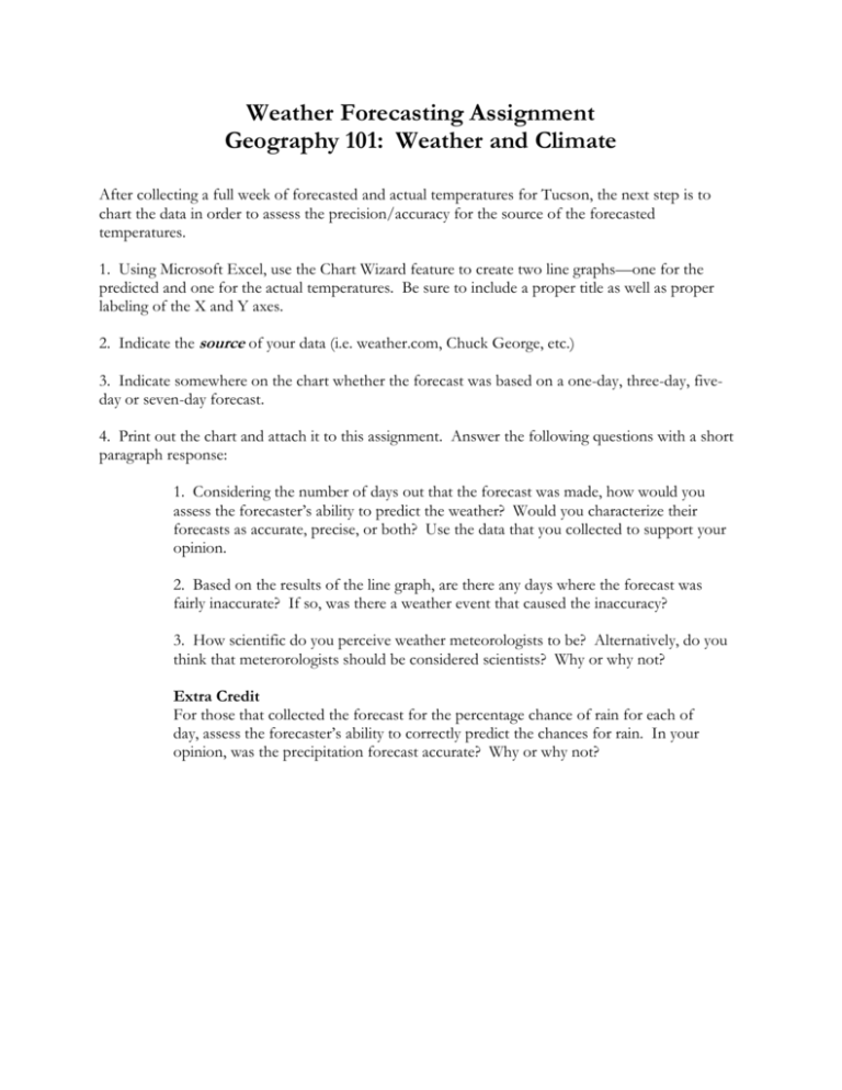
Weather Forecasting Assignment Geography 101: Weather and Climate After collecting a full week of forecasted and actual temperatures for Tucson, the next step is to chart the data in order to assess the precision/accuracy for the source of the forecasted temperatures. 1. Using Microsoft Excel, use the Chart Wizard feature to create two line graphs—one for the predicted and one for the actual temperatures. Be sure to include a proper title as well as proper labeling of the X and Y axes. 2. Indicate the source of your data (i.e. weather.com, Chuck George, etc.) 3. Indicate somewhere on the chart whether the forecast was based on a one-day, three-day, fiveday or seven-day forecast. 4. Print out the chart and attach it to this assignment. Answer the following questions with a short paragraph response: 1. Considering the number of days out that the forecast was made, how would you assess the forecaster’s ability to predict the weather? Would you characterize their forecasts as accurate, precise, or both? Use the data that you collected to support your opinion. 2. Based on the results of the line graph, are there any days where the forecast was fairly inaccurate? If so, was there a weather event that caused the inaccuracy? 3. How scientific do you perceive weather meteorologists to be? Alternatively, do you think that meterorologists should be considered scientists? Why or why not? Extra Credit For those that collected the forecast for the percentage chance of rain for each of day, assess the forecaster’s ability to correctly predict the chances for rain. In your opinion, was the precipitation forecast accurate? Why or why not?
