the outsiders
advertisement
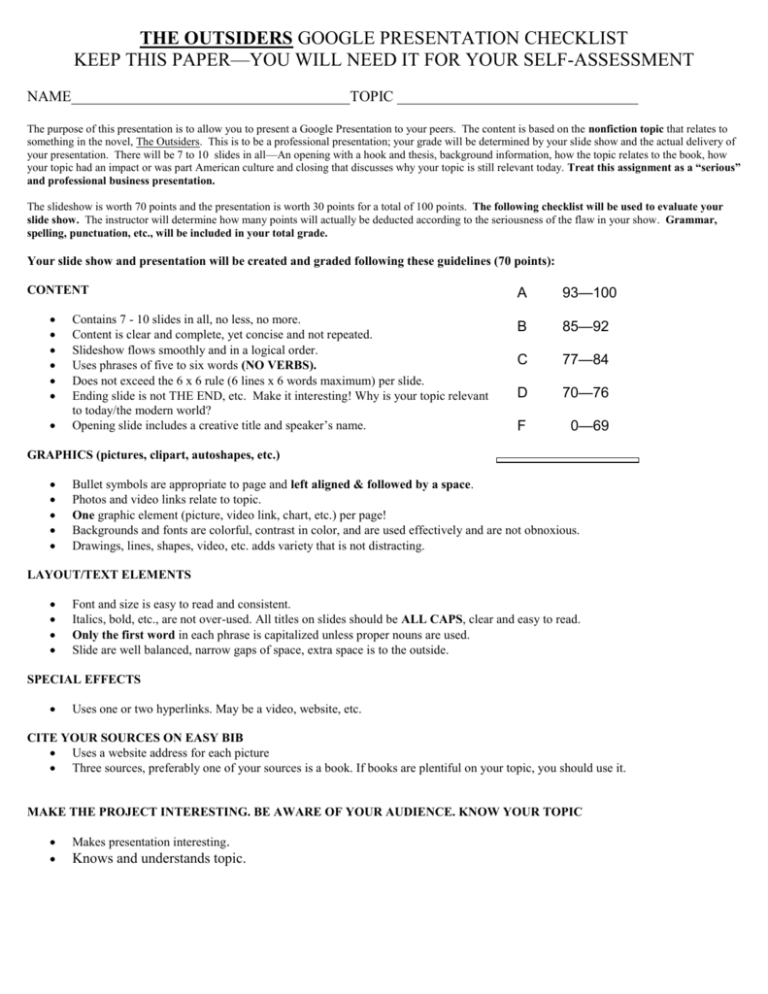
THE OUTSIDERS GOOGLE PRESENTATION CHECKLIST KEEP THIS PAPER—YOU WILL NEED IT FOR YOUR SELF-ASSESSMENT NAME_____________________________________TOPIC ________________________________ The purpose of this presentation is to allow you to present a Google Presentation to your peers. The content is based on the nonfiction topic that relates to something in the novel, The Outsiders. This is to be a professional presentation; your grade will be determined by your slide show and the actual delivery of your presentation. There will be 7 to 10 slides in all—An opening with a hook and thesis, background information, how the topic relates to the book, how your topic had an impact or was part American culture and closing that discusses why your topic is still relevant today. Treat this assignment as a “serious” and professional business presentation. The slideshow is worth 70 points and the presentation is worth 30 points for a total of 100 points. The following checklist will be used to evaluate your slide show. The instructor will determine how many points will actually be deducted according to the seriousness of the flaw in your show. Grammar, spelling, punctuation, etc., will be included in your total grade. Your slide show and presentation will be created and graded following these guidelines (70 points): CONTENT Contains 7 - 10 slides in all, no less, no more. Content is clear and complete, yet concise and not repeated. Slideshow flows smoothly and in a logical order. Uses phrases of five to six words (NO VERBS). Does not exceed the 6 x 6 rule (6 lines x 6 words maximum) per slide. Ending slide is not THE END, etc. Make it interesting! Why is your topic relevant to today/the modern world? Opening slide includes a creative title and speaker’s name. A 93—100 B 85—92 C 77—84 D 70—76 F 0—69 GRAPHICS (pictures, clipart, autoshapes, etc.) Bullet symbols are appropriate to page and left aligned & followed by a space. Photos and video links relate to topic. One graphic element (picture, video link, chart, etc.) per page! Backgrounds and fonts are colorful, contrast in color, and are used effectively and are not obnoxious. Drawings, lines, shapes, video, etc. adds variety that is not distracting. LAYOUT/TEXT ELEMENTS Font and size is easy to read and consistent. Italics, bold, etc., are not over-used. All titles on slides should be ALL CAPS, clear and easy to read. Only the first word in each phrase is capitalized unless proper nouns are used. Slide are well balanced, narrow gaps of space, extra space is to the outside. SPECIAL EFFECTS Uses one or two hyperlinks. May be a video, website, etc. CITE YOUR SOURCES ON EASY BIB Uses a website address for each picture Three sources, preferably one of your sources is a book. If books are plentiful on your topic, you should use it. MAKE THE PROJECT INTERESTING. BE AWARE OF YOUR AUDIENCE. KNOW YOUR TOPIC Makes presentation interesting. Knows and understands topic.
