2.3 part 2 Other Types of Graphs – Pie Graphs and Stem and Leaf
advertisement
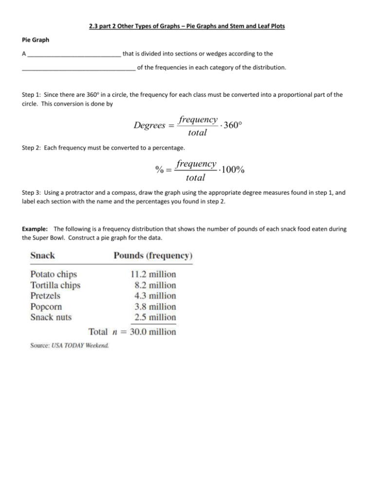
2.3 part 2 Other Types of Graphs – Pie Graphs and Stem and Leaf Plots Pie Graph A ____________________________ that is divided into sections or wedges according to the __________________________________ of the frequencies in each category of the distribution. Step 1: Since there are 360o in a circle, the frequency for each class must be converted into a proportional part of the circle. This conversion is done by Degrees frequency 360 total Step 2: Each frequency must be converted to a percentage. % frequency 100% total Step 3: Using a protractor and a compass, draw the graph using the appropriate degree measures found in step 1, and label each section with the name and the percentages you found in step 2. Example: The following is a frequency distribution that shows the number of pounds of each snack food eaten during the Super Bowl. Construct a pie graph for the data. Example: Construct a pie graph showing the blood types of the army inductees. Misleading graphs What’s misleading about the following graphs? Sourcing All graphs should contain a source for the information presented. The inclusion of a source for the data will enable you to check the reliability of the organization presenting the data. Stem and Leaf Plots A data plot that uses part of the data value as the ________________ and part of the data value as the ______________ to form groups or classes. Step 1: Arrange the data in order. Step 2: Separate the data according to the first digit. (or two digits if the numbers are in the hundreds, 3 digit for thousands, etc.) Step 3: Display the leading digit as the step, and the trailing digit as the leaf. Example: At an outpatient testing center, the number of cardiograms performed each day for 20 days is shown. Construct a stem and leaf plot for the data. Example: An insurance company researcher conducted a survey on the number of car thefts in a large city for a period of 30 days last summer. The raw data are shown. Construct a stem and leaf plot using classes 50-54, 55-59, 60-64, 6569, 70-74, and 75-79. Back to back stem and leaf plot. Example: The number of stories in two selected samples of tall buildings in Atlanta and Philadelphia is shown. Construct a back-to-back stem and leaf plot and compare the distributions. Name: ________________________________________ Statistics Homework 2.3 part 2 1. The following data are based on a survey on why people travel. Construct a pie graph for the data and analyze the results. 2. In a recent survey, 3 in 10 people indicated that they are likely to leave their jobs when the economy improves. Of those surveyed, 34% indicated that they would make a career change, 29% want a new job in the same industry, 21% are going to start a business, and 16% are going to retires. Make a pie chart and a Pareto chart for the data. Which chart do you think better represents the data? 3. A listing of calories per one ounce of selected salad dressings (not fat-free) is given below. Construct a stem and leaf plot for the data. 4. The math and reading achievement scores from the National Assessment of Educational Progress for selected states are listed below. Construct a back-to-back stem and leaf plot with the data and compare the distributions.

