Rubrics for evaluating SC ePortfolios
advertisement
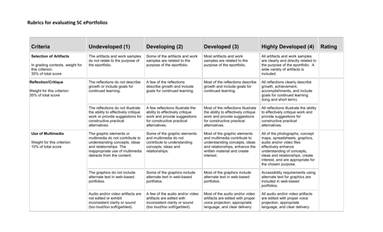
Rubrics for evaluating SC ePortfolios Criteria Undeveloped (1) Developing (2) Developed (3) Highly Developed (4) Selection of Artifacts The artifacts and work samples do not relate to the purpose of the eportfolio. Some of the artifacts and work samples are related to the purpose of the eportfolio. Most artifacts and work samples are related to the purpose of the eportfolio. All artifacts and work samples are clearly and directly related to the purpose of the eportfolio. A wide variety of artifacts is included. The reflections do not describe growth or include goals for continued learning. A few of the reflections describe growth and include goals for continued learning. Most of the reflections describe growth and include goals for continued learning. All reflections clearly describe growth, achievement, accomplishments, and include goals for continued learning (long and short term). The reflections do not illustrate the ability to effectively critique work or provide suggestions for constructive practical alternatives. A few reflections illustrate the ability to effectively critique work and provide suggestions for constructive practical alternatives. Most of the reflections illustrate the ability to effectively critique work and provide suggestions for constructive practical alternatives. All reflections illustrate the ability to effectively critique work and provide suggestions for constructive practical alternatives. The graphic elements or multimedia do not contribute to understanding concepts, ideas and relationships. The inappropriate use of multimedia detracts from the content. Some of the graphic elements and multimedia do not contribute to understanding concepts, ideas and relationships. Most of the graphic elements and multimedia contribute to understanding concepts, ideas and relationships, enhance the written material and create interest. All of the photographs, concept maps, spreadsheets, graphics, audio and/or video files effectively enhance understanding of concepts, ideas and relationships, create interest, and are appropriate for the chosen purpose. The graphics do not include alternate text in web-based portfolios. Some of the graphics include alternate text in web-based portfolios. Most of the graphics include alternate text in web-based portfolios. Accessibility requirements using alternate text for graphics are included in web-based portfolios. Audio and/or video artifacts are not edited or exhibit inconsistent clarity or sound (too loud/too soft/garbled). A few of the audio and/or video artifacts are edited with inconsistent clarity or sound (too loud/too soft/garbled). Most of the audio and/or video artifacts are edited with proper voice projection, appropriate language, and clear delivery. All audio and/or video artifacts are edited with proper voice projection, appropriate language, and clear delivery. In grading contexts, weight for this criterion: 35% of total score Reflection/Critique Weight for this criterion: 35% of total score Use of Multimedia Weight for this criterion: 10% of total score Rating Rubrics for evaluating SC ePortfolios Criteria Undeveloped (1) Developing (2) Developed (3) Highly Developed (4) Citations No images, media or text created by others are cited with accurate, properly formatted citations. Some of the images, media or text created by others are not cited with accurate, properly formatted citations. Most images, media or text elements created by others are cited with accurate, properly formatted citations. All images, media and text follow copyright guidelines with accurate citations. All content throughout the eportfolio displays the appropriate copyright permissions. The navigation links are confusing, and it is difficult to locate artifacts and move to related pages or a different section. There are significant problems with pages connecting to preceding pages or the Table of Contents. Many of the external links do not connect to the appropriate website or file. The navigation links are somewhat confusing, and it is often unclear how to locate an artifact or move to related pages or a different section. Some of the pages connect to the Table of Contents, but in other places the links do not connect to preceding pages or to the Table of Contents. Some of the external links do not connect to the appropriate website or file. The navigation links generally function well, but it is not always clear how to locate an artifact or move to related pages or different section. Most of the pages connect to the Table of Contents. Most of the external links connect to the appropriate website or file. The navigation links are intuitive. The various parts of the portfolio are labeled, clearly organized and allow the reader to easily locate an artifact and move to related pages or a different section. All pages connect to the Table of Contents, and all external links connect to the appropriate website or file. The eportfolio is difficult to read due to inappropriate use of fonts, type size for headings, sub-headings and text and font styles (italic, bold, underline). Many formatting tools are under or over-utilized and decrease the readers' accessibility to the content. The eportfolio is often difficult to read due to inappropriate use of fonts and type size for headings, sub-headings and text or inconsistent use of font styles (italic, bold, underline). Some formatting tools are under or over-utilized and decrease the readers' accessibility to the content. The eportfolio is generally easy to read. The eportfolio is easy to read. Color of background, fonts, and links decreases the readability of the text, is distracting and Color of background, fonts, and links decreases the readability of the text, is distracting and Color, background, font styles, and type size for headings, sub-headings and text are Color, background, font styles (italic, bold, underline) and type size for headings, sub-headings Weight for this criterion: 5% of total score Navigation Weight for this criterion: 5% of total score Layout and Readability Weight for this criterion: 5% of total score Rating Rubrics for evaluating SC ePortfolios Criteria Quality of Writing and Proofreading Weight for this criterion: 5% of total score Undeveloped (1) Developing (2) Developed (3) Highly Developed (4) used inconsistently throughout the eportfolio. used inconsistently in some places throughout the eportfolio. generally used consistently throughout the eportfolio. and text are used consistently and enhance the readability throughout the eportfolio. Horizontal and vertical white space alignment is used inappropriately, and the content appears disorganized and cluttered. Horizontal and vertical white space alignment is sometimes used inappropriately to organize content. Horizontal and vertical white space alignment is generally used appropriately to organize content. Horizontal and vertical white space alignment is used appropriately to organize content. No artifacts are accompanied by a caption that clearly explains the importance of the item including title, author, and date. Some of the artifacts are accompanied by a caption that clearly explains the importance of the item including title, author, and date. Most of the artifacts are accompanied by a caption that clearly explains the importance of the item work including title, author, and date. All artifacts are accompanied by a caption that clearly explains the importance of the item including title, author, and date. There are numerous grammatical, spelling or punctuation errors. The style of writing does not facilitate effective communication and requires major editing and revision. The writing includes include some grammatical, spelling or punctuation errors that distract the reader and requires some editing and revision. The writing is largely free of grammatical, spelling or punctuation errors. The style of writing generally facilitates communication and minor editing is required. The writing is free of grammatical, spelling or punctuation errors. The style of writing facilitates communication and no editing is required. TOTAL GRADING (STUDENT MUST RECEIVE AT LEAST AN 85 TO GRADUATE WITH SCHOLAR-CITIZEN STATUS) Adapted from https://www2.uwstout.edu/content/profdev/rubrics/eportfoliorubric.html Rating Rubrics for evaluating SC ePortfolios A Generic Rubric for Evaluating ePortfolios Exemplary 4 points Proficient 3 points Partially Proficient 2 points Incomplete 1 point Criterion: Selection of artifacts and written communication All artifacts and work samples are clearly and directly related to the purpose of the eportfolio. All of the components demonstrate the use of clear, well organized, and accurate written communication. Most artifacts and work samples are related to the purpose of the eportfolio. There are only one or two occurrences of unorganized, inaccurate, or difficult to interpret written information. Few artifacts and work samples are related to the purpose of the eportfolio. There are three or four occurrences of unorganized, inaccurate, or difficult to interpret written information. Most artifacts and work samples are unrelated to the purpose of the eportfolio. There are more than four instances of unorganized, inaccurate, or difficult to interpret written information. Criterion: Reflections All reflections clearly identify and describe professional growth goals for lifelong learning and are constructive in nature. Most of the reflections identify and describe professional growth goals for lifelong learning and are constructive in nature. A few reflections identify and describe professional growth goals for lifelong learning and these are constructive in nature. No reflections identify and describe professional growth goals for lifelong learning. Criterion: Use of Multimedia All of the multimedia enhance the purpose of the eportfolio, create interest, and are appropriate. The content of the eportfolio is enhanced in an original way. All of the examples are appropriate for the chosen purpose. Most of the multimedia enhance the purpose of the eportfolio, create interest, and are generally appropriate. The content of the eportfolio is enhanced somewhat in an original way. A few of the multimedia enhance the purpose of the eportfolio, create interest, and are sometimes appropriate. The content of the eportfolio is not always enhanced because of the inappropriate examples chosen for the purpose. The photographs, graphics, sounds, and/or videos are inappropriate. They are distracting and detract from the content. Criterion: Captions Each artifact is accompanied by a caption that clearly explains the importance of that particular work including title, author, and date. Most of the artifacts are accompanied by a caption that clearly explains the importance of that particular work including title, author, and date. Some of the artifacts are accompanied by a caption that clearly explains the importance of that particular work including title, author, and date. None of the artifacts are accompanied by a caption that clearly explains the importance of that particular work including title, author, and date. Rubrics for evaluating SC ePortfolios Criterion: Ease of Navigation All of the portfolio navigation links and all sections (standards, artifacts, and reflections) connect back to the Home page and all external links connect to the appropriate website. Most of the portfolio navigation links and most sections (standards, artifacts, and reflections) connect back to the Home page. Most of the external links connect to the appropriate website. Some of the portfolio navigation links and some sections (standards, artifacts, and reflections) connect back to the Home page, but sometimes the links do not connect to preceding pages or to the original Home page. Some of the external links connect to the appropriate website. There are significant problems with portfolio navigation links and many sections (standards, artifacts, and reflections) do not connect back to the Home page or preceding pages. Many external links do not connect to the appropriate website. Criterion: Layout and Text Elements The eportfolio is easy to read. Fonts, point size, bullets, italics, bold, and indentations for headings and sub-headings enhance the presentation. Horizontal and vertical white space is always used appropriately. Background and colours enhance the readability and aesthetic quality of the text. The eportfolio is generally easy to read. Fonts, point size, bullets, italics, bold, and indentations for headings and sub-headings enhance the presentation. A few minor format changes would enhance the presentation. Horizontal and vertical white space is used appropriately in most places. Background and colours generally enhance the readability of the text. The eportfolio is often difficult to read. Fonts, point size, bullets, italics, bold, and indentations for headings and sub-headings do not always enhance the presentation. Some formatting tools are under or overutilized. Horizontal and vertical white space is used inappropriately in some places. Background and colours are distracting in some places. They diminish somewhat the readability of the text. The eportfolio is difficult to read. Fonts, point size, bullets, italics, bold, and indentations for headings and sub-headings do not enhance the presentation. Many formatting tools are under or over-utilized. Horizontal and vertical white space is used inappropriately so that the content appears cluttered. Background and colours are distracting. They diminish the readability of the text. Criterion: Writing Mechanics There are no errors in grammar, capitalization, punctuation, and spelling. There are a few errors in grammar, capitalization, punctuation, and spelling. These require minor editing and revision. There are 4 or more errors in grammar, capitalization, punctuation, and spelling requiring editing and revision. The text has more than 6 errors in grammar, capitalization, punctuation, and spelling. It requires major editing and revision. A Generic Rubric for Evaluating ePortfolios The above rubric has been adapted by the ePortfolio Portal team as an example of the evaluation of eportfolios. The exact criteria will depend on the purpose of the evaluation.


