Here
advertisement
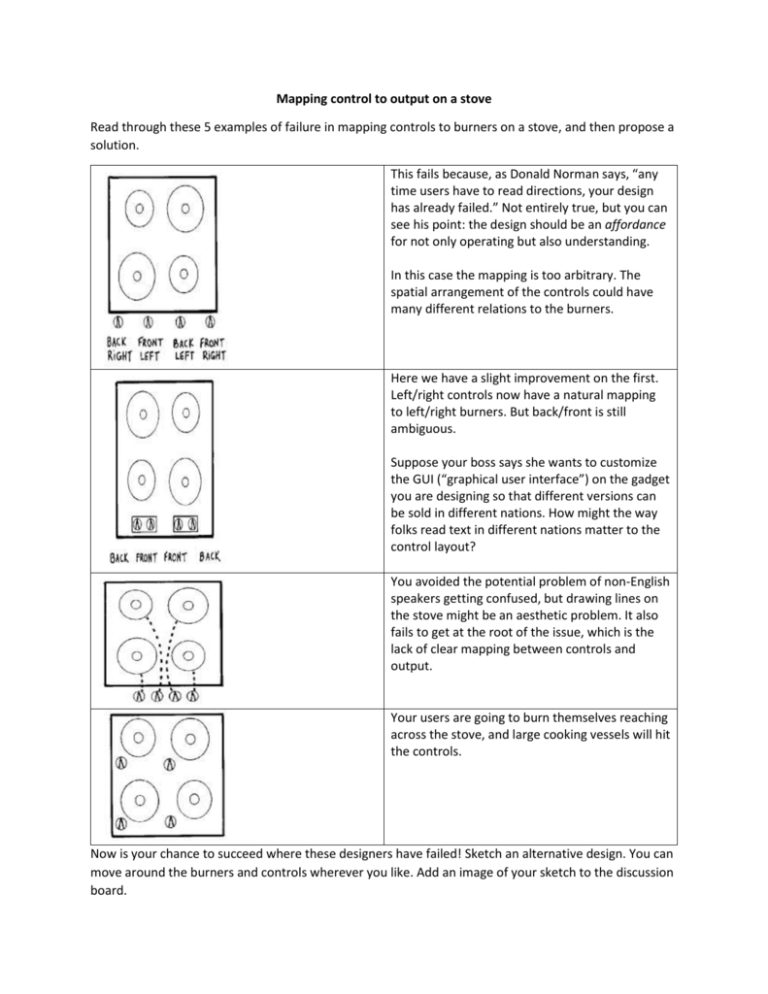
Mapping control to output on a stove Read through these 5 examples of failure in mapping controls to burners on a stove, and then propose a solution. This fails because, as Donald Norman says, “any time users have to read directions, your design has already failed.” Not entirely true, but you can see his point: the design should be an affordance for not only operating but also understanding. In this case the mapping is too arbitrary. The spatial arrangement of the controls could have many different relations to the burners. Here we have a slight improvement on the first. Left/right controls now have a natural mapping to left/right burners. But back/front is still ambiguous. Suppose your boss says she wants to customize the GUI (“graphical user interface”) on the gadget you are designing so that different versions can be sold in different nations. How might the way folks read text in different nations matter to the control layout? You avoided the potential problem of non-English speakers getting confused, but drawing lines on the stove might be an aesthetic problem. It also fails to get at the root of the issue, which is the lack of clear mapping between controls and output. Your users are going to burn themselves reaching across the stove, and large cooking vessels will hit the controls. Now is your chance to succeed where these designers have failed! Sketch an alternative design. You can move around the burners and controls wherever you like. Add an image of your sketch to the discussion board. (above is from http://csunplugged.org/wp-content/uploads/2014/12/unplugged-19human_interface_design_0.pdf).
