Part II – Exploring Data, Chapter 1 from our textbook Read through
Part II – Exploring Data, Chapter 1 from our textbook
Read through Chapter 1 in the Practice of Statistics textbook, Page 4-72.
First familiarize yourself with the way the textbook is laid out.
There are figures, examples, tables, activities, and exercises. All are numbered. What often confuses students is that there may be a Table 1.2, a Figure 1.2, and an Exercise 1.2 and they might be unrelated and on different pages in the book.
Please also note that the notation 1.4 (four) is different than 1.40 (forty).
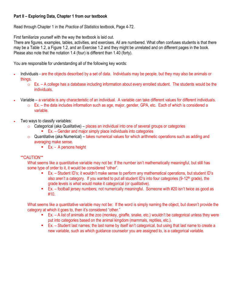
You are responsible for understanding all of the following key words:
Individuals - are the objects described by a set of data. Individuals may be people, but they may also be animals or things. o Ex. – A college has a database including information about every enrolled student. The students would be the individuals.
Variable – a variable is any characteristic of an individual. A variable can take different values for different individuals. o Ex. – the data includes information such as age, major, gender, GPA, etc. Each of which is considered a variable.
Two ways to classify variables: o Categorical (aka Qualitative) – places an individual into one of several groups or categories
Ex. – Gender and major simply place individuals into categories o Quantitative (aka Numerical) – takes numerical values for which arithmetic operations such as adding and averaging make sense.
Ex. - A persons height
**CAUTION**
What seems like a quantitative variable may not be: If the number isn’t mathematically meaningful, but still has some type of order to it, it would be considered “other”.
Ex. – Student ID’s; it wouldn’t make sense to perform any mathematical operations, but student ID’s also aren’t a category. If you wanted to put all student ID’s into four categories (9-12 th grade), the grade levels is what would make it categorical (or qualitative).
Ex. – football jersey numbers; not numerically meaningful. Someone with #20 isn’t twice as good as
#10.
What seems like a quantitative variable may not be: If the word is simply naming the object, but doesn’t provide the category at which it goes to, then it’s considered “other.”
Ex. – A list of animals at the zoo (monkey, giraffe, snake, etc.) wouldn’t be categorical unless they were put into categories based on the animal kingdom (mammals, reptiles, etc.).
Ex. – Student last names; the last name by itself isn’t categorical, but using that last name to create a new variable, such as which guidance counselor you are assigned to, is a categorical variable.
Case – An entire row of data. o Ex. – If data was collected for an entire class in which each individual was asked their student ID, gender, age, and GPA, each individual would be considered a case.
Distribution – what values the variable takes and how often it takes these values o When describing a distribution, include the center, shape, spread, and outliers
Count & Percent – are used for categorical data
**Center, Spread, and Shape describe the overall pattern of the distribution**
Center
Mean – average (non-resistant) – cannot resist the influence of extreme observations
Median – middle value – is resistant to extreme observations
Mode – value or values that occur most often – is resistant to extreme observations – can have no mode, 1 mode, or more than 1 mode
Spread
Range – the difference between the highest and lowest data values
Quartiles – Q
1
– First quartile (median of lower half), M or Q
2
– Middle quartile (median of entire data set), and Q
3
–
Third quartile (median of upper half)
interquartile range (IQR) – The middle 50% of the data set. IQR = Q
3
– Q
1 variance – the average of the squared differences from the mean (s 2 ). s
2 n
1
1
( x i
x )
2
standard deviation (and properties on page 51) – the square root of the variance. Measures spread by looking at how far the observations are from their mean.
s
1
1
( x i
x )
2 n
Properties of standard deviation:
1.
s measures spread about the mean and should only be used when the mean is chosen as the measure of center (aka – only use for a normal or approx. normal distribution)
2.
s = 0 when there is no spread. This happens only when all observations have the same value. Otherwise,
s > 0. As the observations become more spread out about their mean, s gets larger.
3.
s, like the mean x
, is not resistant. Strong skewness or a few outliers can make s very large.
Shape
rectangular
bimodal
tri-modal
bell-shaped – not necessarily normal
“approximately normal”
Symmetric – If the right and left sides are approximately mirror images of each other
skewed to the left (lower values) – when there are extreme observations that are lower than most of the data. The mean will be less than the median and the mode will be greater than the median.
skewed to the right (higher values) – when there are extreme observations that are higher than most of the data.
The mean will be greater than the median and the mode will be less than the median.
Outlier - an individual observation that falls outside the overall pattern of the graph
what an outlier looks like – how to calculate if something actually is one – If the value is smaller than
Q
1
Q
3
(1.5
IQR )
(1.5
IQR )
or larger than
Pecentile - the value such that p percent of the observations fall at or below it.
o Ex. – If you scored in the 80 th percentile on a standardized test that means that 80% of the people that took the test either scored the same or less than you.
Creating a frequency table –
1.
In the first column write down all of the data values in acceding order (or create bins)
2.
In the second column tally the number of times those values occur
3.
In the third column write the total number of times each value occurred
Roundoff error - the difference between the calculated approximation of a number and its exact mathematical value.
o Happens in relative frequency tables if the percentages are rounded
Trend – When the data values represent a common overall pattern.
Seasonal variation – A pattern that repeats itself at regular time intervals.
Resistant measure – When the measure cannot be affected by outliers.
o Mean – non-resistant o Median – resistant o Mode – resistant o IQR - resistant o Standard deviation – non-resistant
Degrees of freedom – The number of values in a study that are “free” to vary. Represented as n – 1. o Ex. – Suppose you need to take 10 classes and only 10 are offered. You are able to choose the order in which you take the first 9, but come time for the 10 th course, you don’t have a choice. Therefore you have 9 degrees of freedom. o For standard deviation of a sample (s) we use n – 1 because the sum of deviations is always 0 and therefore the last deviation can be found once we know all other n – 1 deviations.
Linear transformation – Useful for changing units of measurement. Changes the original value x into the new variable x new
. x new o Adding the constant a shifts all values of x upward or downward (aka; adds or subtracts) by the same amount
Adding a constant a amount to each observation does not change the shape or spread, but will change the center and quartiles. o Multiplying by the constant b changes the size of the unit of measurement
Multiplying a constant amount by each observation will change both measures of center (mean and median) and the spread (the standard deviation and IQR). The shape may or may not change depending on the factor. o SEE FIGURE 1.21 ON PAGE 54 FOR AN EXAMPLE
Know how to read and construct each of the following: (Also, know when each is appropriate to use.)
Pie Chart – Use for categorical data. Pie charts are best used when trying to compare parts of a whole.
Bar Chart – Used for categorical data. Used to compare things between different groups.
o Pareto Chart - contains both bars and a line graph, where individual values are represented in descending order by bars, and the cumulative total is represented by the line. The purpose of the Pareto chart is to highlight the most important among a (typically large) set of factors.
Dot Plot (aka Number Line Plot) – One of the simplest ways to display quantitative data.
Stem and Leaf Plot (aka Stem Plot) – Typically used when the values of a variable are too spread out to make a reasonable dotplot. o The stem consists of all but the rightmost digit (this goes in the left column) o The leaf is the final digit (these go in ascending order in the right column) o Be sure to have an equal number of possible leaf digits assigned if you split stems o Five stems is a good minimum
Back to Back Stem and Leaf Plot – A method of constructing two sets of leaves, in the stem-and-leaf plots involving two sets of data, hanging on both sides of the same stem.
Histogram (and how it differs from a bar chart) – The most common graph of the distribution of one quantitative variable. The graph is clearer if nearby values are grouped together. This is different than a bar chart because it displays quantitative data versus qualitative data. The bars are also touching in a histogram whereas they are separated in a bar chart. o Five classes is a good minimum o To group the values be sure to divide the range of the data into classes of equal width o Beware of letting a computer or graphing calculator choose the classes o The start of the class should include the number marked o If you are not starting at zero, put a “break” in the graph (see figure 1.7 on page 20)
Ogive (aka Relative Cumulative Frequency Graph) – Pronounced O-JIVE – A graph that shows the relative standing (percentage) of an individual observation. The main purpose of an ogive is to easily find percentiles.
o Example of a cumulative relative frequency table o Example of an ogive
This means that 68% of households have between 0 and 4.999999… cattle. Which also means that 50% of the entire sample have between 1 & 4 cattle (assuming there isn’t part of a cattle ).
This means that
18% of households have 0 cattle.
This means that the median (50 th percentile) would be 3 cattle.
Time Plot – plots each observation against the time at which it was measured. o Always mark the time on the x-axis o If there are too many points, connect with a line
Box and Whisker Plot (aka Boxplot) – A graphical display based on the five-number summary. Best used for sideby-side comparison.
Side by Side Box and Whisker Plot
Modified Boxplot (shows outliers)
Technology Toolboxes (make sure you are competent with Lists, 1-Var Stats, Histograms, Bar Charts, & Box Plots).
Good problems to look at: 1.1, 1.3, 1.5, 1.9, 1.17, 1.19, 1.29, 1.31, 1.33, 1.39, 1.45, 1.55, 1.57, 1.66, 1.67
I tried to give you all odd problems so you could check your answers in the back of the book.
I will not be checking to see if you have completed these when you return.
They are optional, but highly suggested exercises.
We will have our first assessment on Chapter 1 soon after school starts (probably the second class). Be prepared.
Please feel free to email me with any questions or comments
