Climate Graphs Worksheet: Geography Data Analysis
advertisement
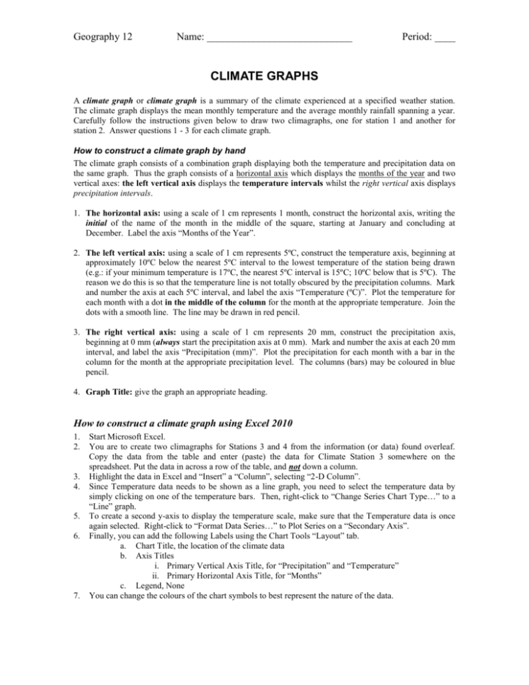
Geography 12 Name: ____________________________ Period: ____ CLIMATE GRAPHS A climate graph or climate graph is a summary of the climate experienced at a specified weather station. The climate graph displays the mean monthly temperature and the average monthly rainfall spanning a year. Carefully follow the instructions given below to draw two climagraphs, one for station 1 and another for station 2. Answer questions 1 - 3 for each climate graph. How to construct a climate graph by hand The climate graph consists of a combination graph displaying both the temperature and precipitation data on the same graph. Thus the graph consists of a horizontal axis which displays the months of the year and two vertical axes: the left vertical axis displays the temperature intervals whilst the right vertical axis displays precipitation intervals. 1. The horizontal axis: using a scale of 1 cm represents 1 month, construct the horizontal axis, writing the initial of the name of the month in the middle of the square, starting at January and concluding at December. Label the axis “Months of the Year”. 2. The left vertical axis: using a scale of 1 cm represents 5ºC, construct the temperature axis, beginning at approximately 10ºC below the nearest 5ºC interval to the lowest temperature of the station being drawn (e.g.: if your minimum temperature is 17ºC, the nearest 5ºC interval is 15ºC; 10ºC below that is 5ºC). The reason we do this is so that the temperature line is not totally obscured by the precipitation columns. Mark and number the axis at each 5ºC interval, and label the axis “Temperature (ºC)”. Plot the temperature for each month with a dot in the middle of the column for the month at the appropriate temperature. Join the dots with a smooth line. The line may be drawn in red pencil. 3. The right vertical axis: using a scale of 1 cm represents 20 mm, construct the precipitation axis, beginning at 0 mm (always start the precipitation axis at 0 mm). Mark and number the axis at each 20 mm interval, and label the axis “Precipitation (mm)”. Plot the precipitation for each month with a bar in the column for the month at the appropriate precipitation level. The columns (bars) may be coloured in blue pencil. 4. Graph Title: give the graph an appropriate heading. How to construct a climate graph using Excel 2010 1. 2. 3. 4. 5. 6. 7. Start Microsoft Excel. You are to create two climagraphs for Stations 3 and 4 from the information (or data) found overleaf. Copy the data from the table and enter (paste) the data for Climate Station 3 somewhere on the spreadsheet. Put the data in across a row of the table, and not down a column. Highlight the data in Excel and “Insert” a “Column”, selecting “2-D Column”. Since Temperature data needs to be shown as a line graph, you need to select the temperature data by simply clicking on one of the temperature bars. Then, right-click to “Change Series Chart Type…” to a “Line” graph. To create a second y-axis to display the temperature scale, make sure that the Temperature data is once again selected. Right-click to “Format Data Series…” to Plot Series on a “Secondary Axis”. Finally, you can add the following Labels using the Chart Tools “Layout” tab. a. Chart Title, the location of the climate data b. Axis Titles i. Primary Vertical Axis Title, for “Precipitation” and “Temperature” ii. Primary Horizontal Axis Title, for “Months” c. Legend, None You can change the colours of the chart symbols to best represent the nature of the data. Geography 12 Name: ____________________________ Period: ____ a. 8. Temperature should be red to represent the amount of heat. Click on the line and be sure that the entire line is selected. Right-click to Format Data Series and change the Line Colour to red. b. Precipitation should be blue to represent the amount of water. Click on a bar and be sure that the entire bar graph is selected. Right-click to Format Data Series and select Fill to change the Solid Fill colour to blue. You have successfully created a climate graph on Excel!!! Climatic Data Station 1 Months Temperature (°C) Precipitation (mm) J 22 87 F M A M J J 22 21 18 15 13 12 103 127 133 126 118 118 A 13 75 S 15 71 O 18 70 N 19 73 D 21 73 Station 2 Months Temperature (°C) Precipitation (mm) J -15 25 F -10 20 A 16 80 S 11 38 O 7 18 N -4 16 D -10 25 M -5 20 A 4 22 M 12 40 J 15 76 J 17 88 Station 3 Months Temperature (°C) Precipitation (mm) J F M A M J J A S O N D 24.2 24.6 26.7 28.6 30.0 29.0 27.5 27.2 27.3 28.2 27.3 25.6 2.7 1.1 0.6 1.5 14.1 518.4 647.1 383.9 276.2 55.3 14.5 2.1 Station 4 Months Temperature (°C) Precipitation (mm) J F M A M J J A S O N D 26.0 26.0 25.9 26.0 26.2 26.3 26.5 27.2 27.5 27.5 27.1 26.6 263.9 262.0 297.9 282.7 203.7 103.1 66.9 45.6 63.0 111.1 161.0 219.8 Climate Questions 1. Calculate the following values for each climate station: a) annual temperature range: the difference between the highest and lowest average monthly temperatures b) mean annual temperature: the average of the average monthly temperatures c) total annual precipitation: the sum of the average monthly precipitation 2. Match each graph with one of the possible location for each graph from the list below: Sydney, Australia Manaus, Brazil Bombay, India Miami, Florida 3. For each station: a) Describe and account for the annual range in temperature: b) Describe and account for the pattern of precipitation. Edmonton, Alberta
